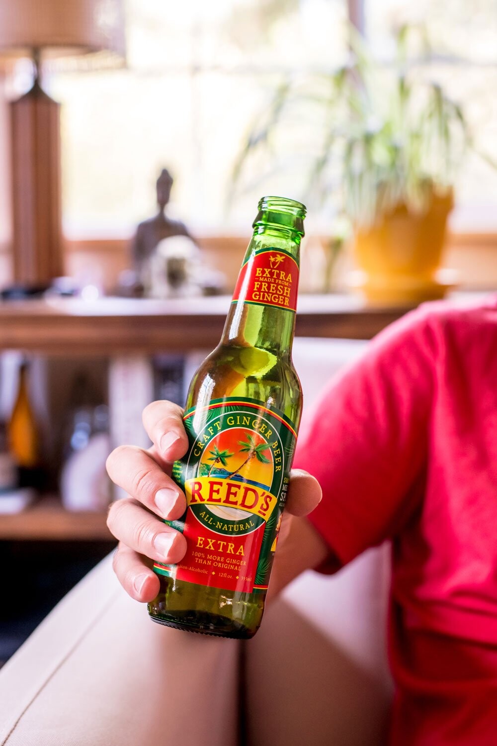
Reed's is America's number one ginger beer brand. When they decided on a refresh, the brief wasn't to reinvent the brand, but to modernize it in a way that earned its place on a shelf that had become more competitive since the original was launched. Keep what makes Reed's Reed's. Fix what was making it harder to shop and harder to compete. Know the difference between 'new' and 'renew'.
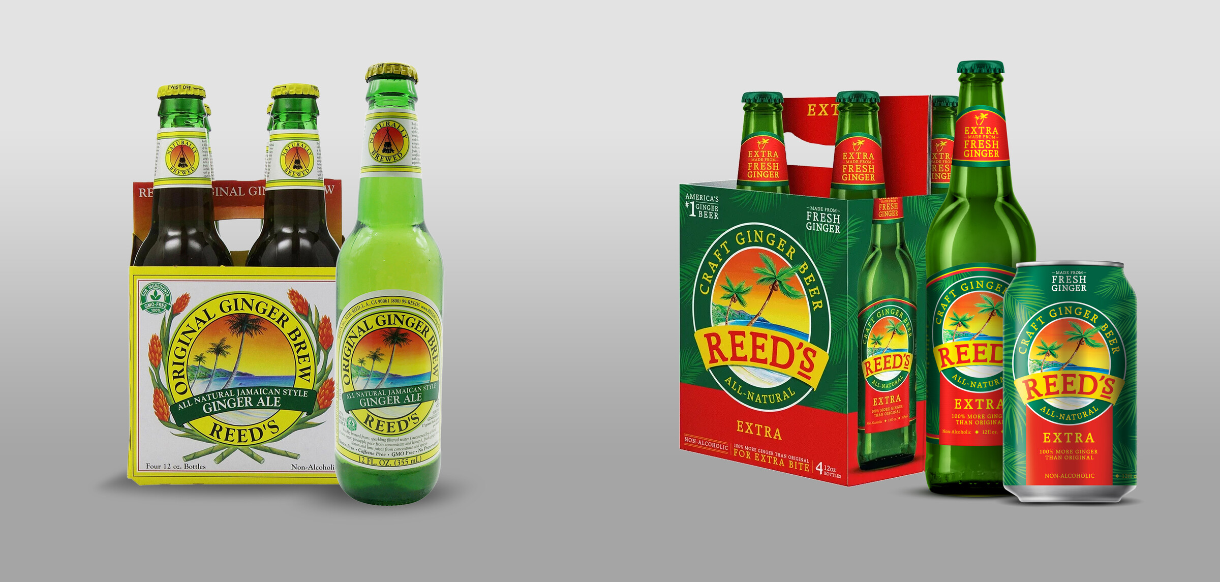
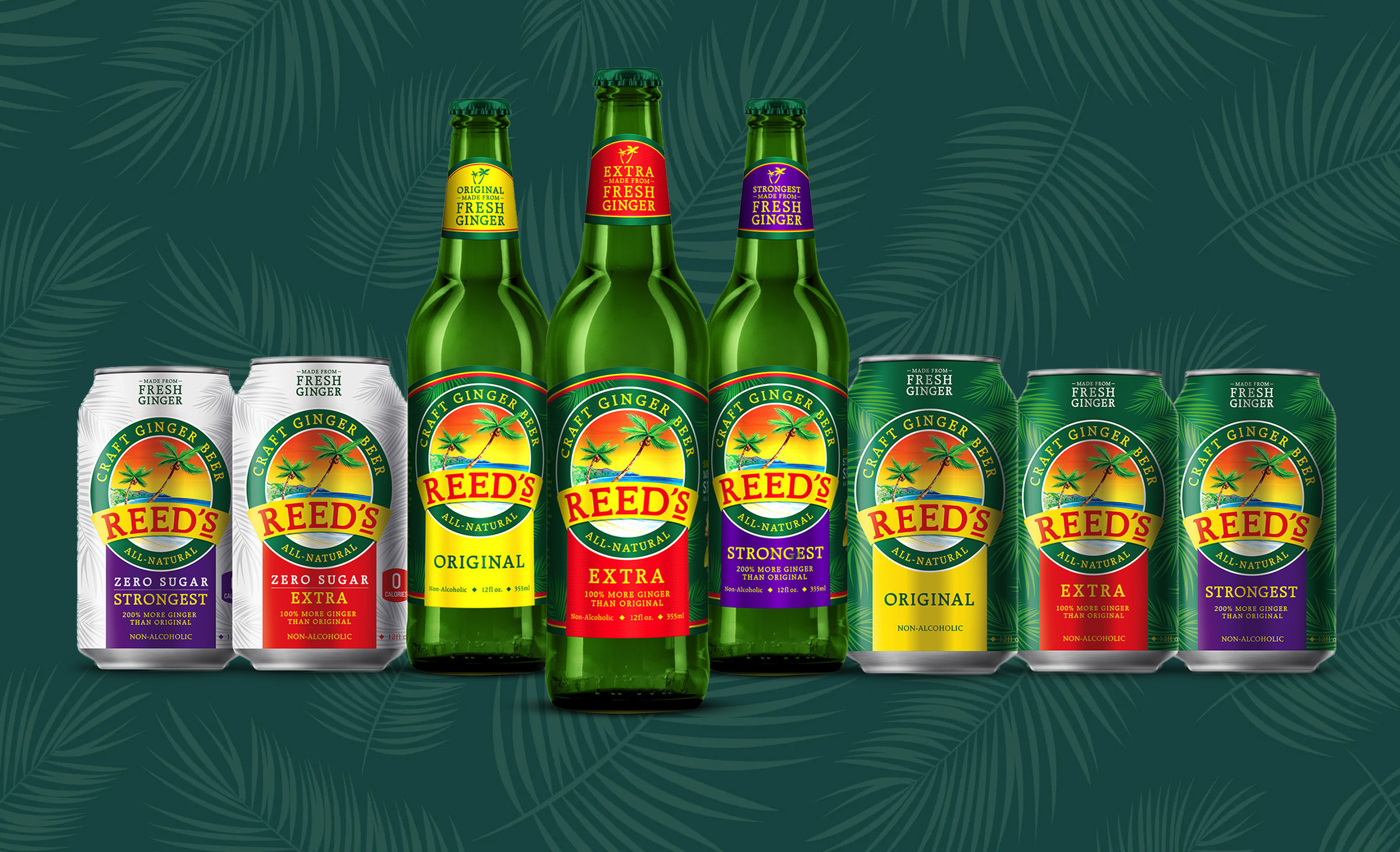
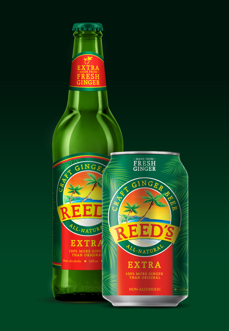
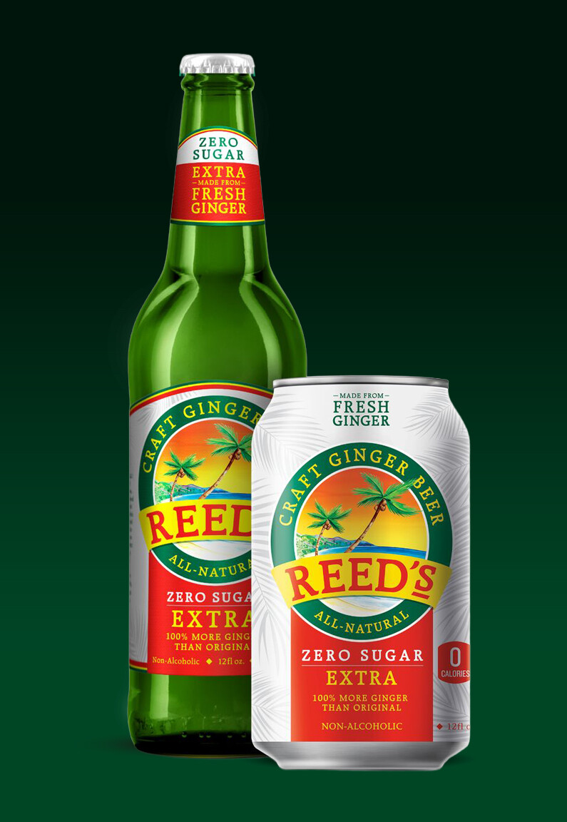
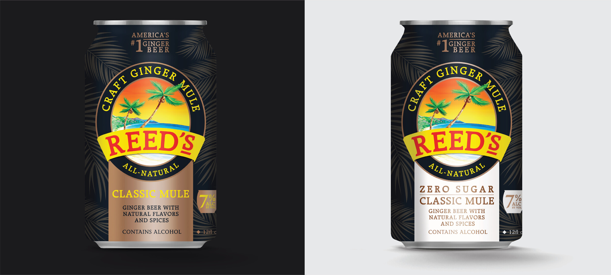
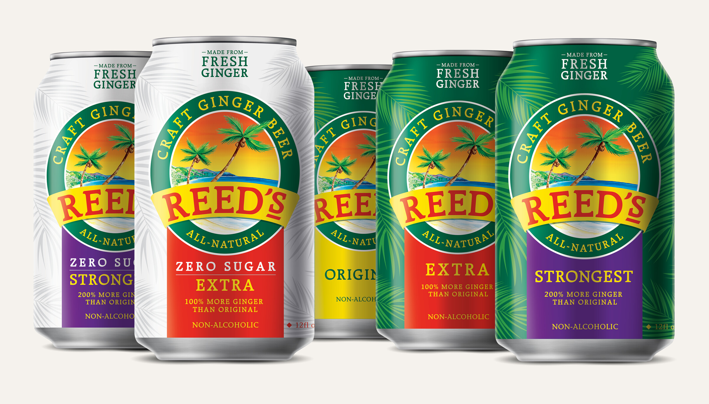
The refresh focused on three things: improving hierarchy so the product story landed faster, unifying the visual system across glass bottles, cans, and multipacks, and strengthening flavor differentiation so a customer could navigate the lineup at a glance. The brand equity stayed intact, and the execution became significantly sharper.
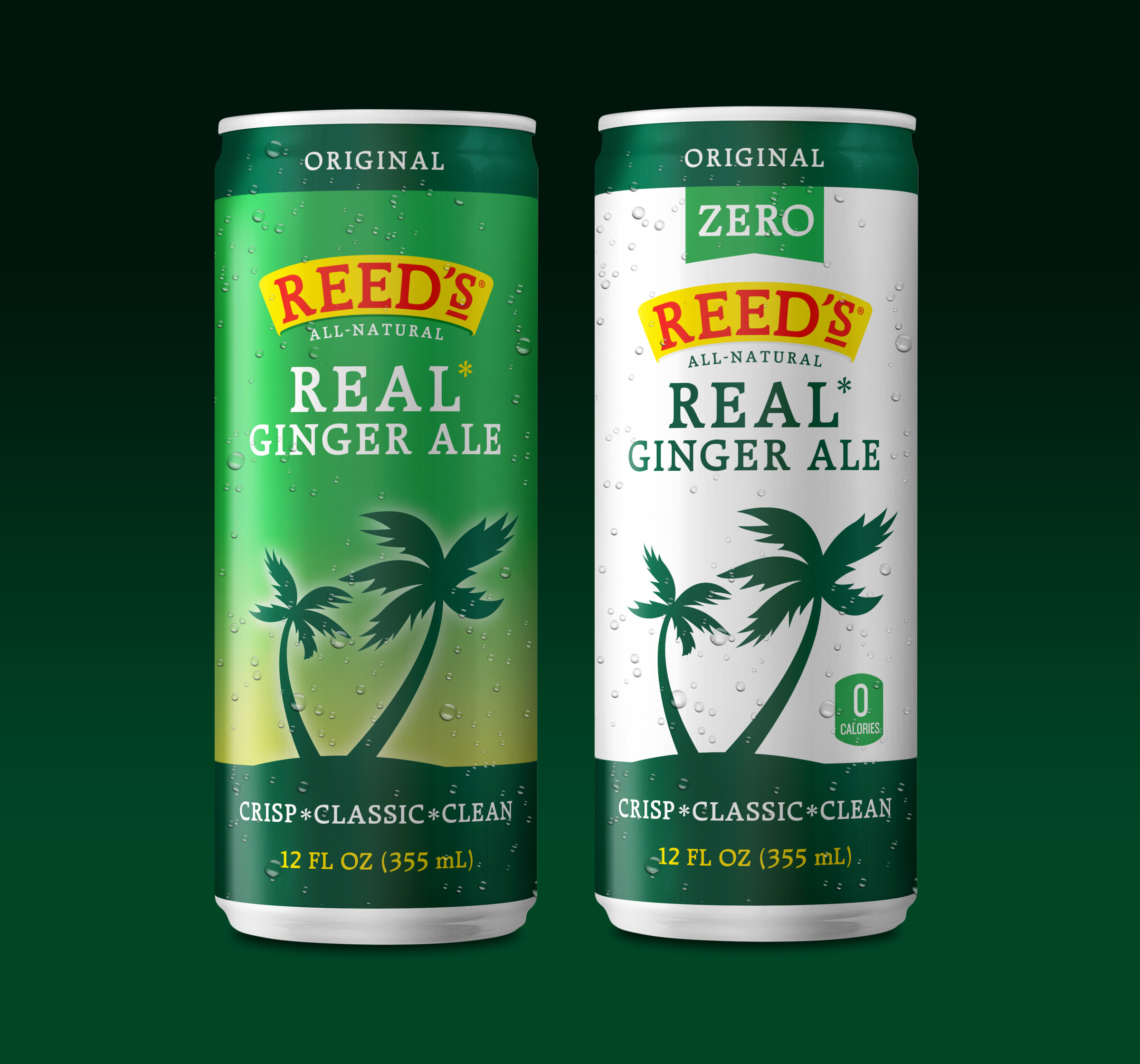
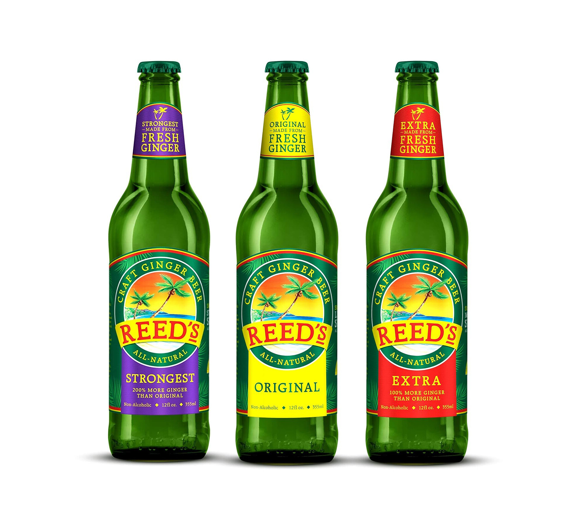
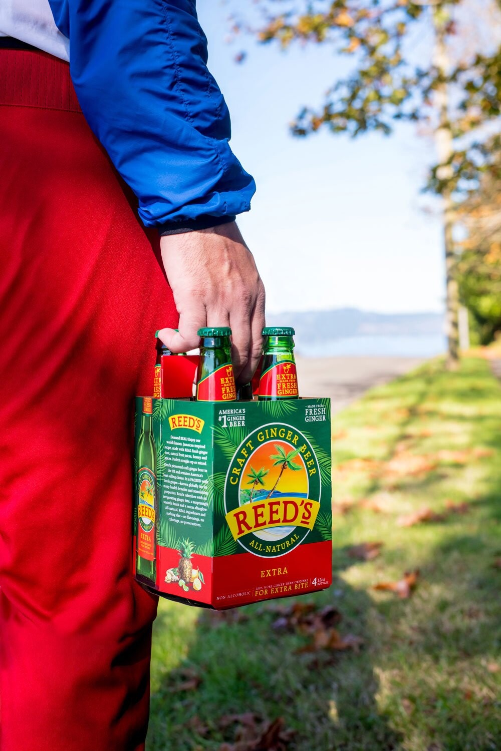
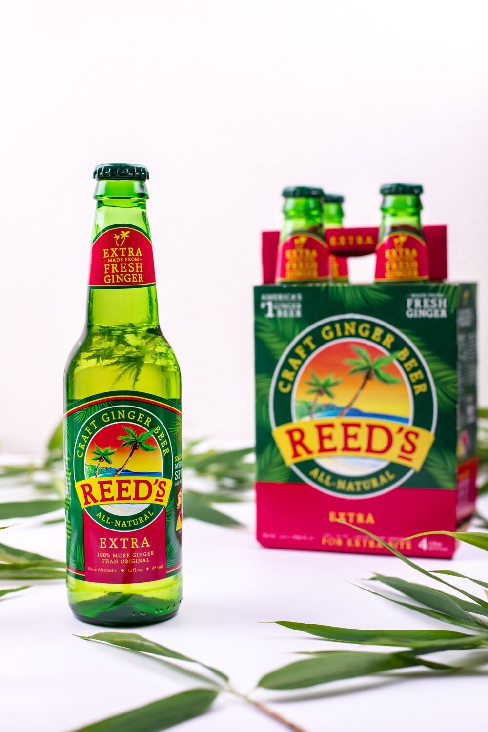
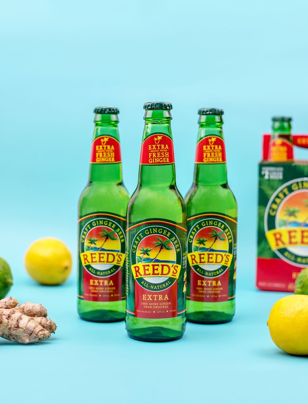
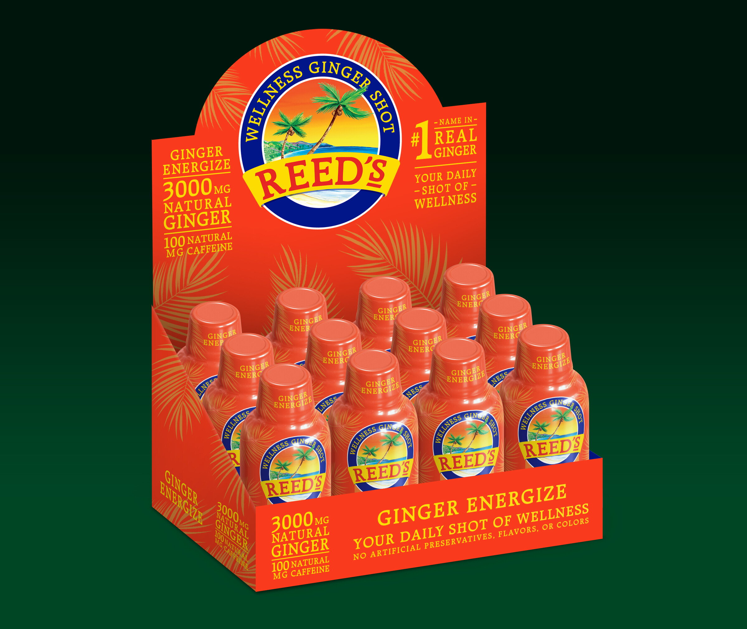
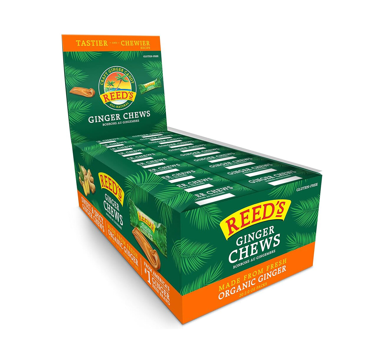
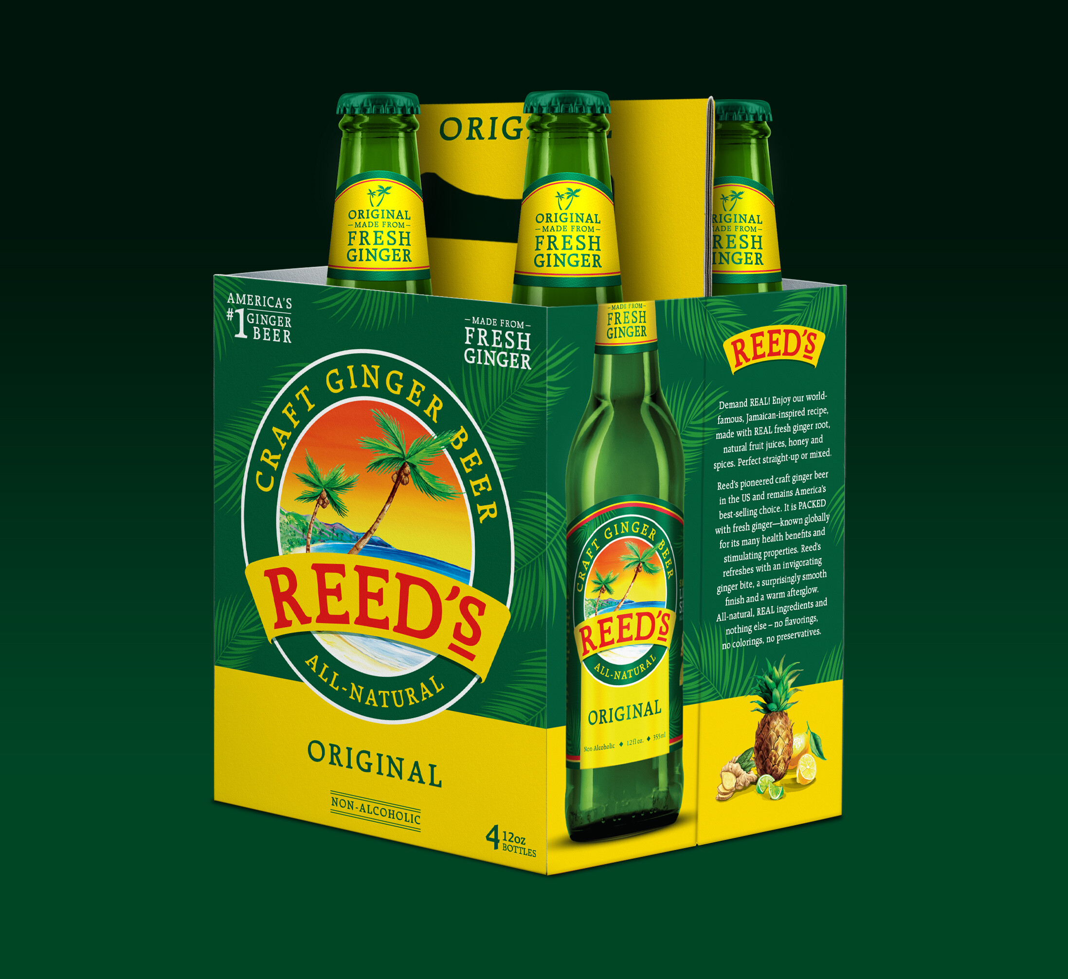
Once the core identity was resolved, the system extended across the full product range. The original ginger beer line in glass bottles, the canned formats, and the 4-pack and 12-pack multipack structures. Each format has its own production requirements, and the visual language translated cleanly across all of them.
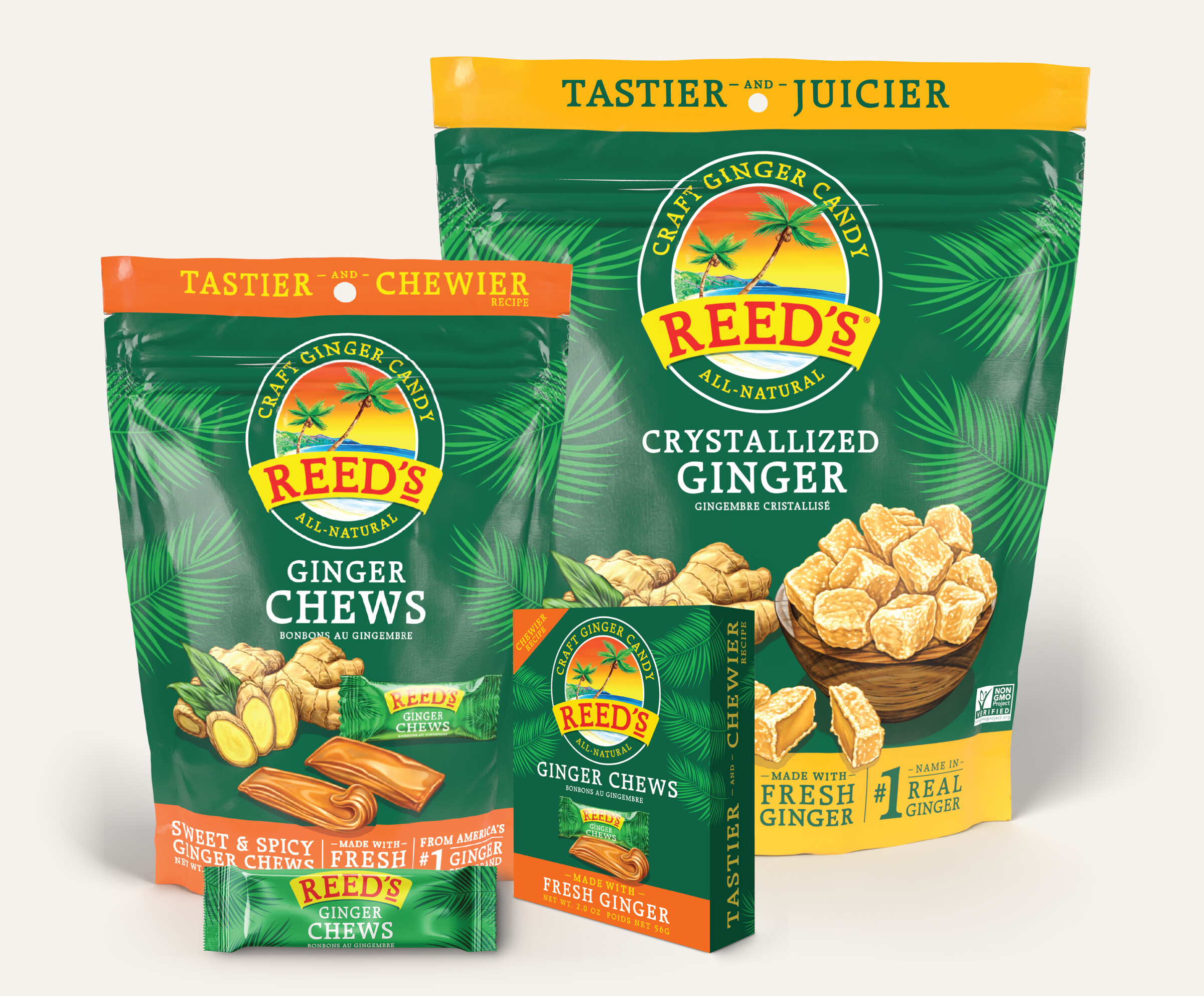
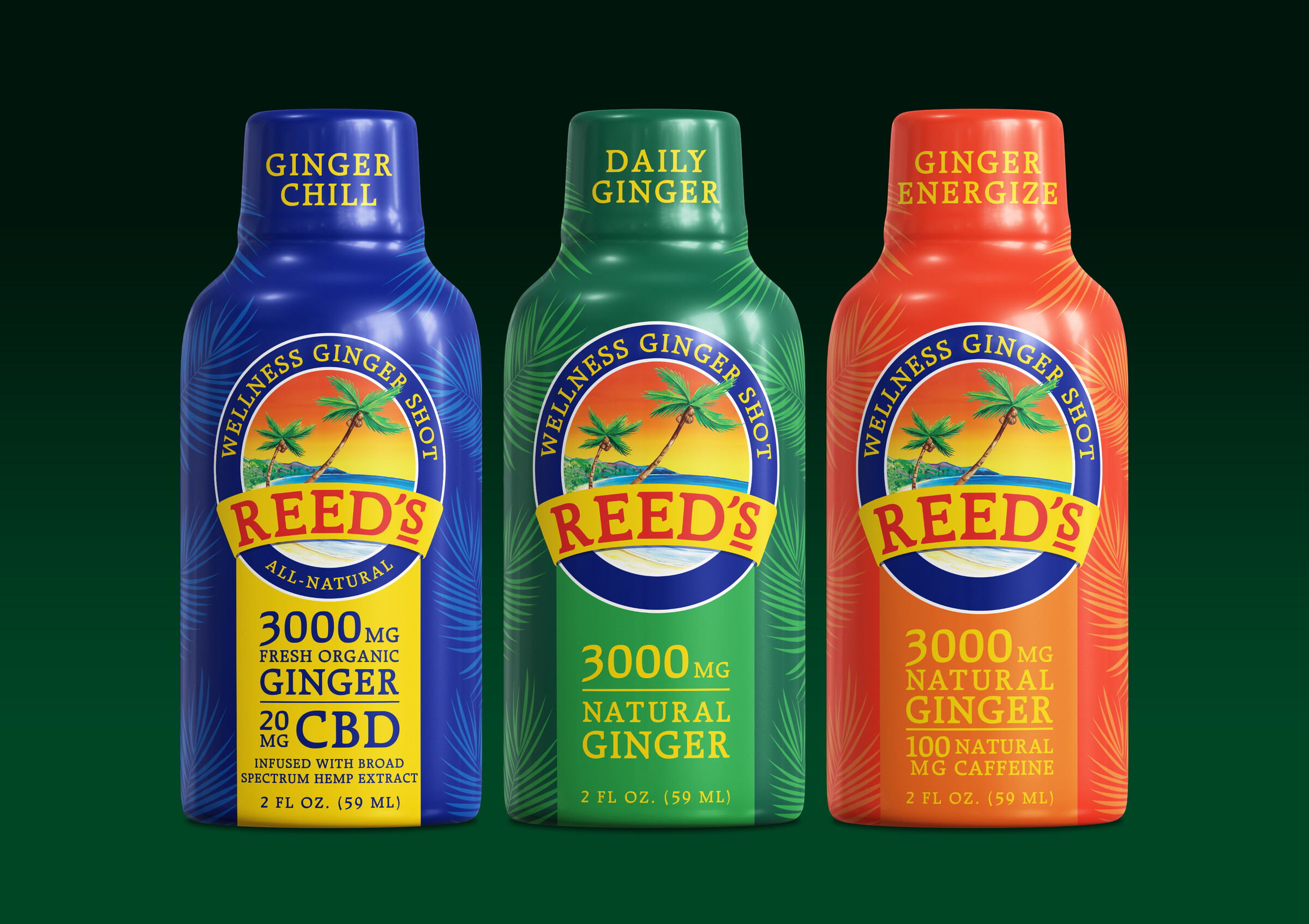
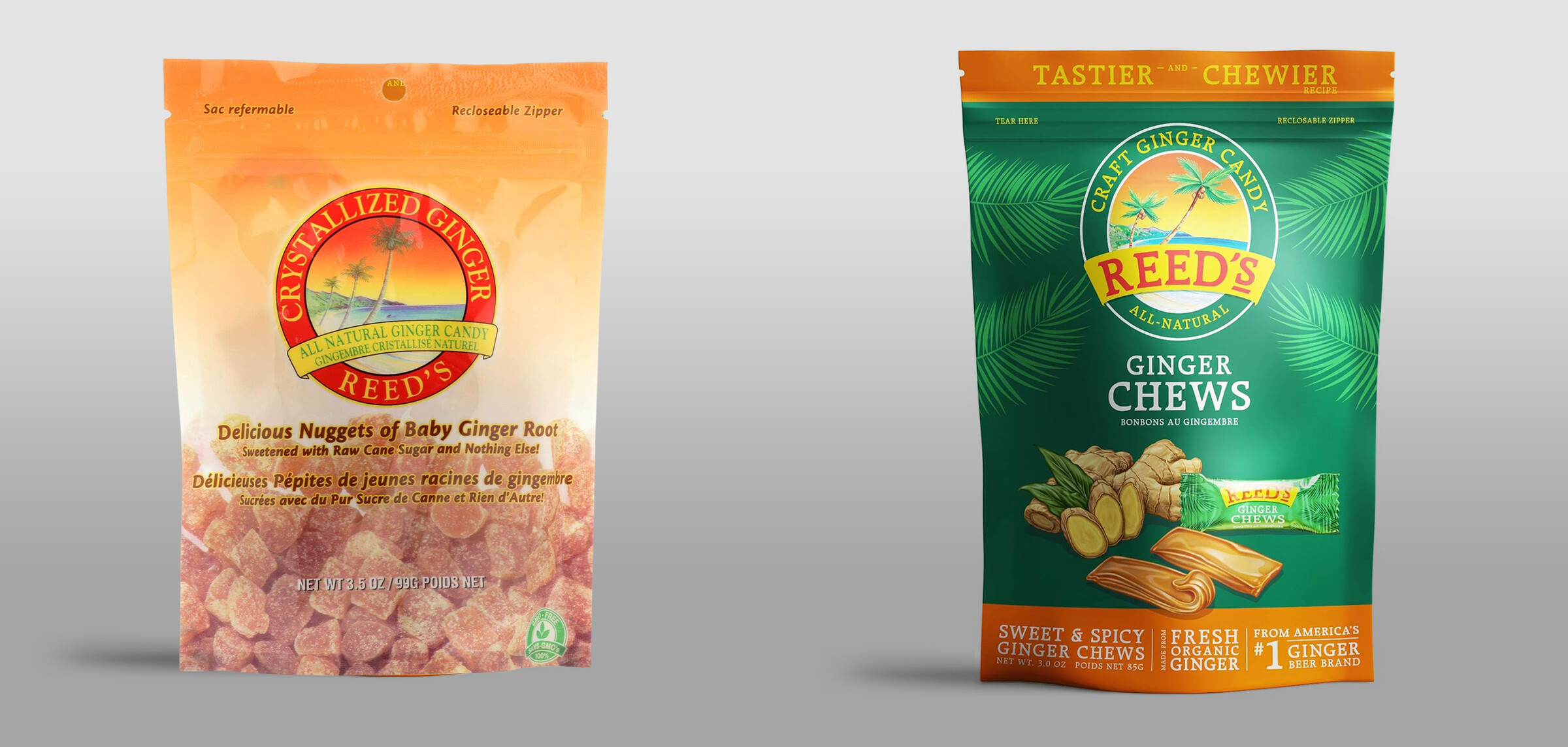
The refresh served as the platform for Reed's new product development, including ginger candy and a wellness energy shot line. New formats and new retail categories showed it could extend beyond the original product family, and carry the brand equity strengthened by the refresh.