
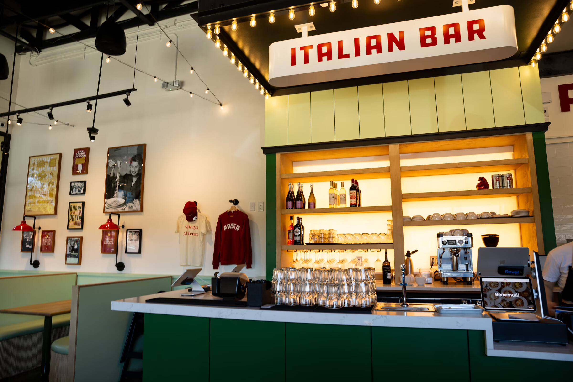
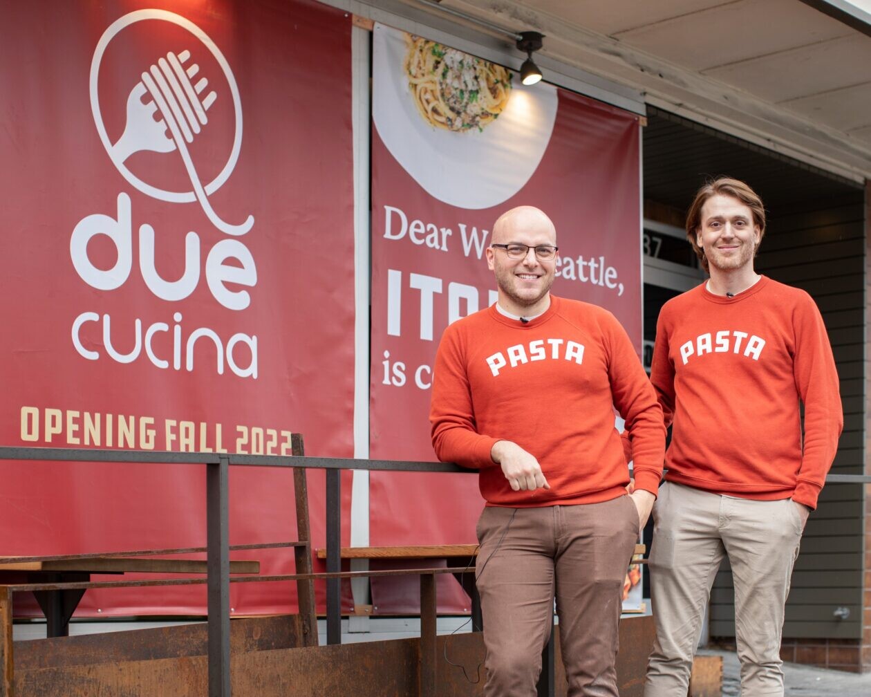
Due Cucina set out to bring authentic Italian fast-casual dining to Seattle, with premium ingredients, proper technique, approachable speed. The brand needed to balance that tension honestly: genuinely Italian, not like a theme park version of it, while operating at the pace and scale of a multi-location fast-casual concept.
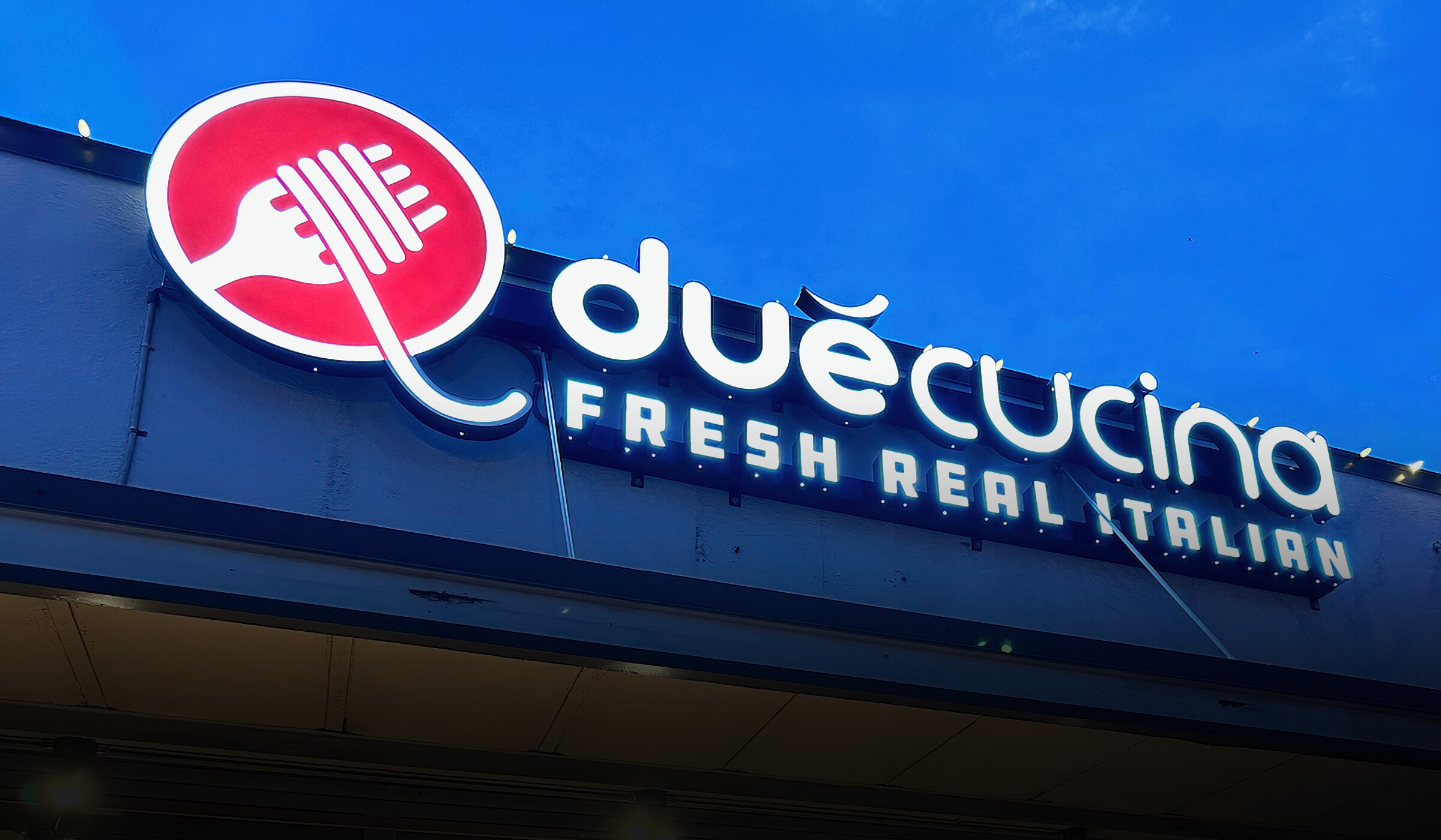
The design challenge was translating the warmth of traditional Italian dining into a format that could work across storefront, menu board, packaging, and digital, without losing what makes Italian food culture feel worth fighting over.
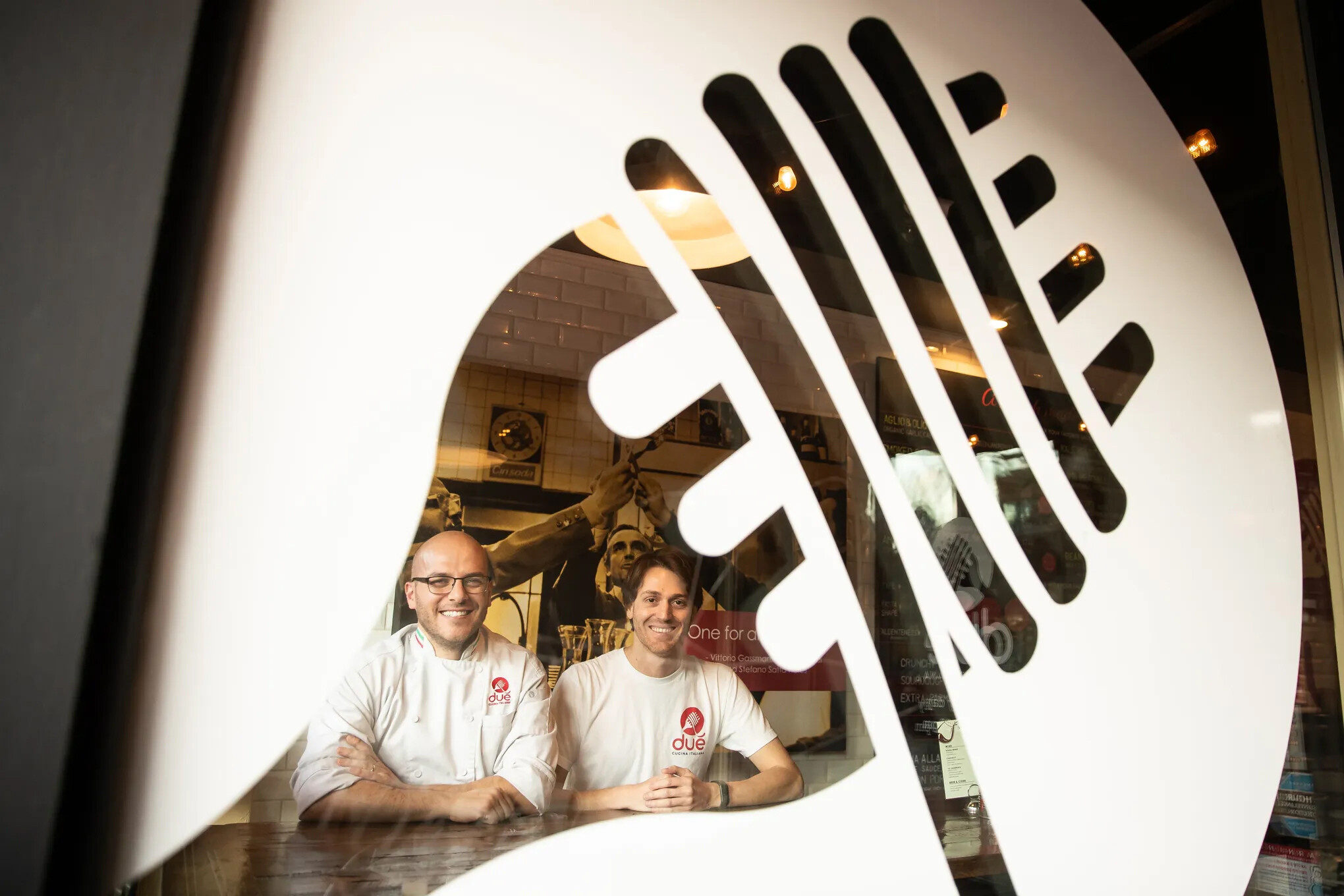
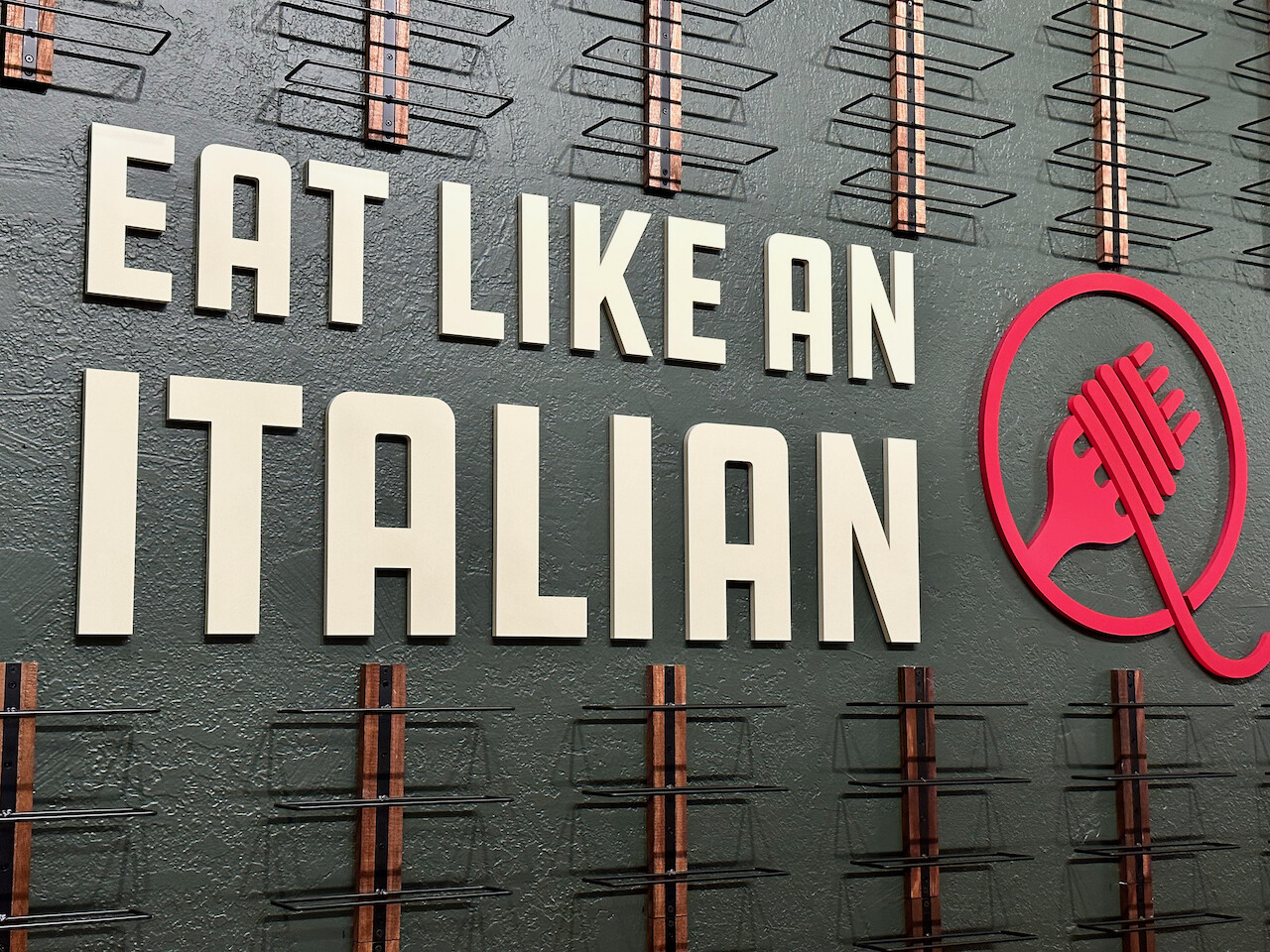
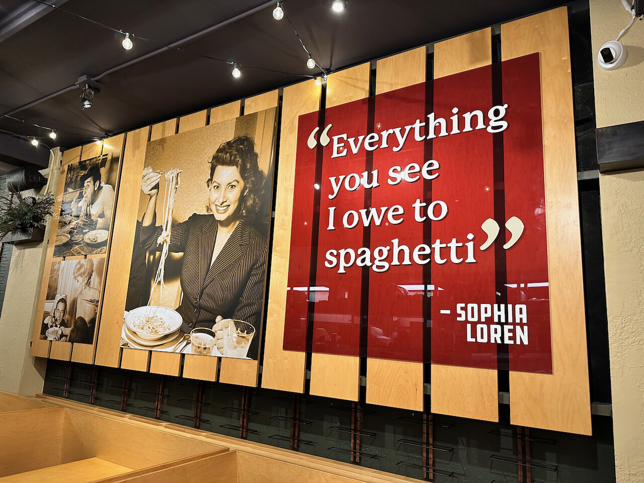
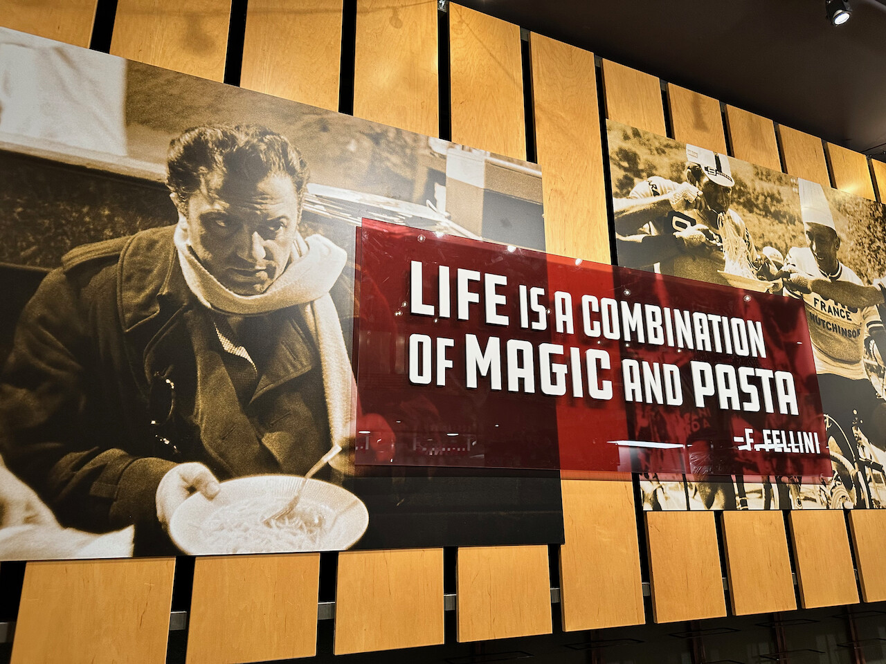
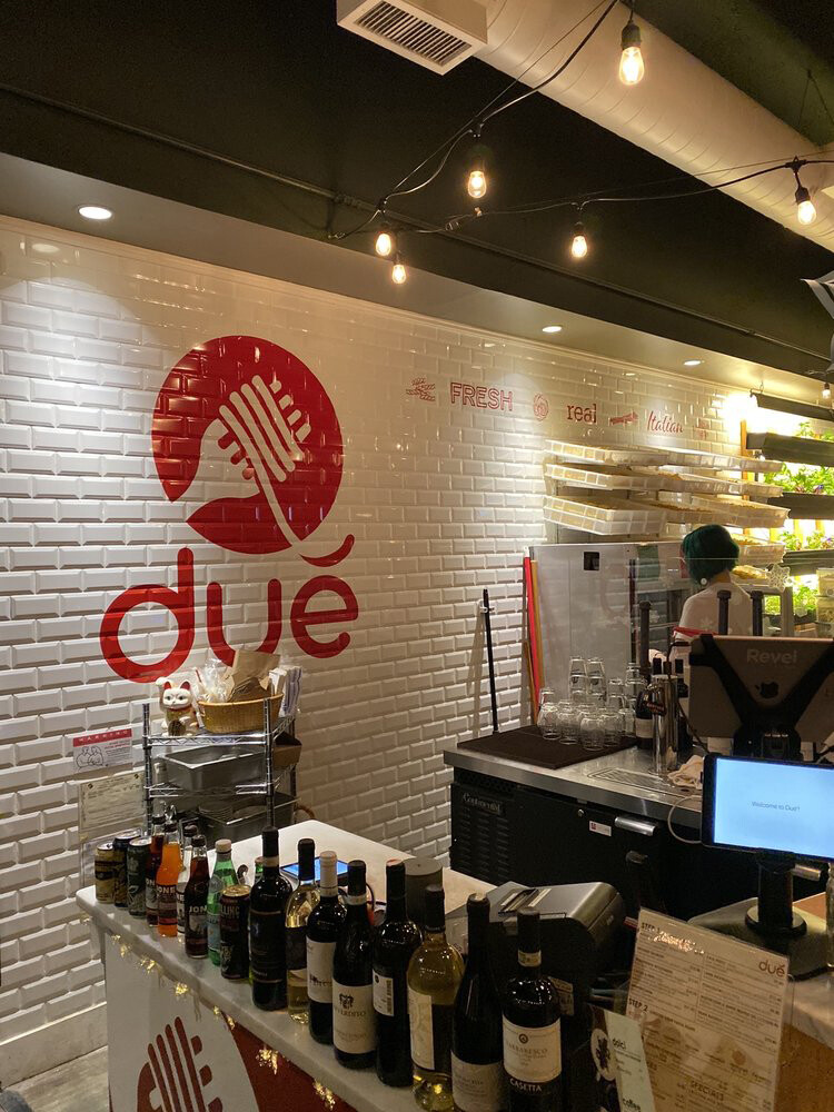
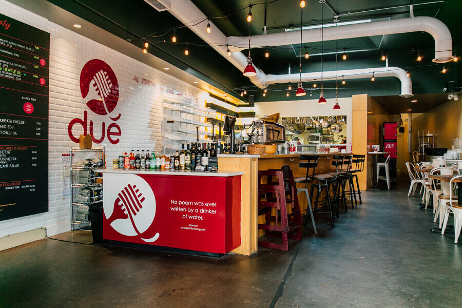
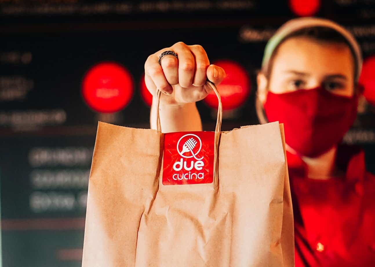
Brand development ran from the first napkin sketch through logo, typography, color, menu systems, packaging, interior graphics, and digital ads across multiple Seattle locations. The visual language - clean type, warm Italian palette, and honest food photography guidance - was built to be warm without being clichéd and modern without being sterile.
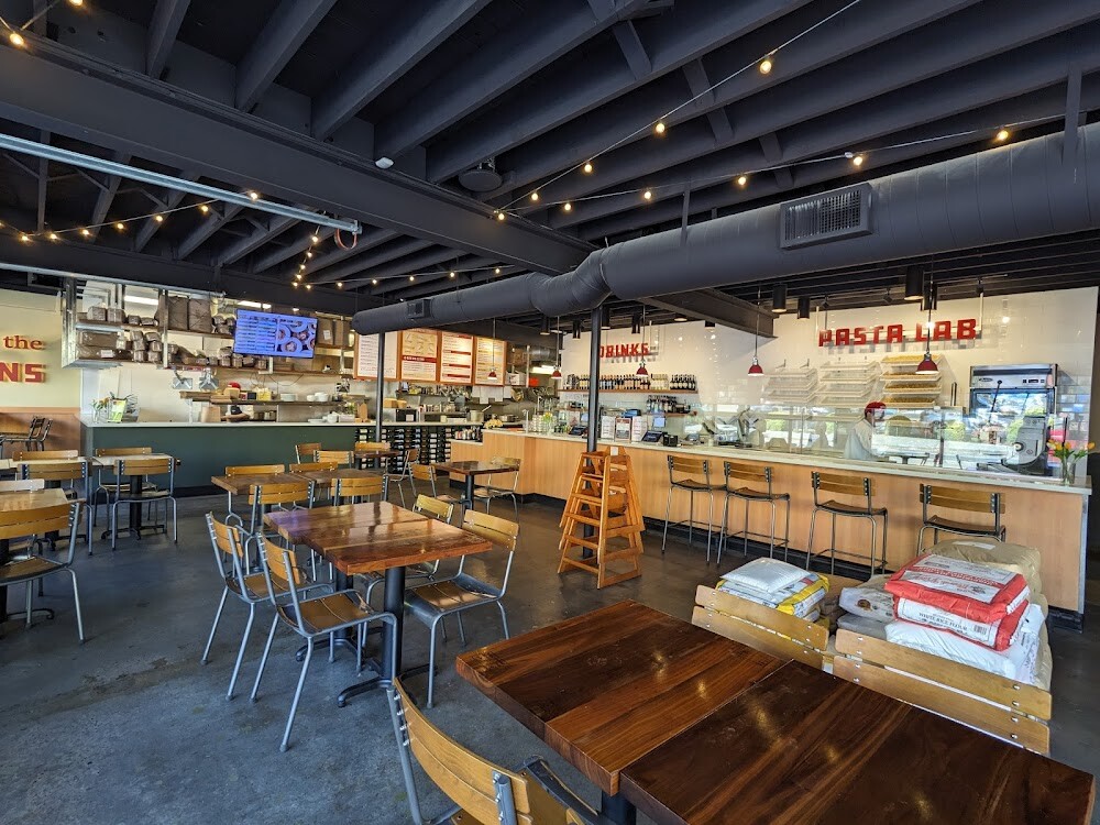
Interior graphics and the physical environmental rollout were executed by a specialist environmental graphics agency working from the brand foundation. Strong identity handed off clean, with enough system documentation that the next person can execute it faithfully.
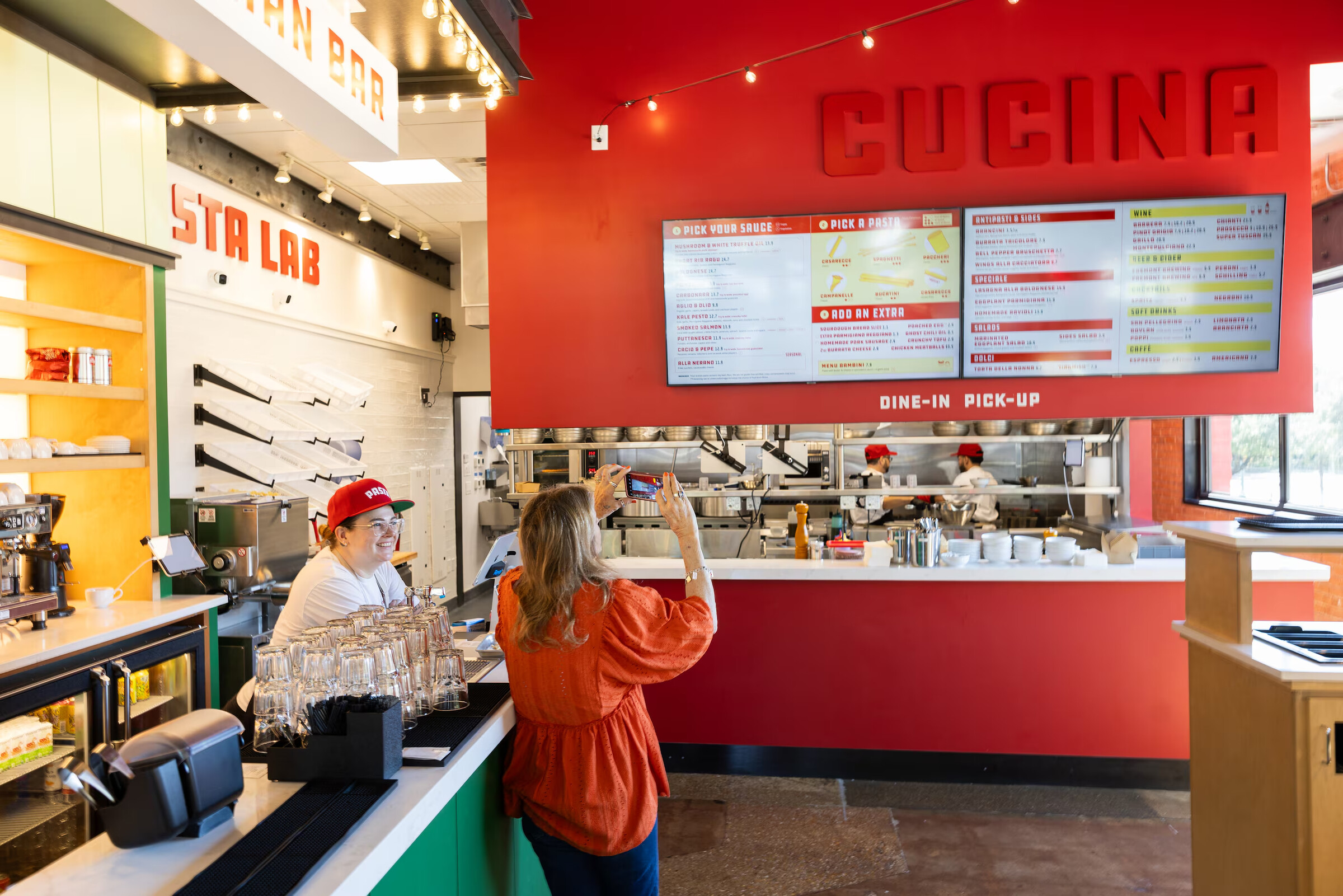
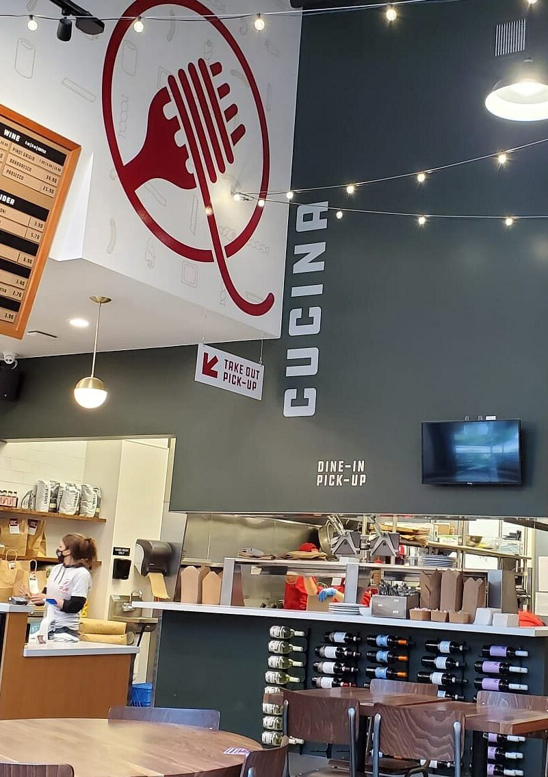
Digital ads, social media templates, and in-store signage were developed alongside the core identity, ensuring the brand worked wherever a customer might encounter it. The system was designed to grow and adapt - new locations could onboard without reinventing the visual foundation each time.
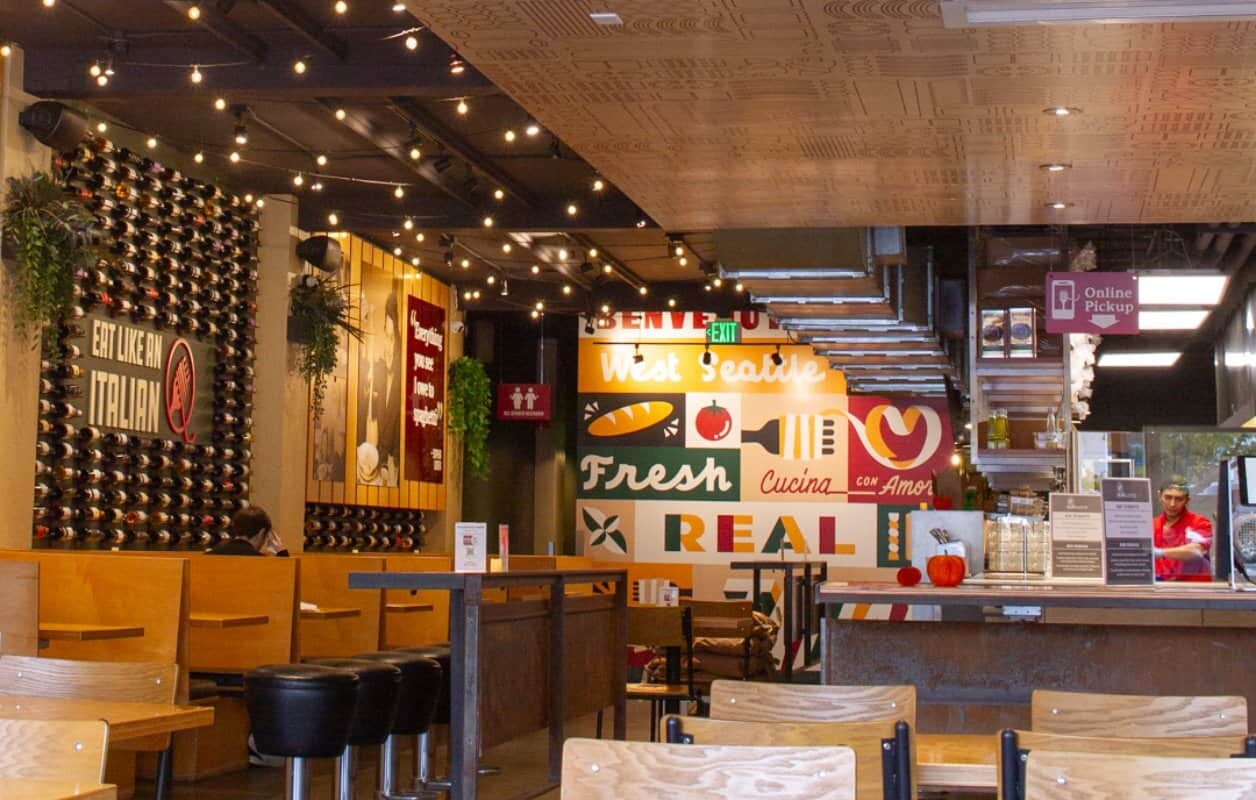
"Clean type, inviting palettes, and honest food photography creating a system that travels effortlessly from storefront to social feed."