
Top Pot Doughnuts is nationally recognized, beloved in Seattle, and proud of its design roots. The brief for the coffee program was as open as it sounds: take the mid-century modern direction and make something that feels unmistakably Top Pot, while elevating the coffee line to the same level as the rest of the brand. Eight directions were developed and presented.
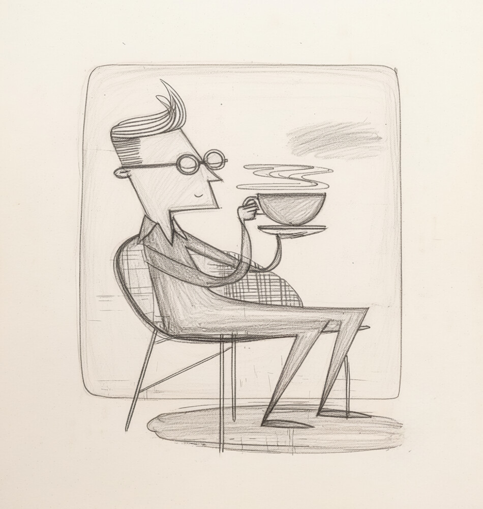
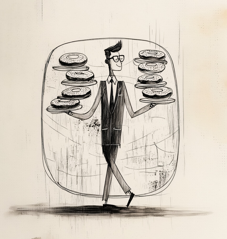
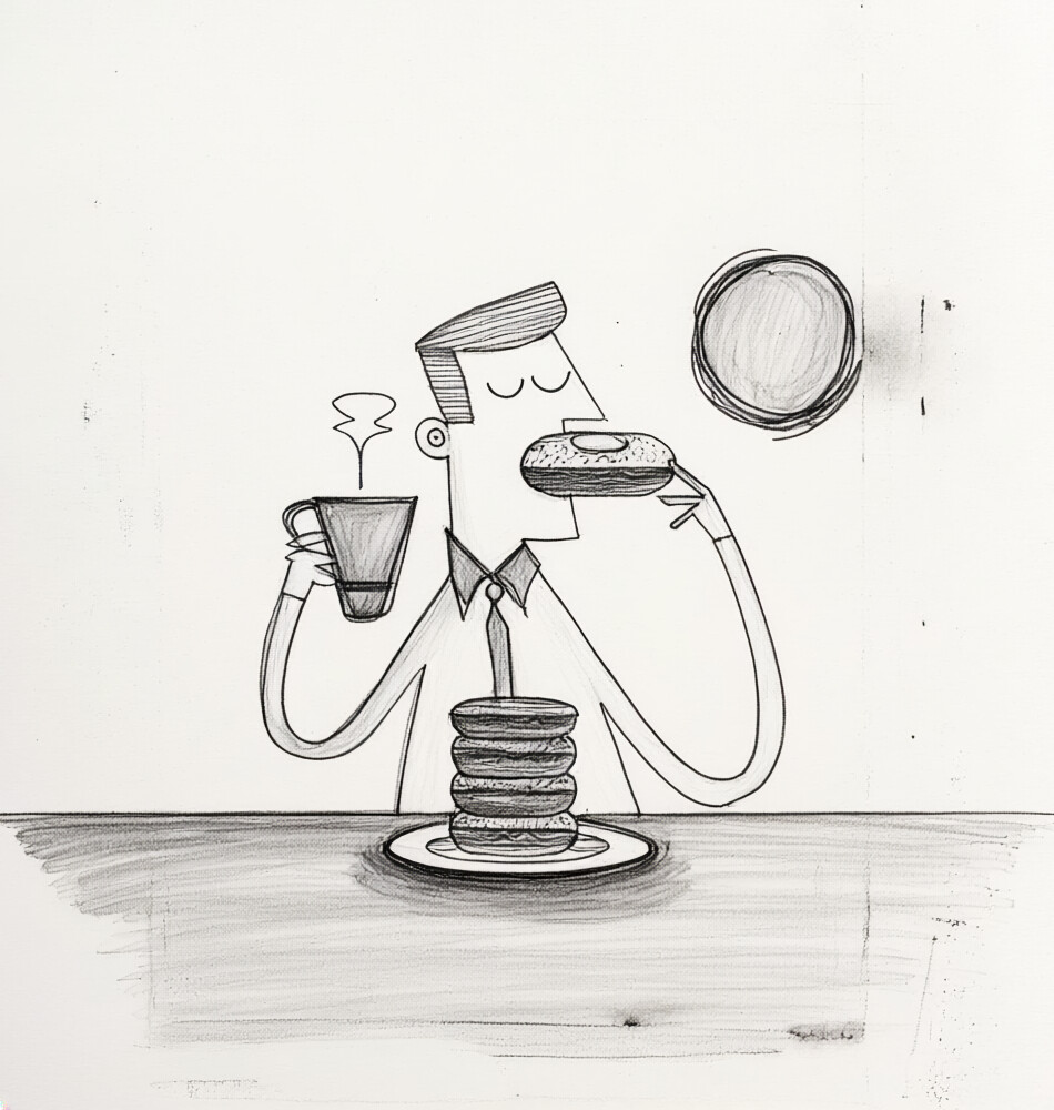
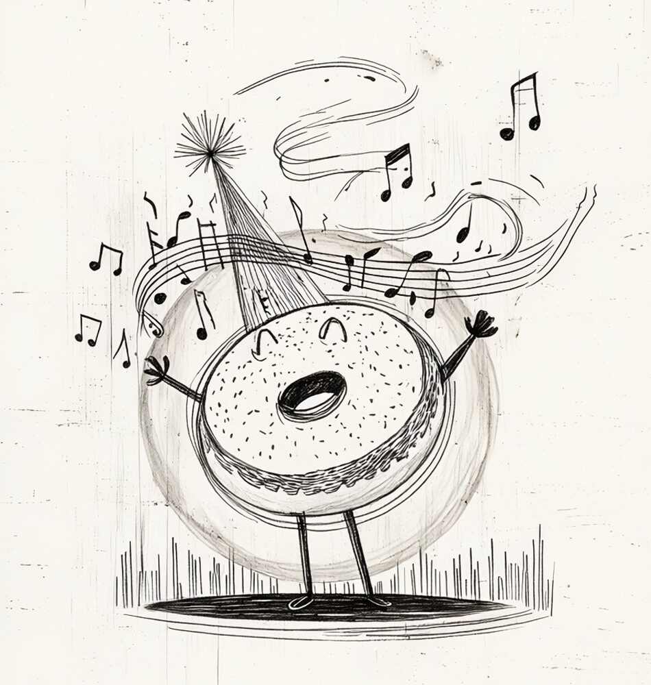
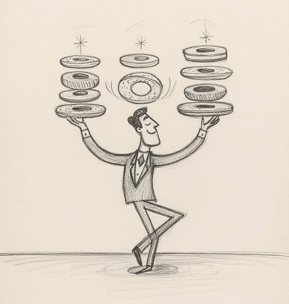
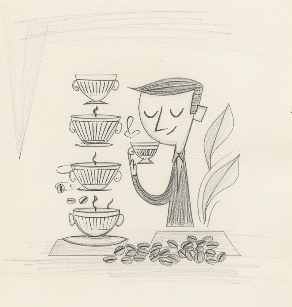
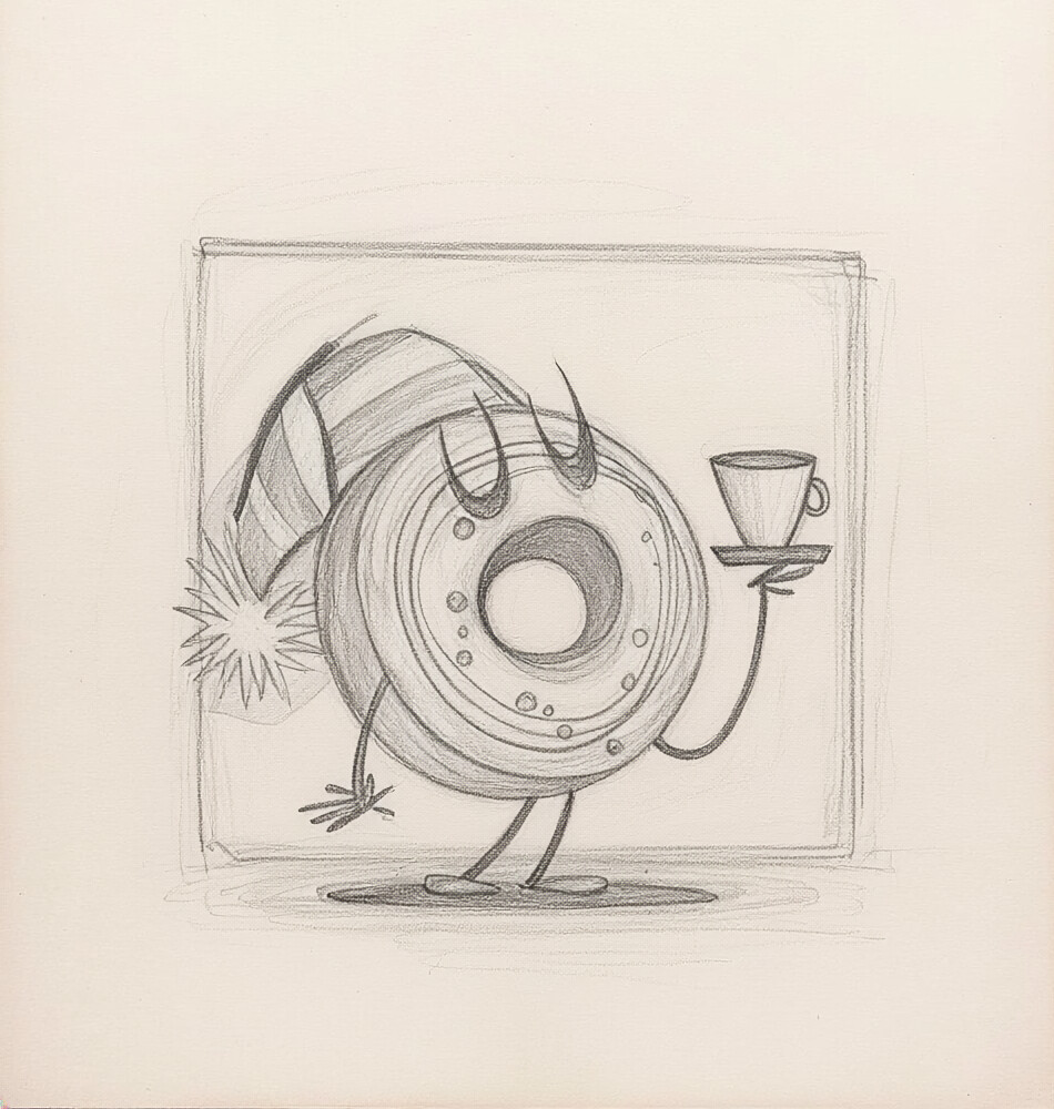
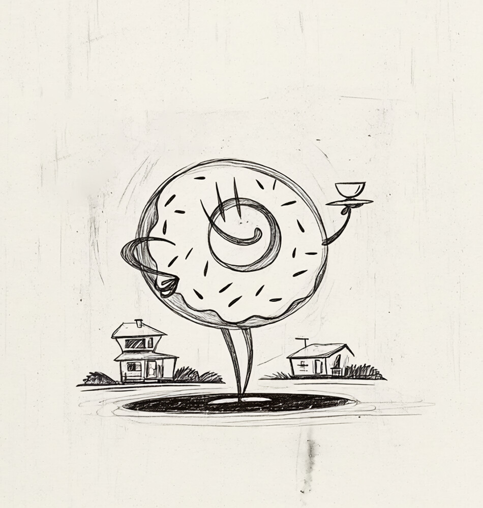
Character development began with hand sketches, working through poses, proportions, and personality before anything moved to digital. The goal was to establish figures that felt genuinely mid-century without being derivative of any single reference. Loose, expressive linework in the sketch phase kept the energy alive before the refinement process began.
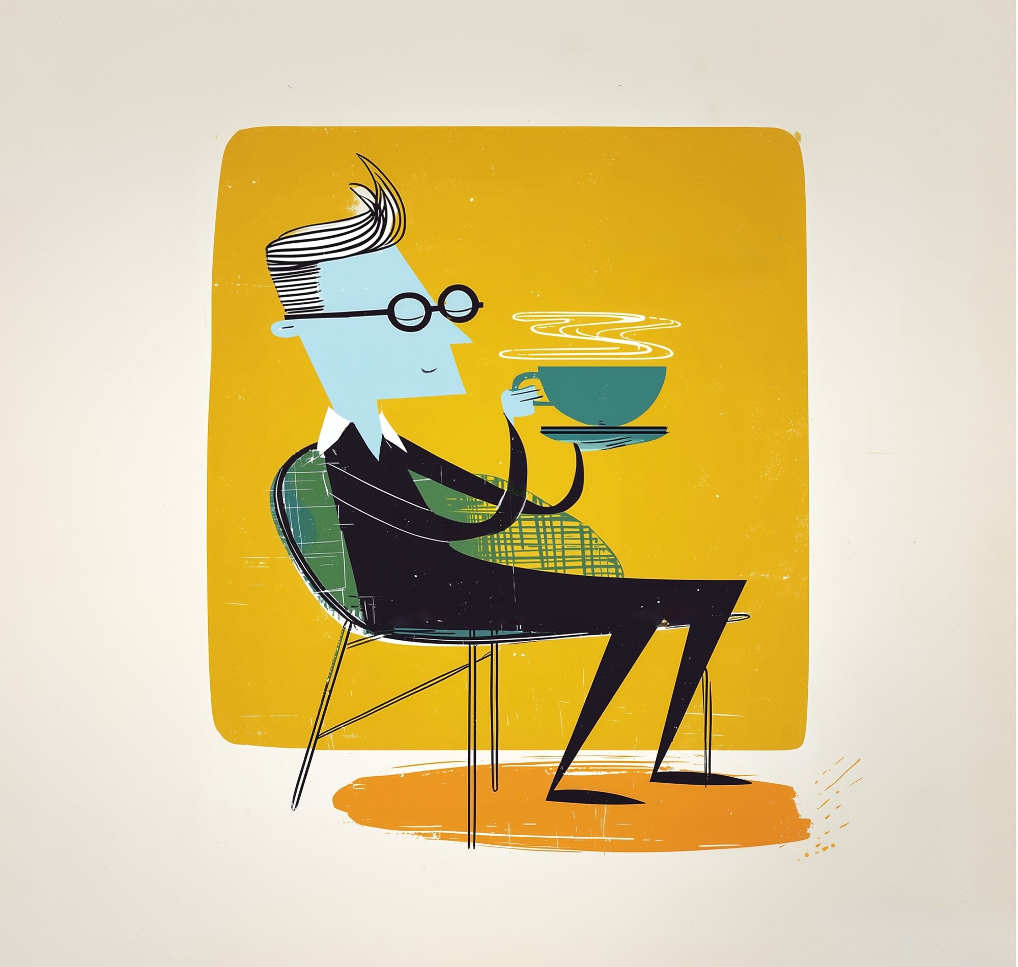
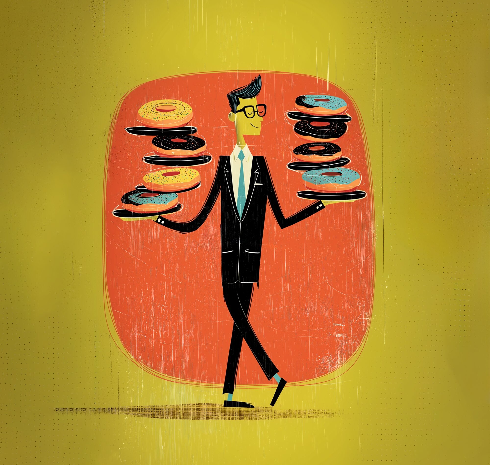
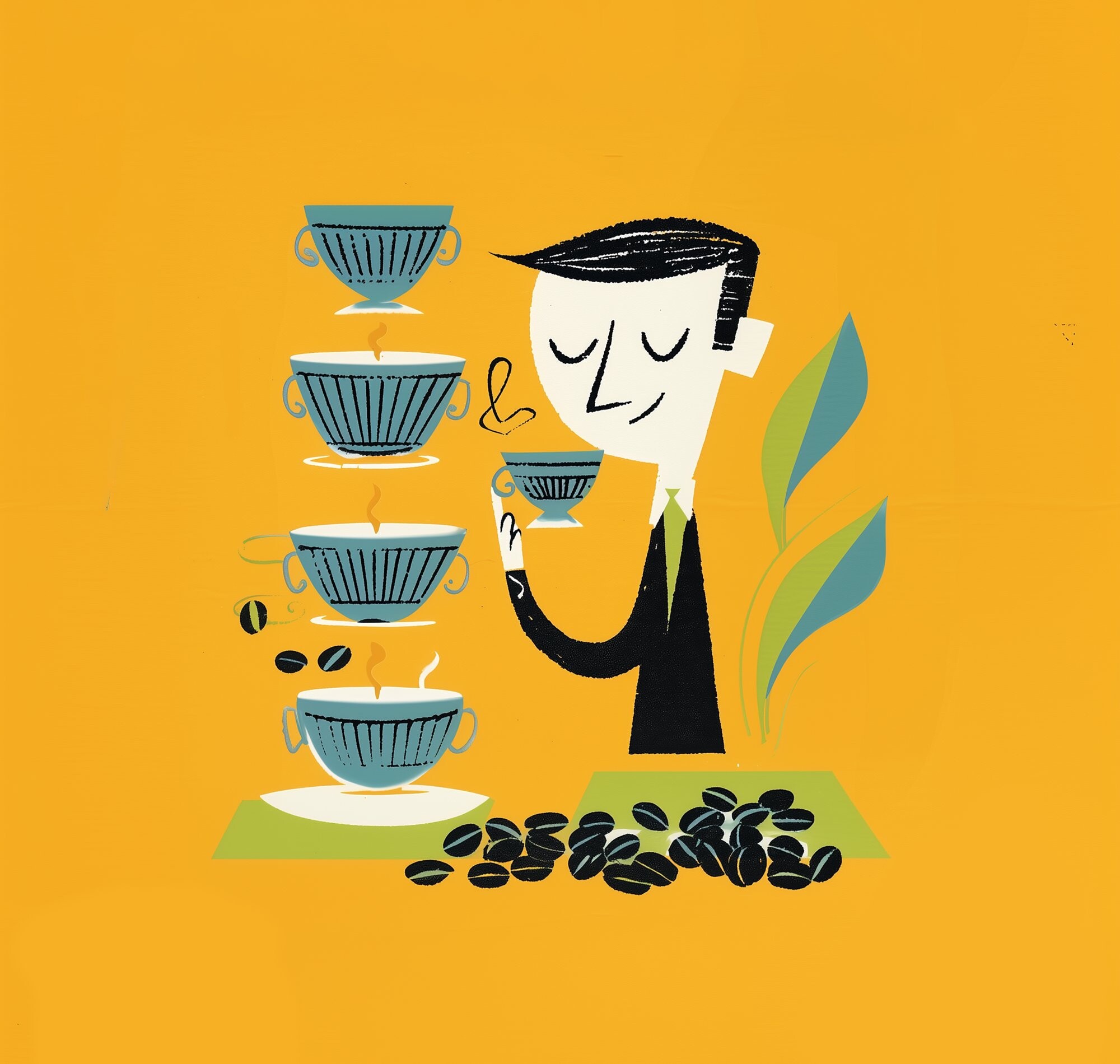

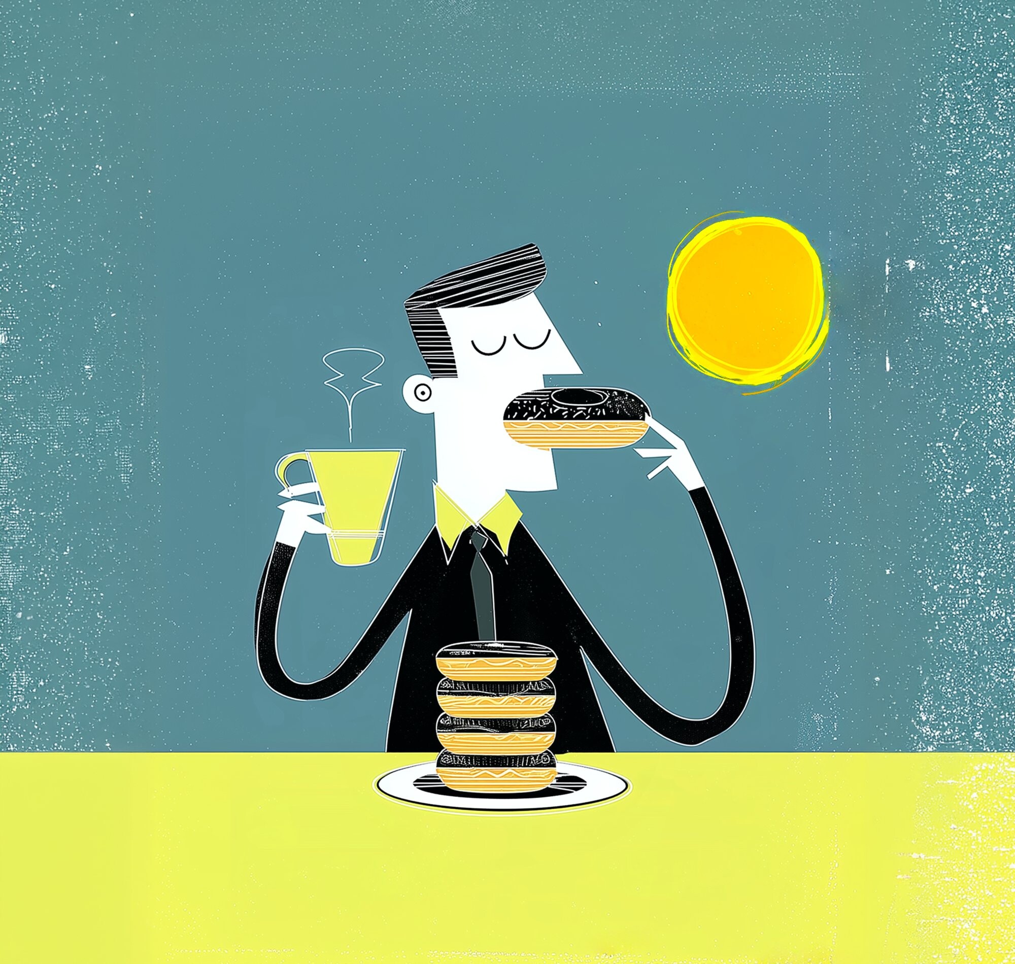
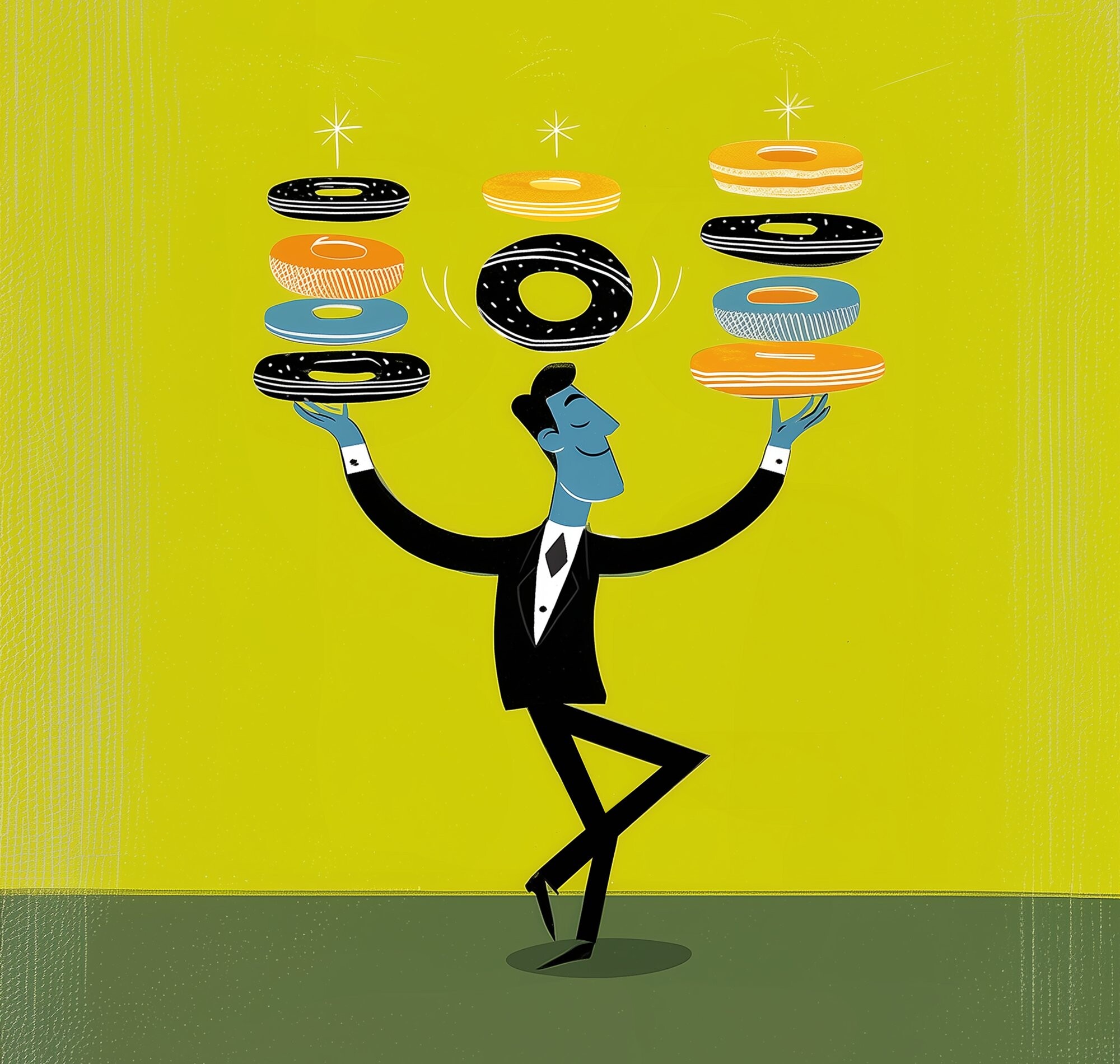
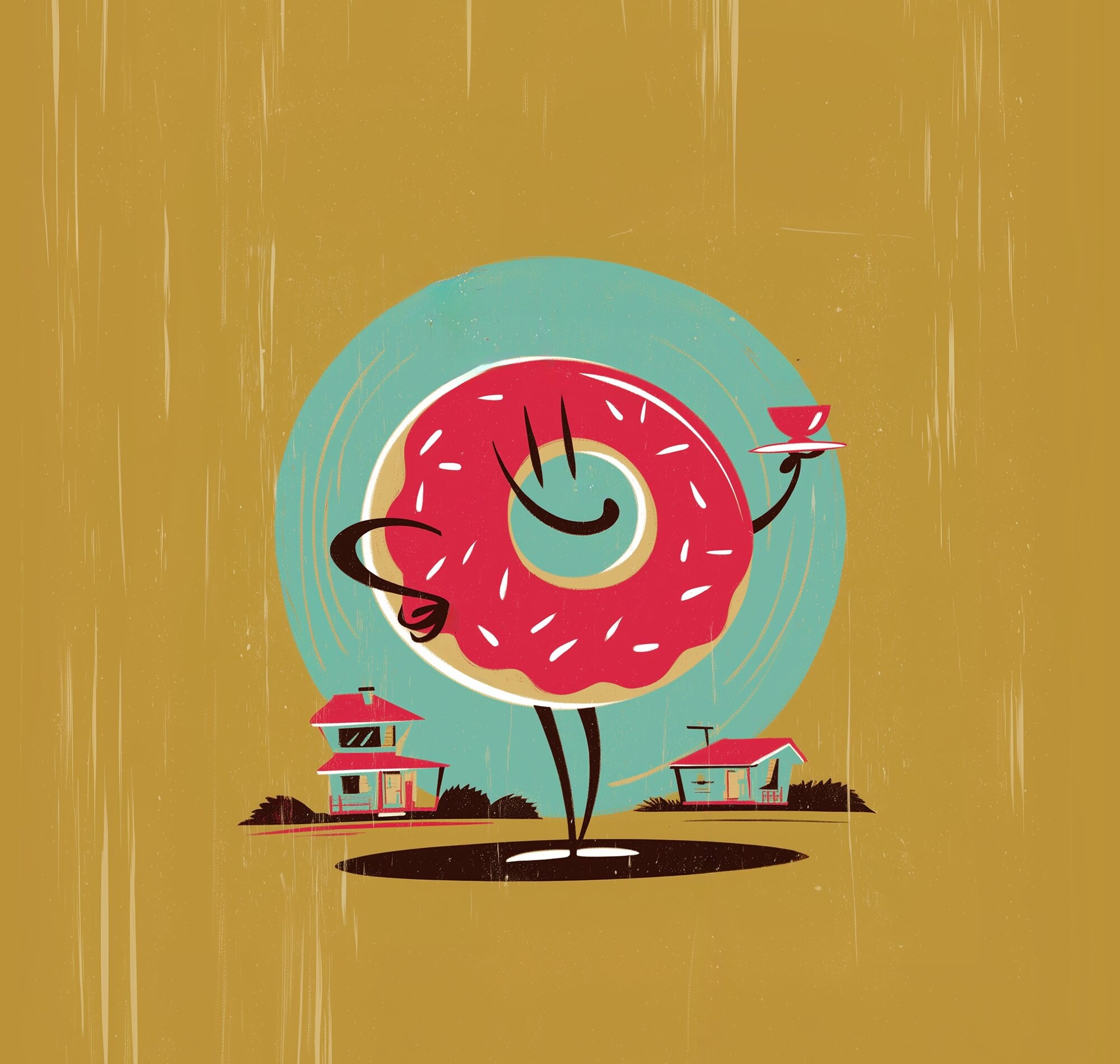
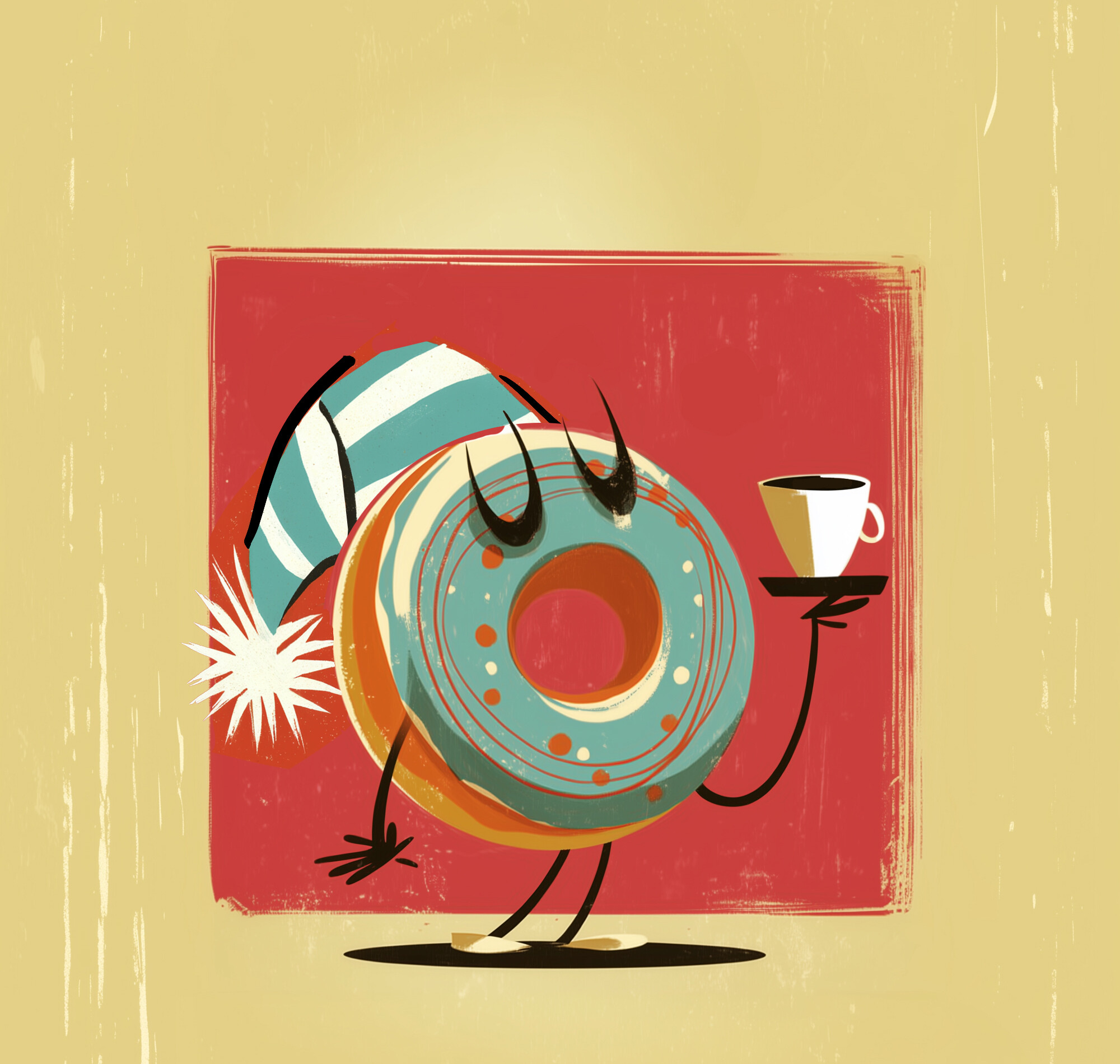
The first round of work was a set of illustration studies, each one interpreting the mid-century modern brief through a different character, moment, or mood. The goal wasn't to pick one - it was to build a vocabulary. A cast of characters the brand could own and keep building from. What I dubbed 'uniform variety'. The client kept them all.
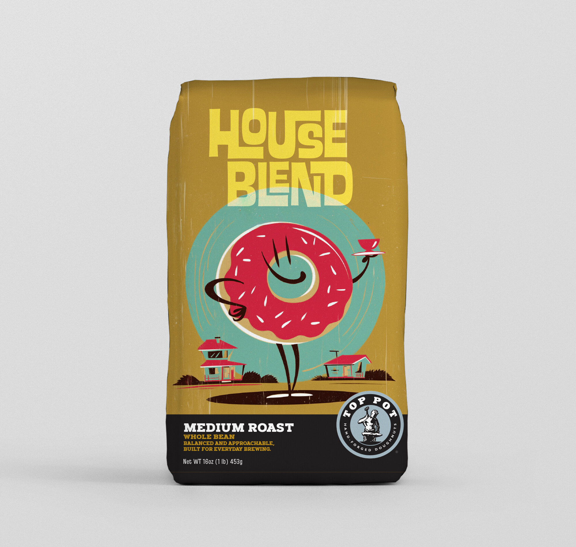
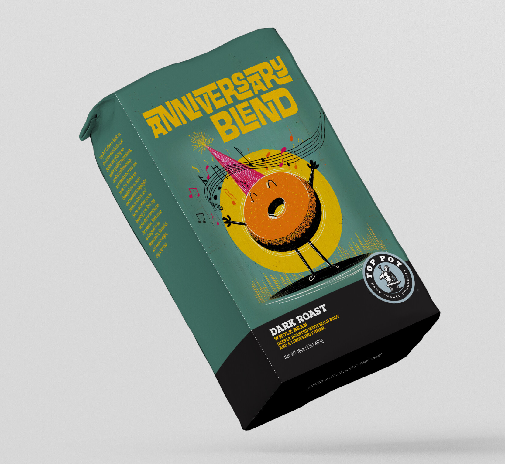
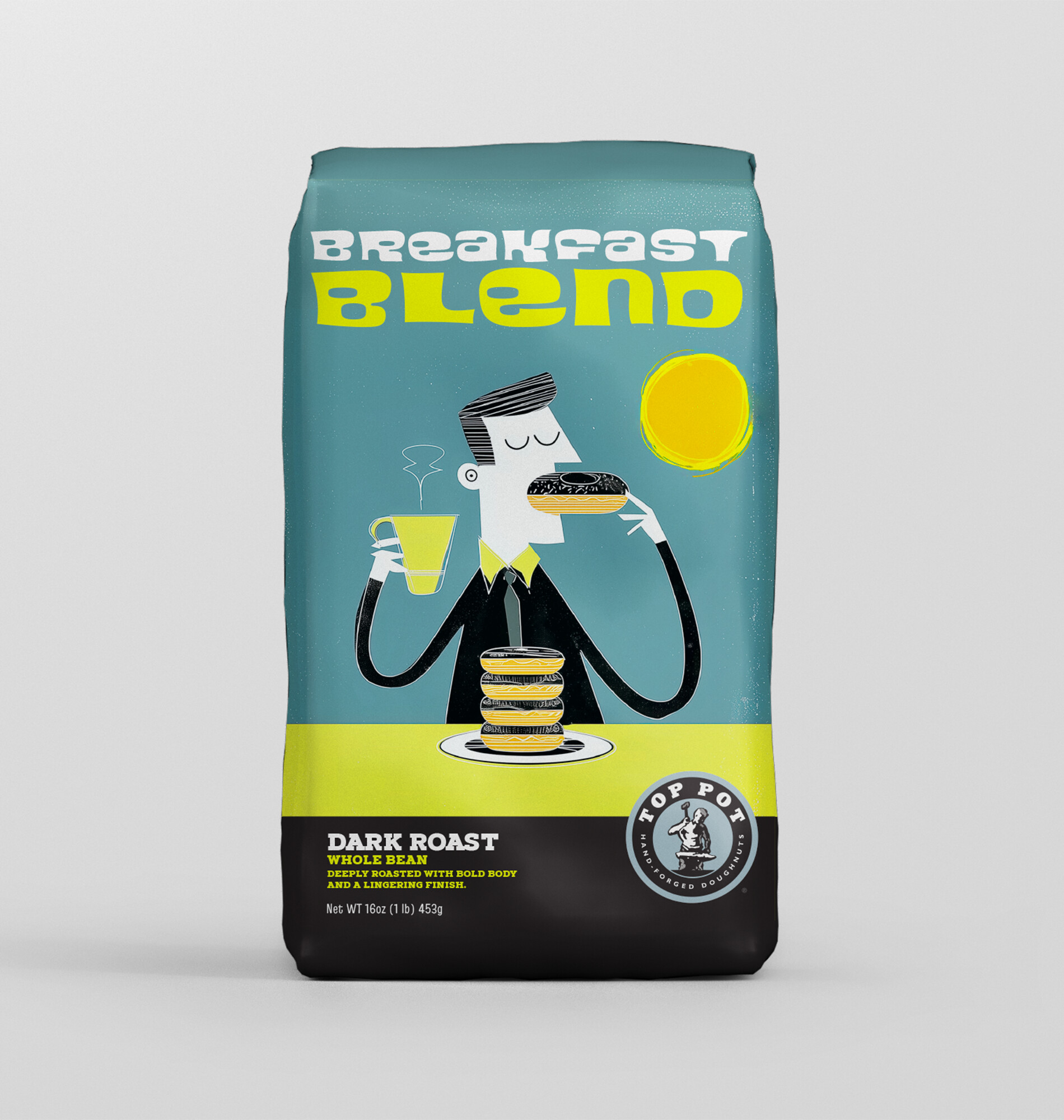
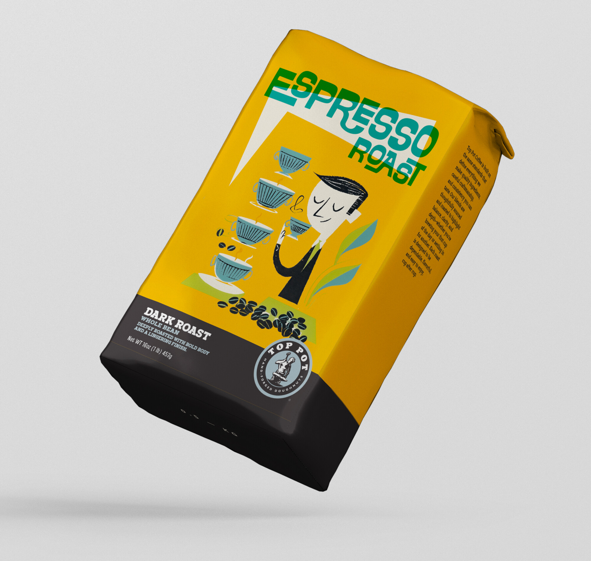
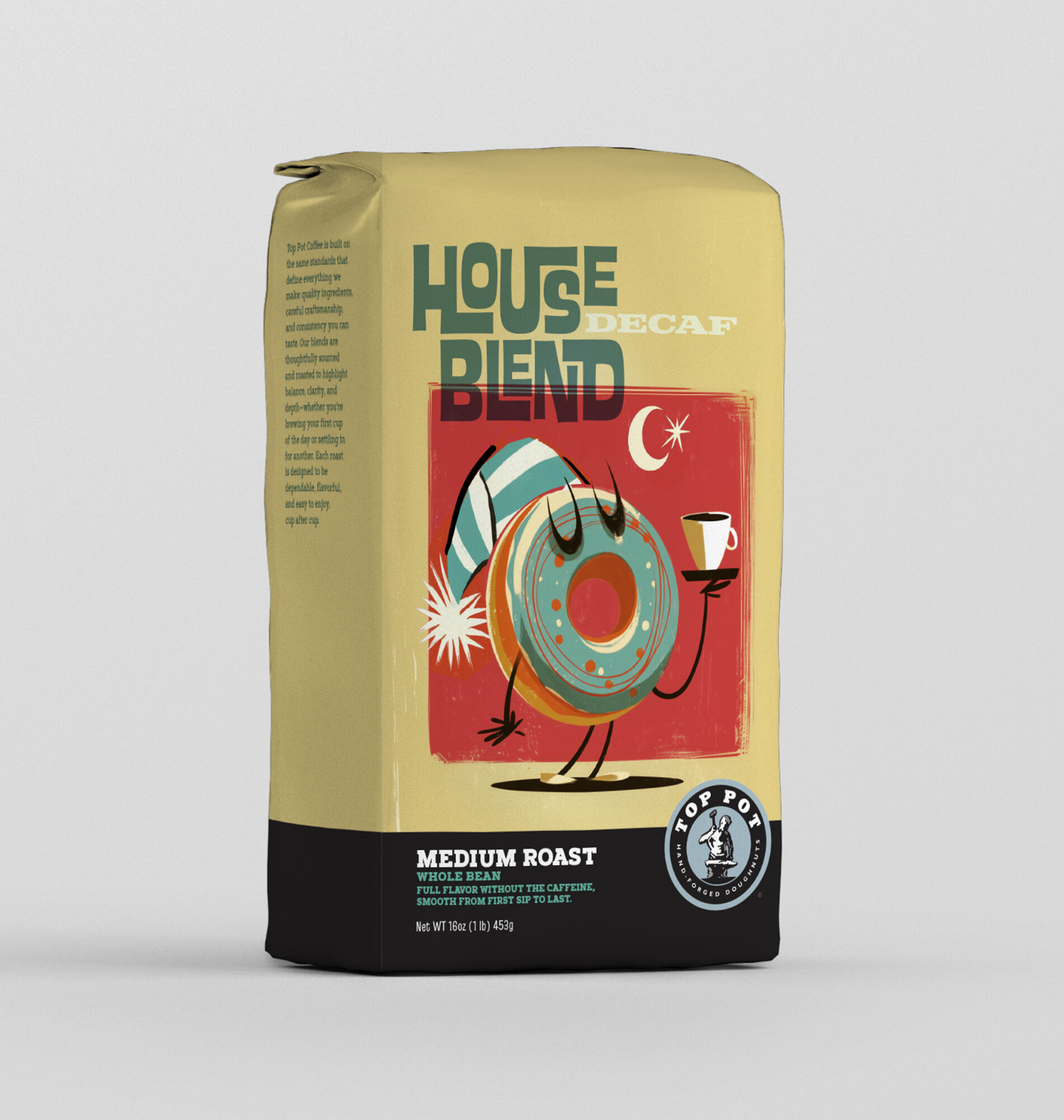
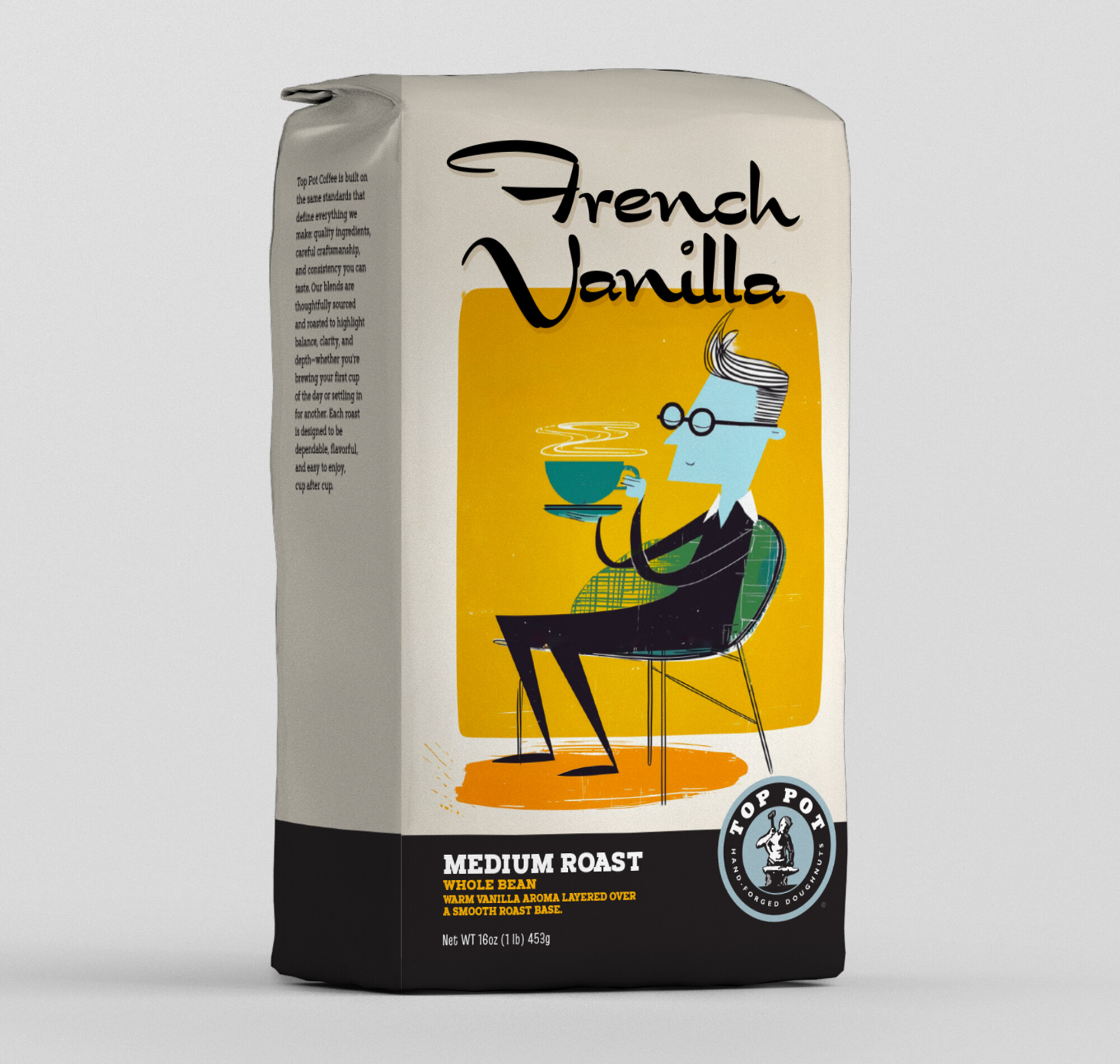
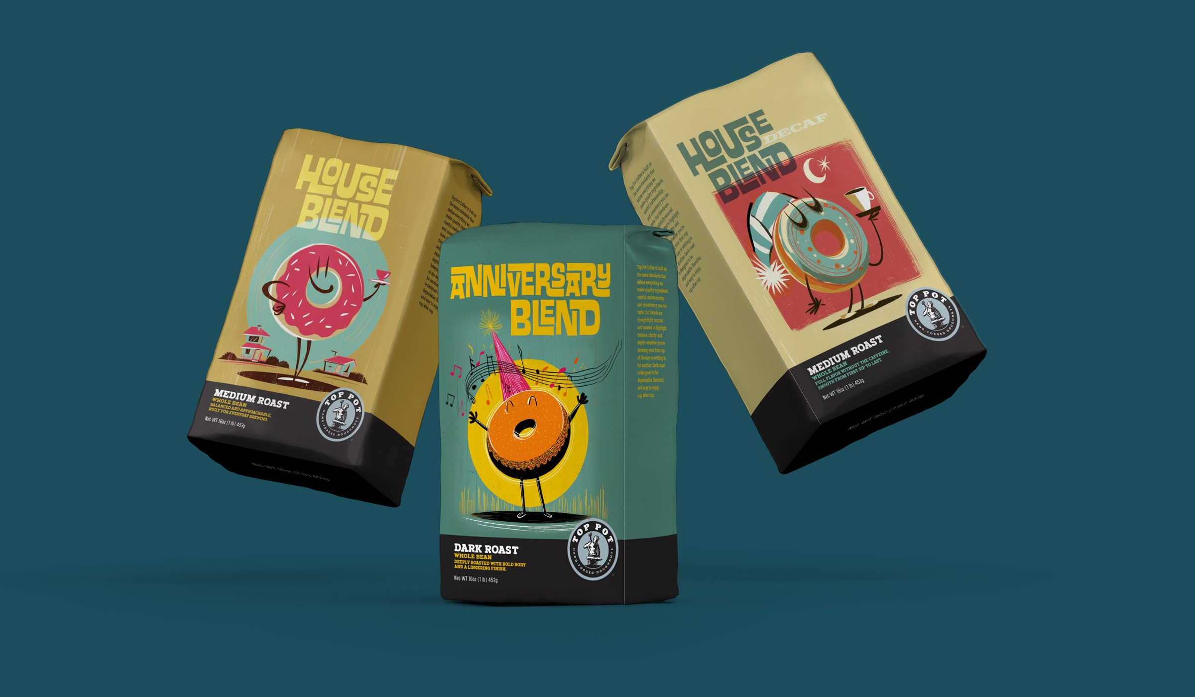
Coffee bag packaging was the primary vehicle - the format where the illustration was going to work hardest, on a small surface, competing for attention in a crowded specialty coffee retail environment. Each blend has its own visual treatment within the system, maintaining Top Pot cohesion while giving each product a distinct character. Proprietary artwork means the client owned every piece. No stock, no licensing complications.
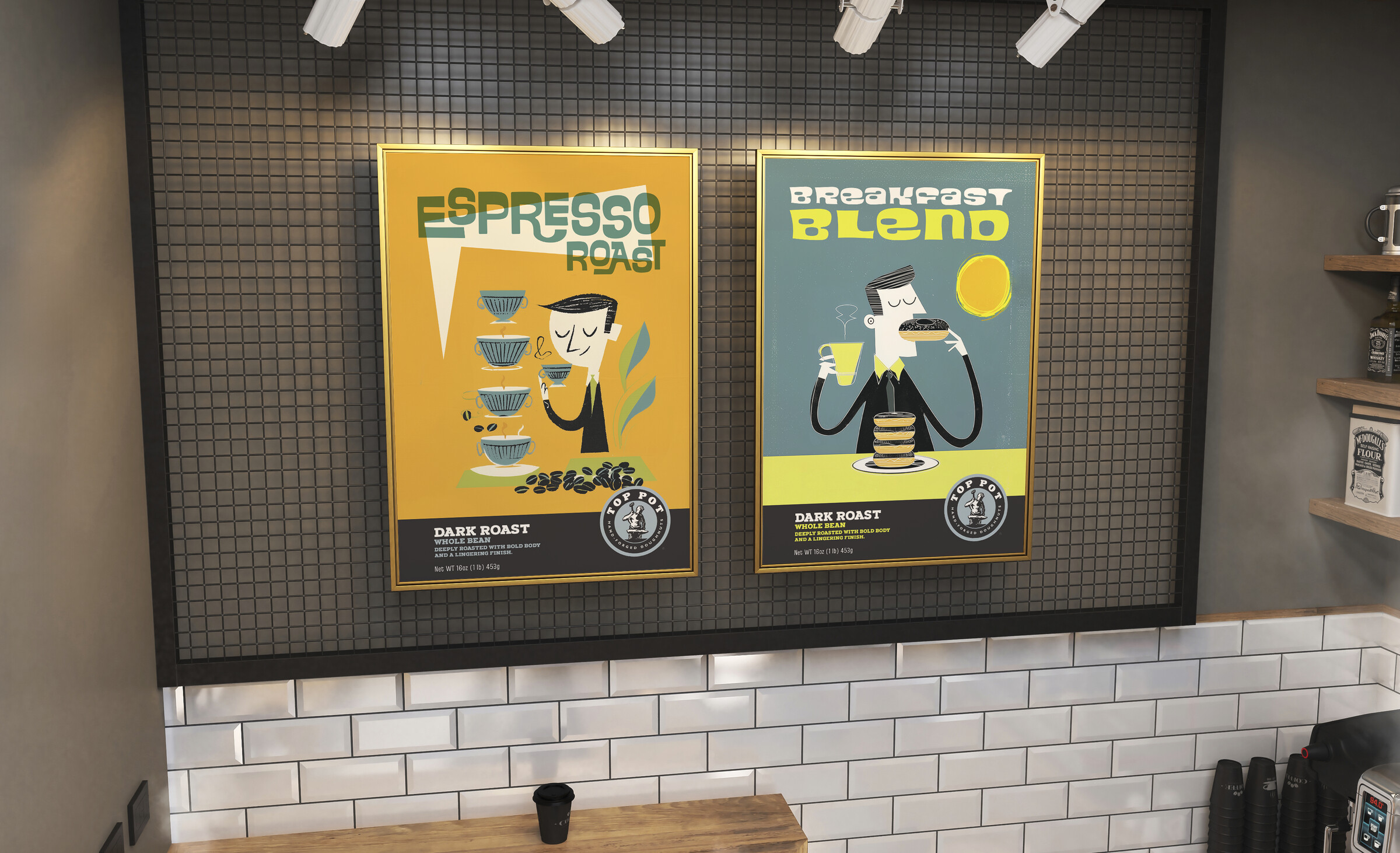
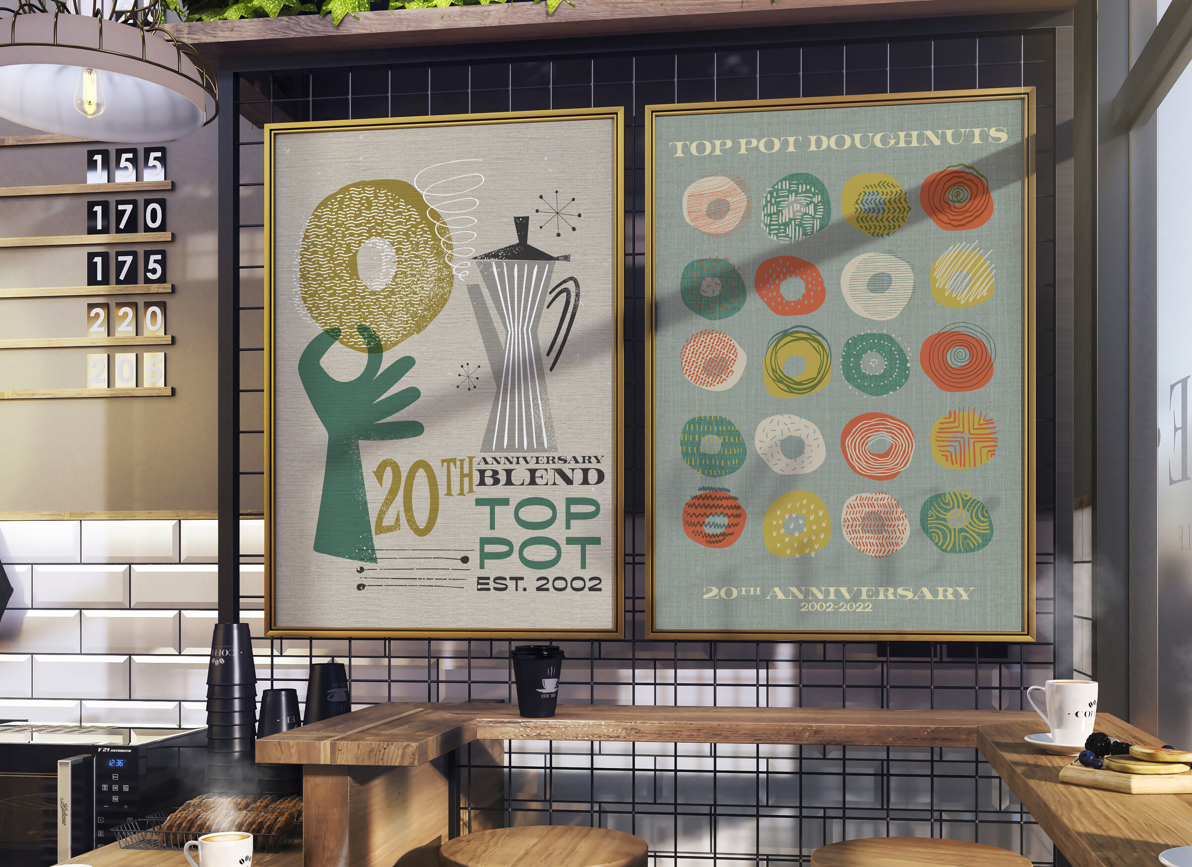
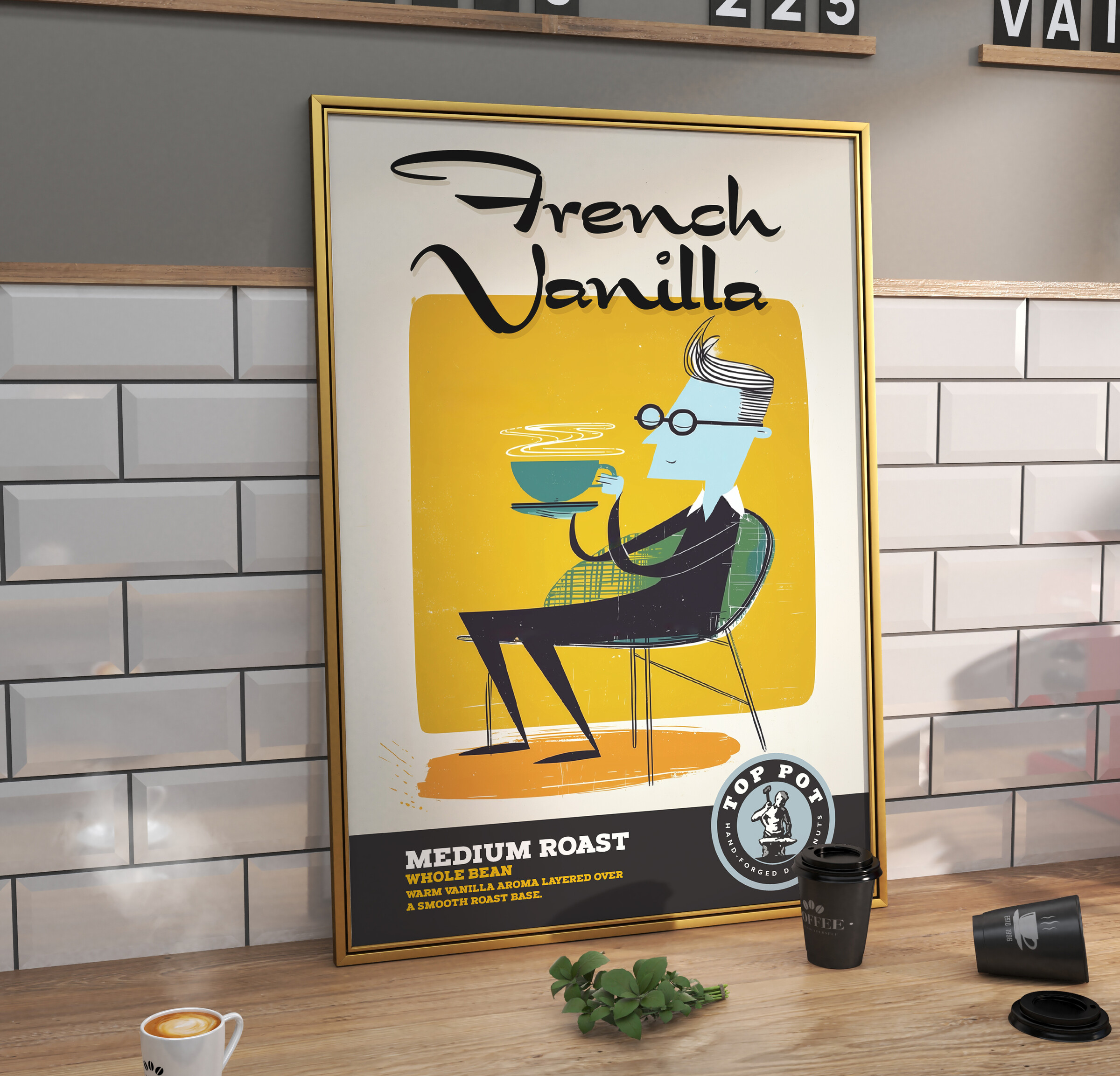
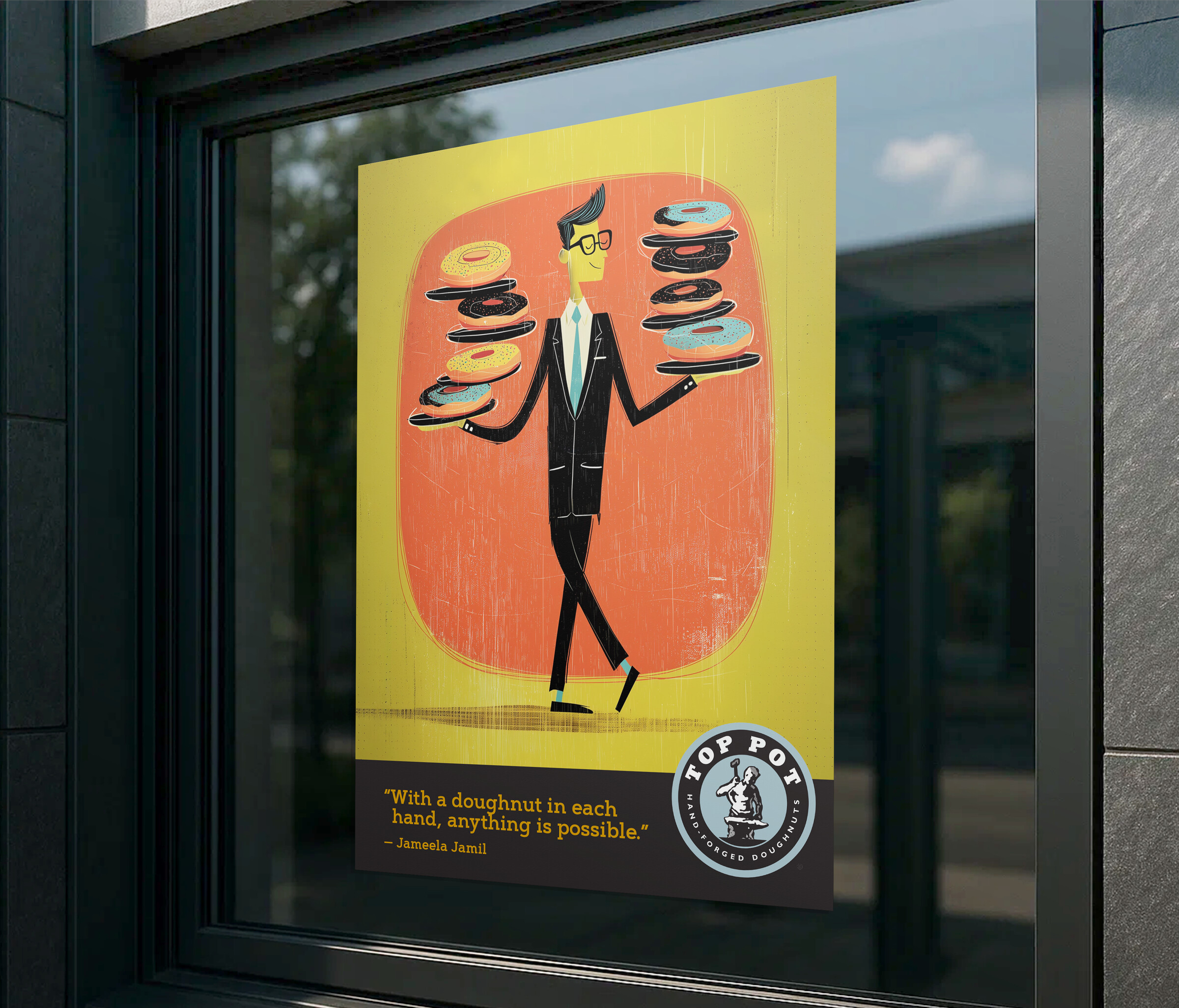
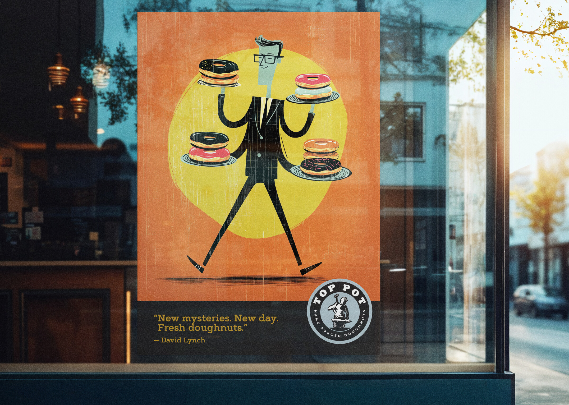
The illustration system extended across the retail environment through POP displays, in-store advertising, window graphics, and environmental signage. The same vocabulary that lives on the coffee bag works just as hard at full-wall scale. From coffee bag to storefront window, with one consistent visual voice.
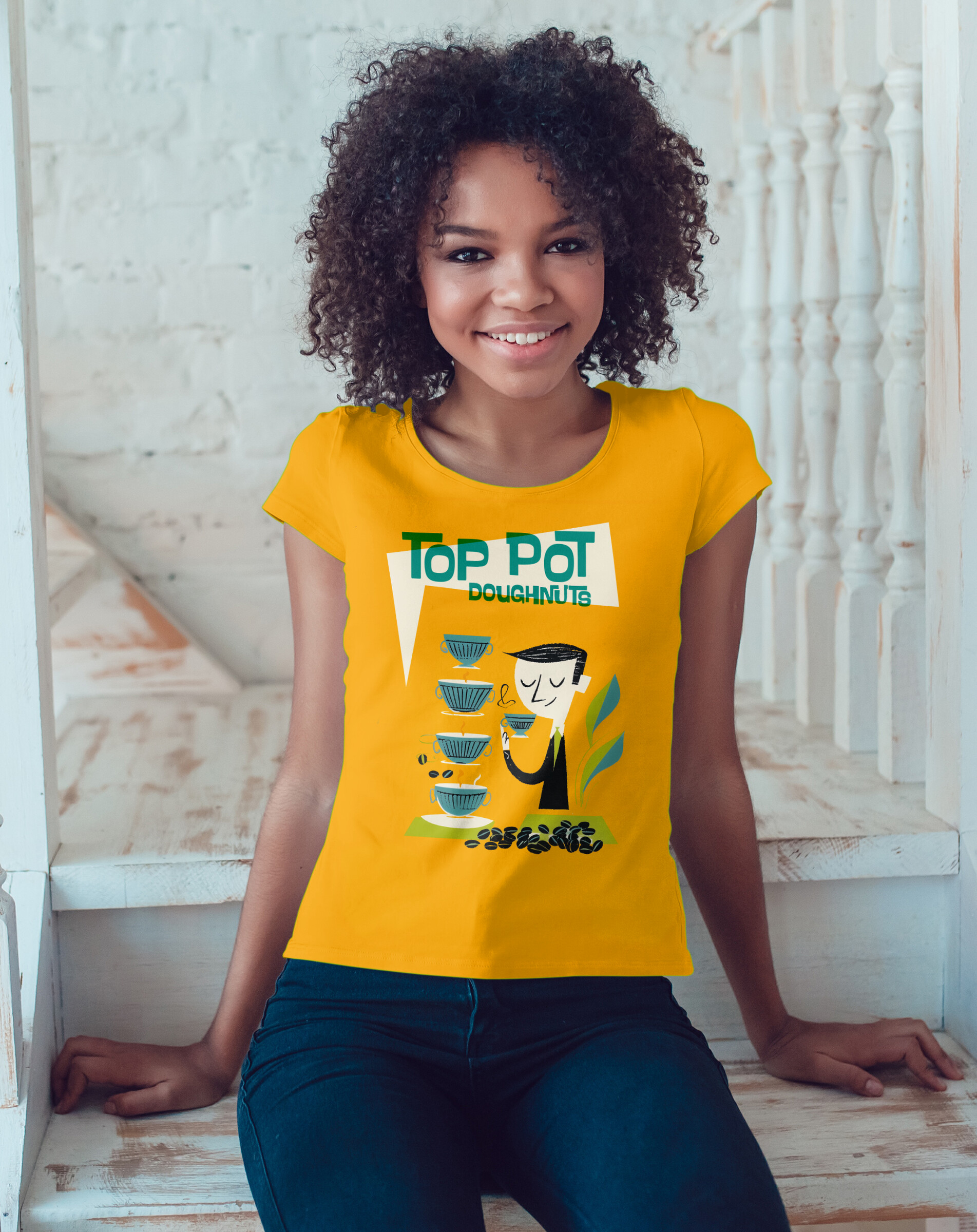
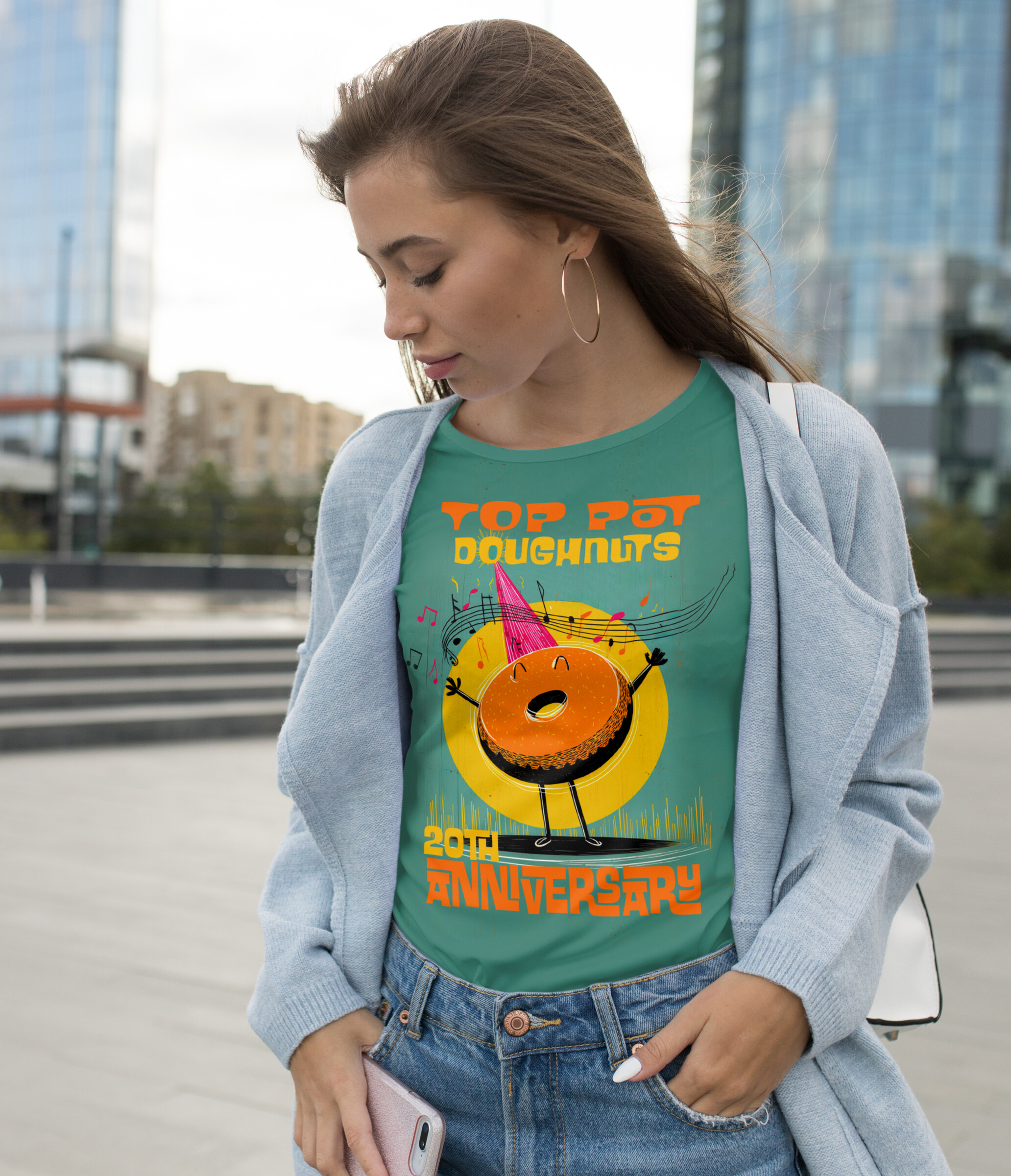
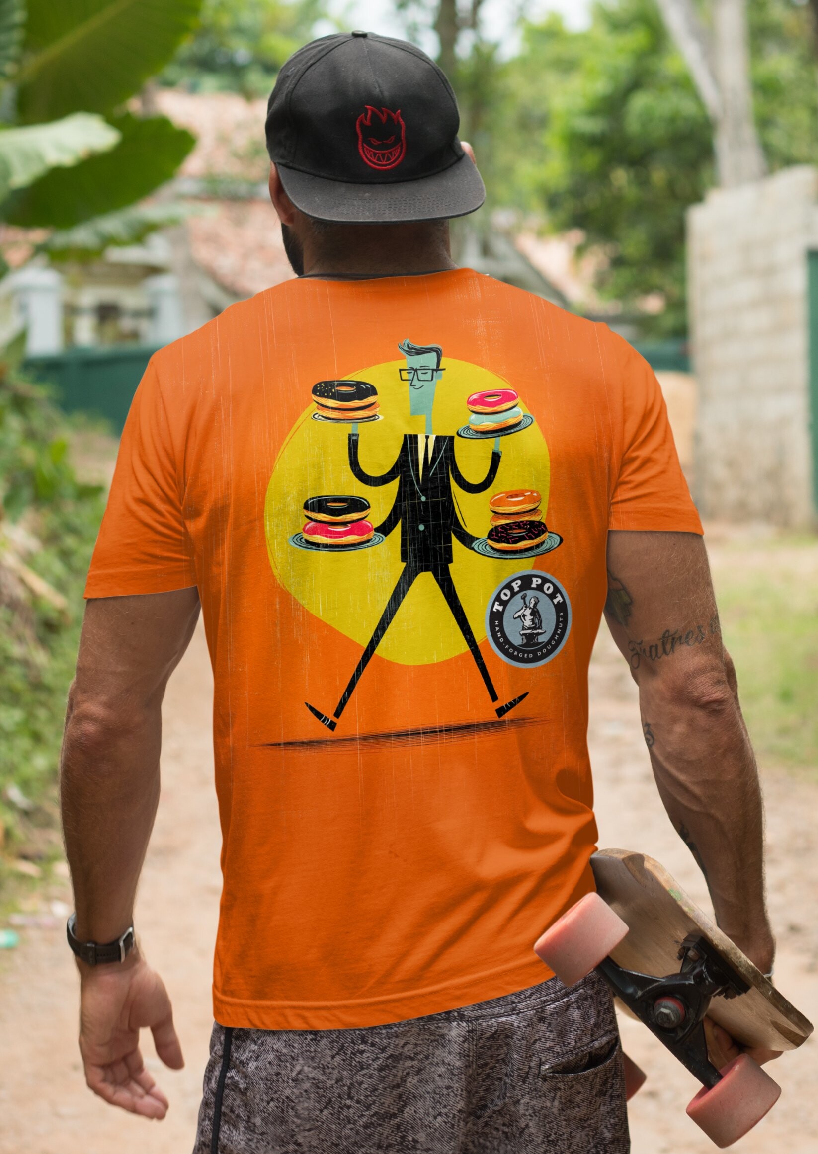
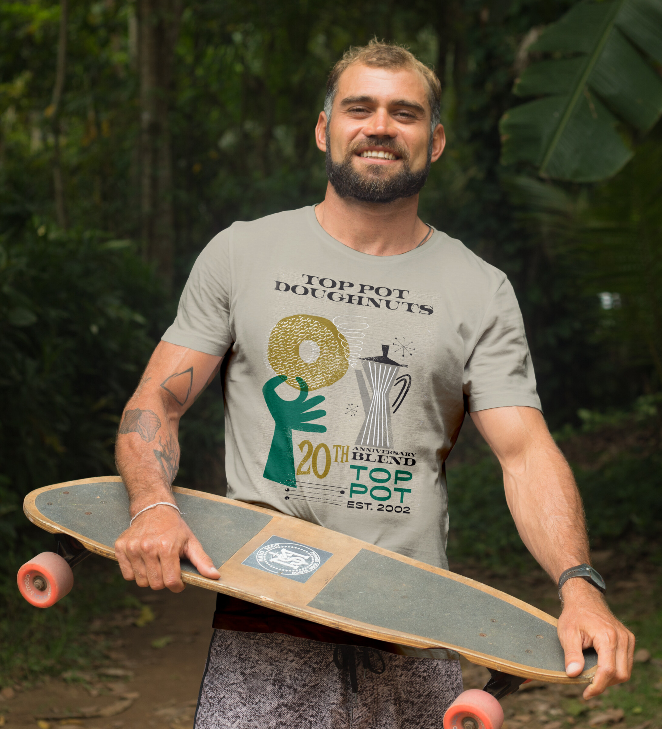
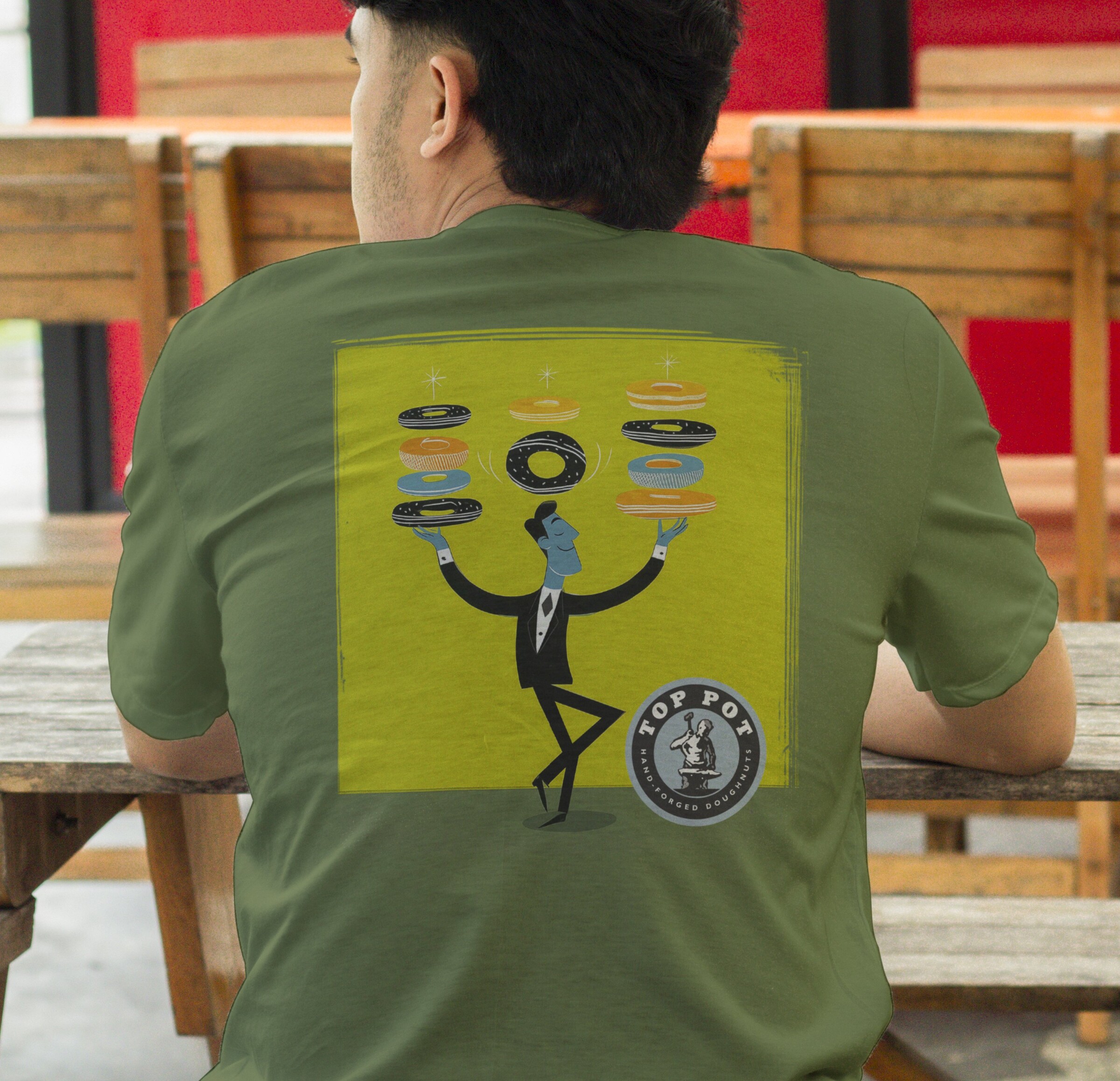
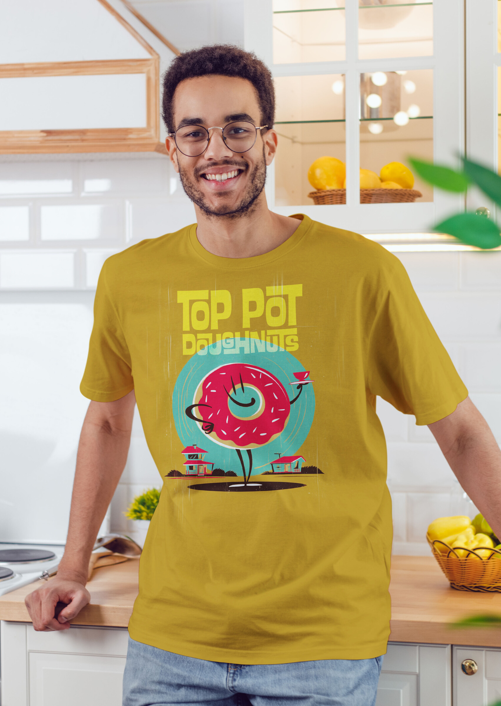
No stock. No licensing complications. The client owned every piece - artwork that could be used, reused, and expanded across merchandise as the coffee program grew. From coffee bag to shirt to storefront wall, with a consistent visual voice that is 100% Top Pot.