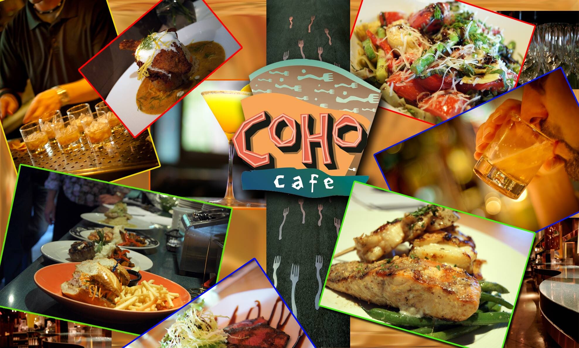
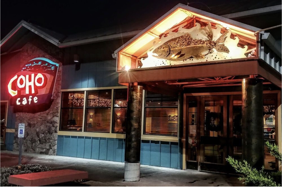
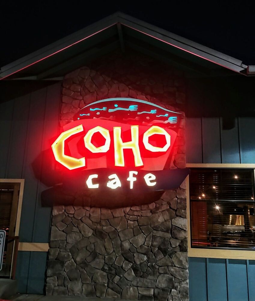
Coho Cafe blends local Pacific Northwest seafood with Southwest flavor - an eclectic combination that needed a brand that could hold both without feeling forced. The goal was a system that was handcrafted yet polished, approachable enough for a weeknight dinner and elevated enough for a date night.
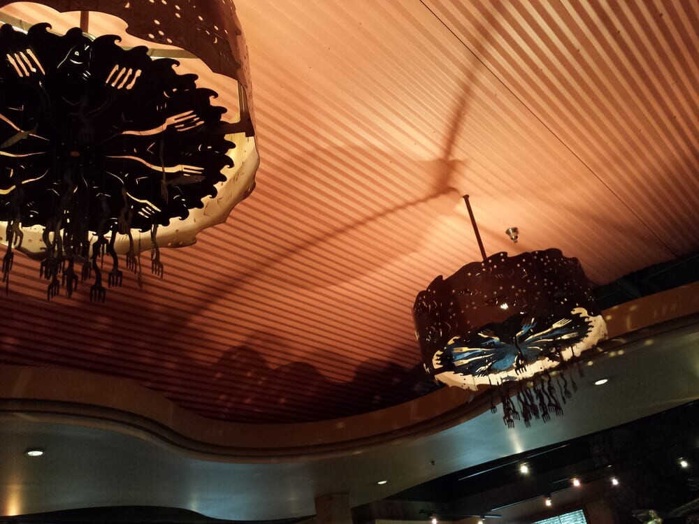
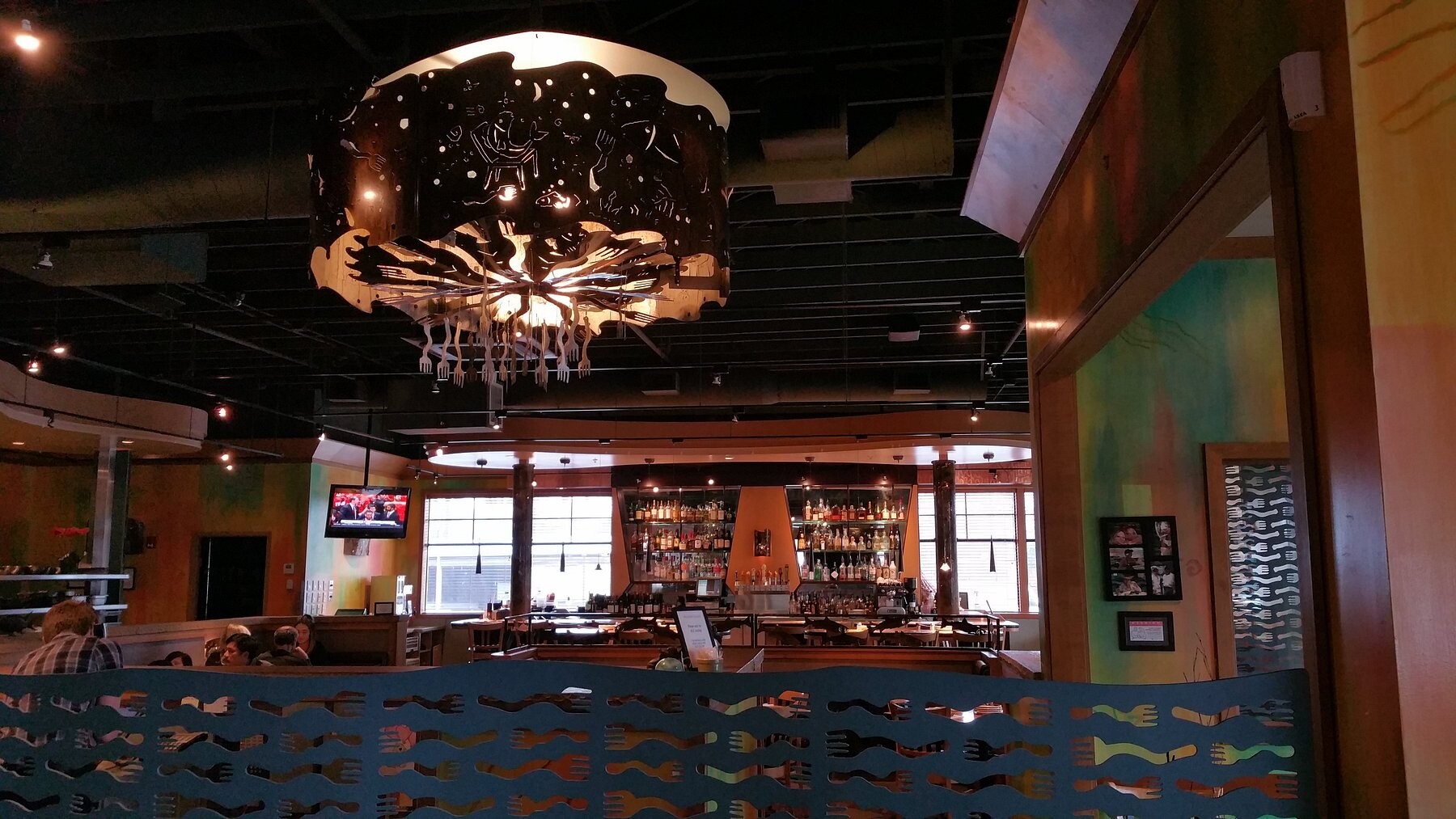
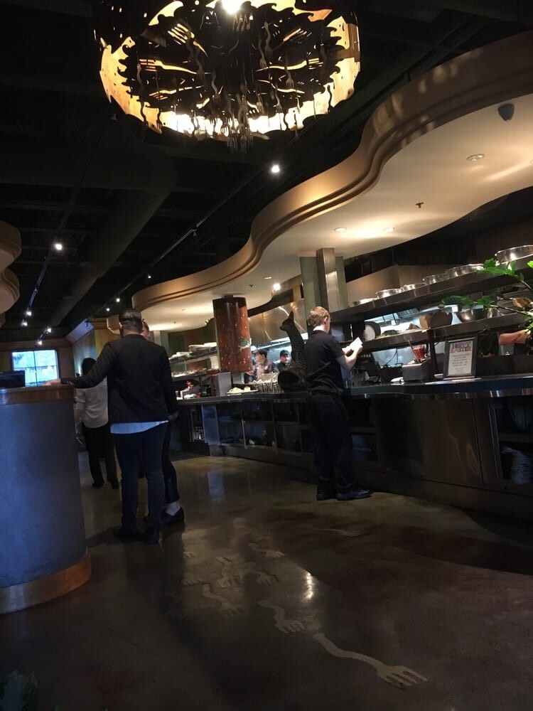
The work covered the full scope of a restaurant brand - from initial identity exploration through interior design direction, including custom chandeliers and floor inlays featuring the 'swimming forks'. Final menus, packaging, signage, and all in-house print materials were designed to ensure consistency across print, web, and the physical space.
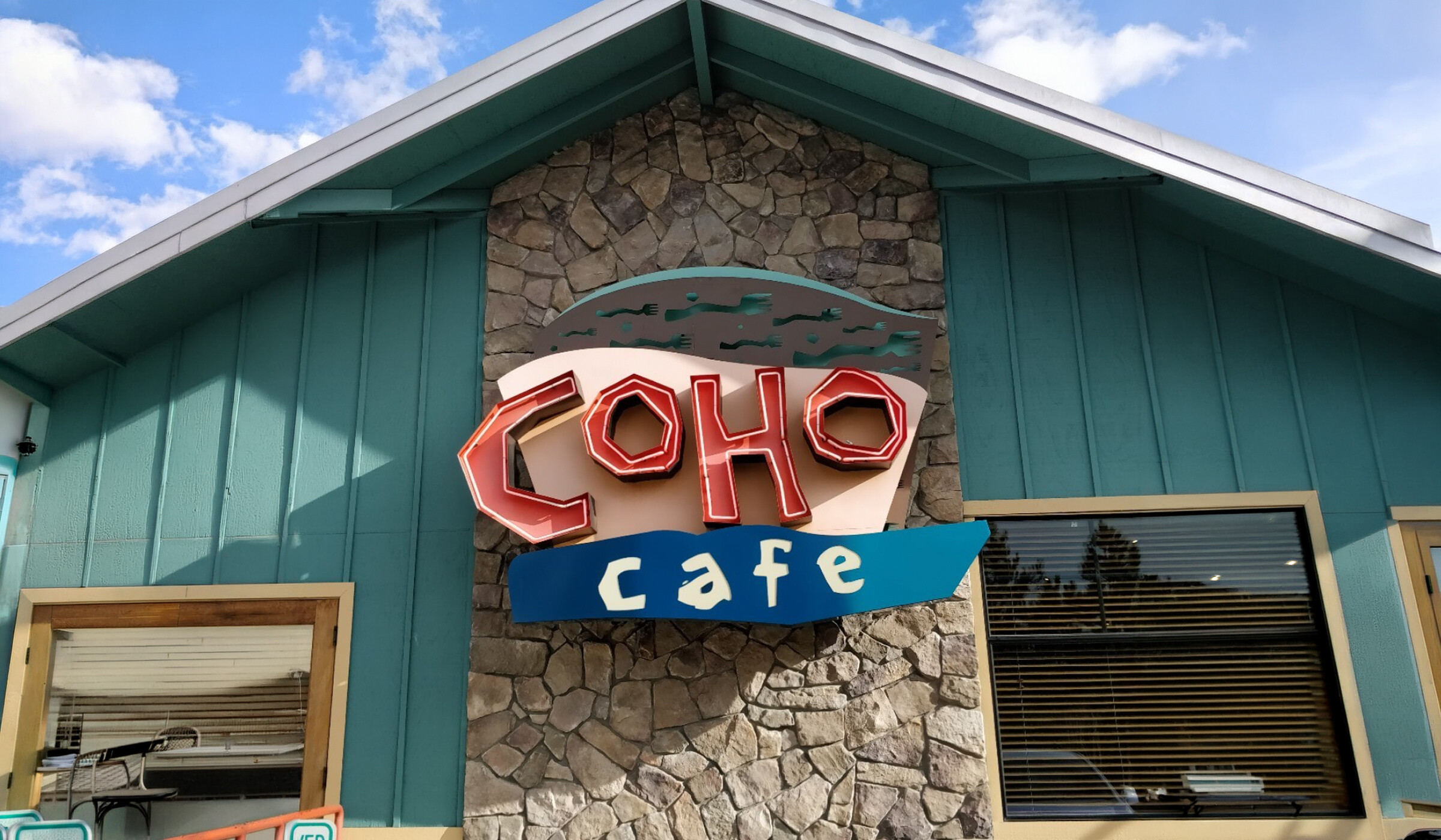
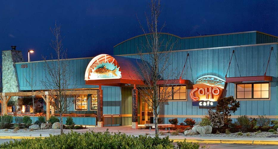
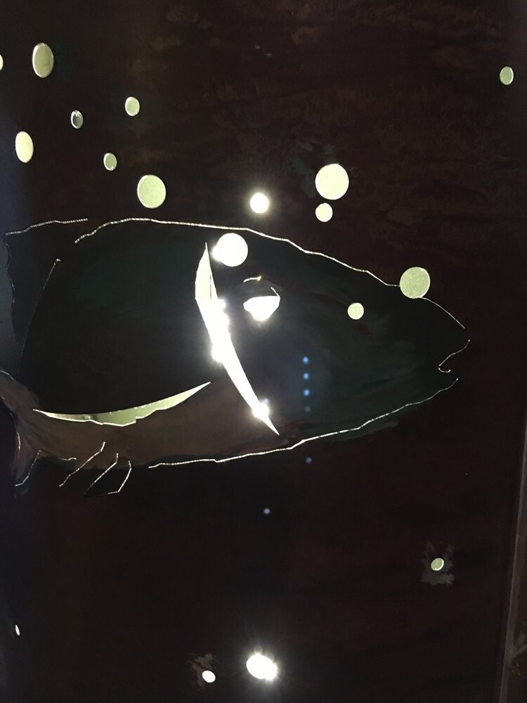
Color palettes draw from cedar, steel, and the Pacific Northwest coast. Custom typography echoes the warmth of handcrafted signage from the region's fishing heritage. Everything was built for performance in a real kitchen environment - legible in low light, durable under daily use, consistent across years of seasonal updates.
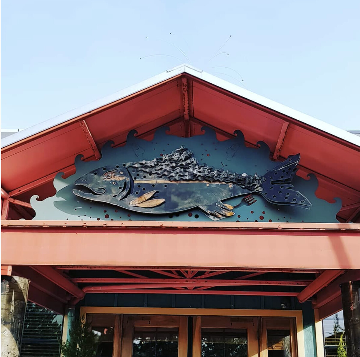
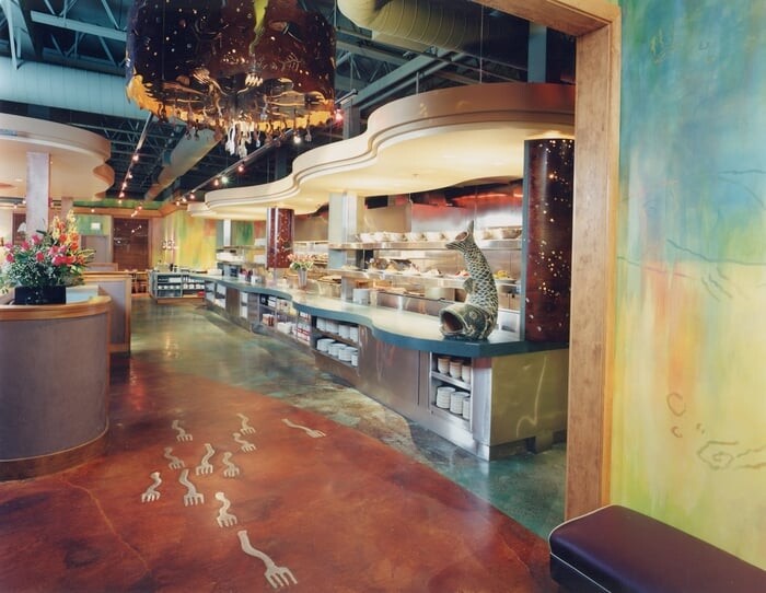
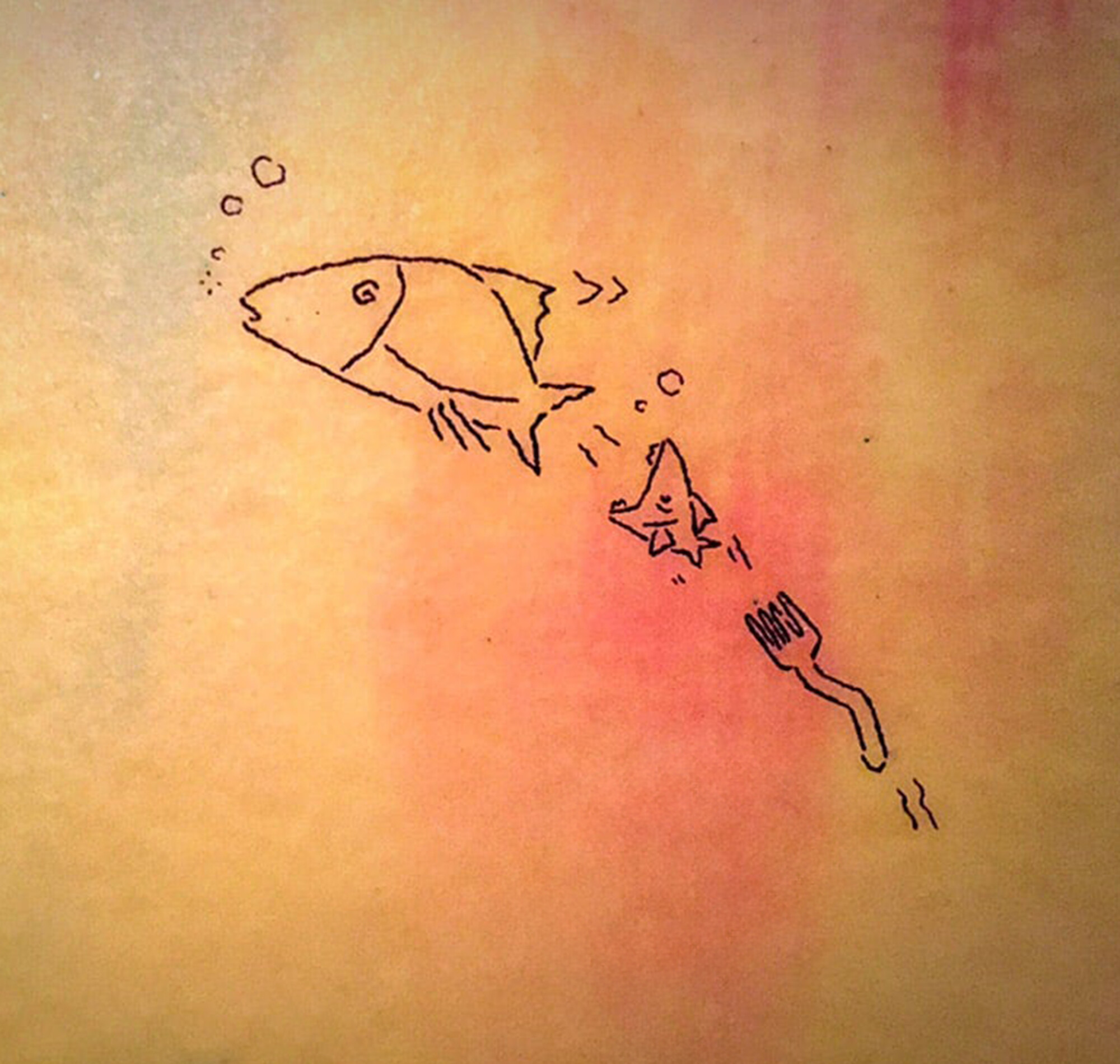
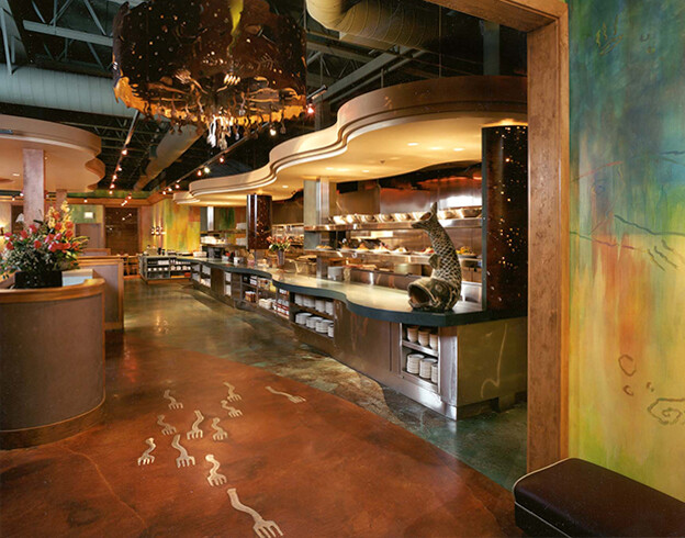
The 'swimming forks' motif that defines the exterior metalwork also lives inside - in the chandeliers, the rail dividers, and the floor. What started as a logomark became a design language that extended into every surface of the physical space.
The system launched for Coho Cafe was built to grow with them. When success created the opportunity to expand to additional locations, the visual system went with it. Seasonal promotions, new menu formats, gift card programs - each one handled within the existing framework, without rebuilding from scratch.