
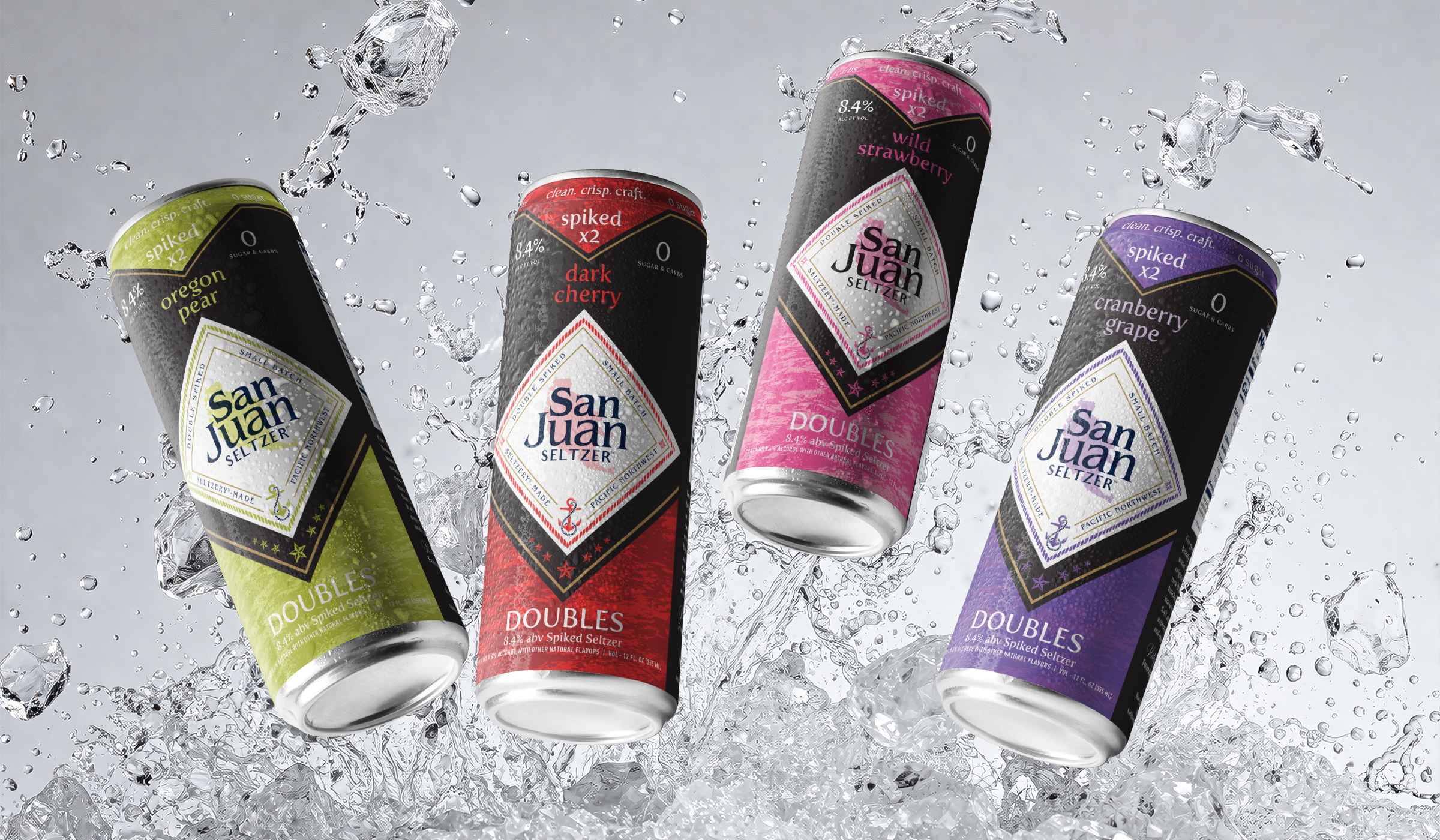
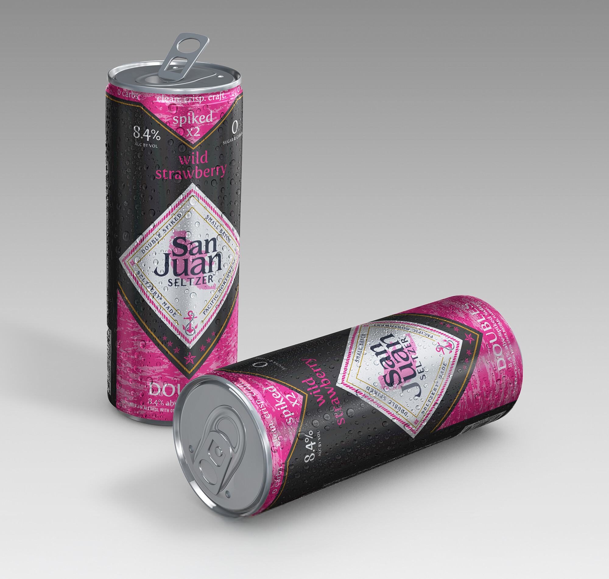
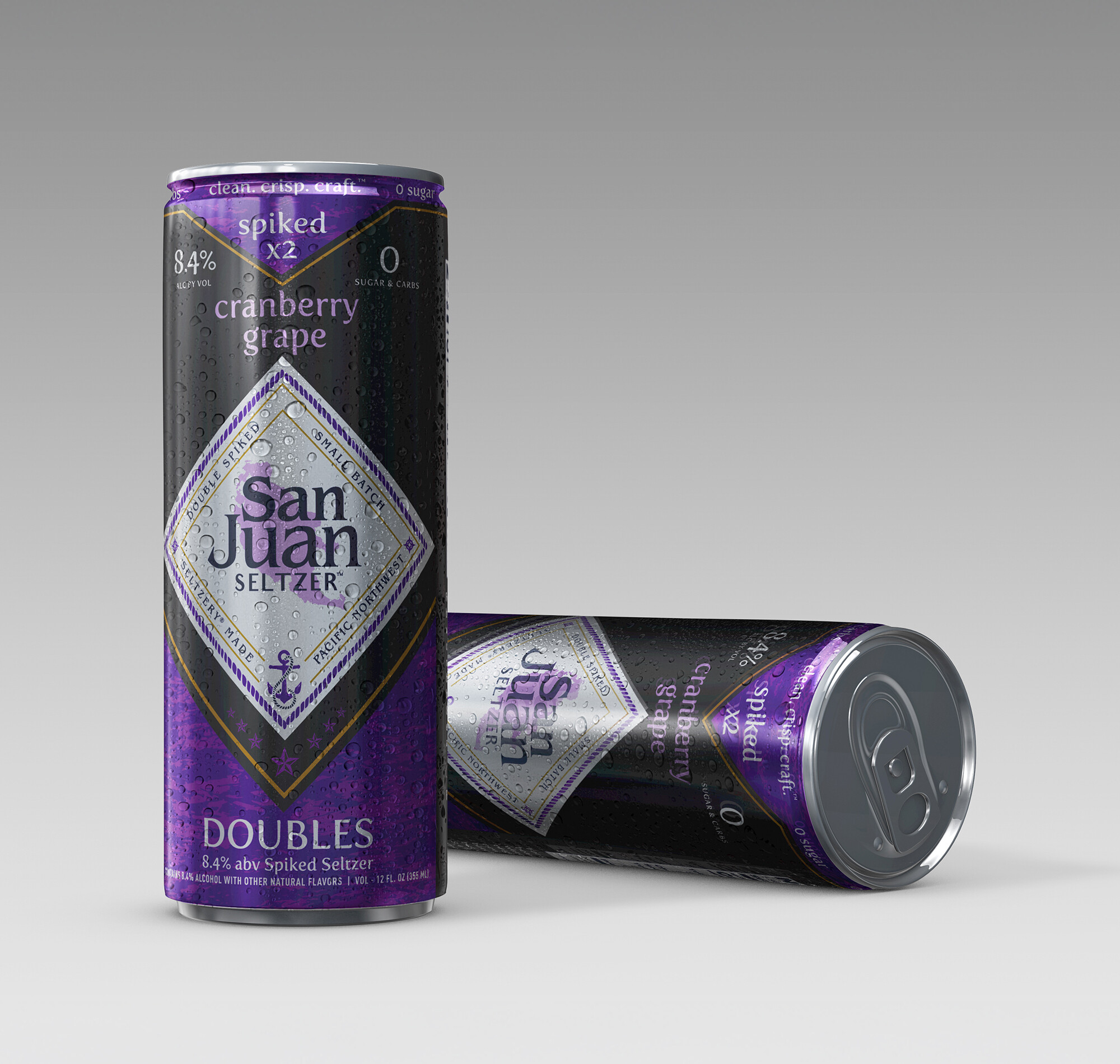
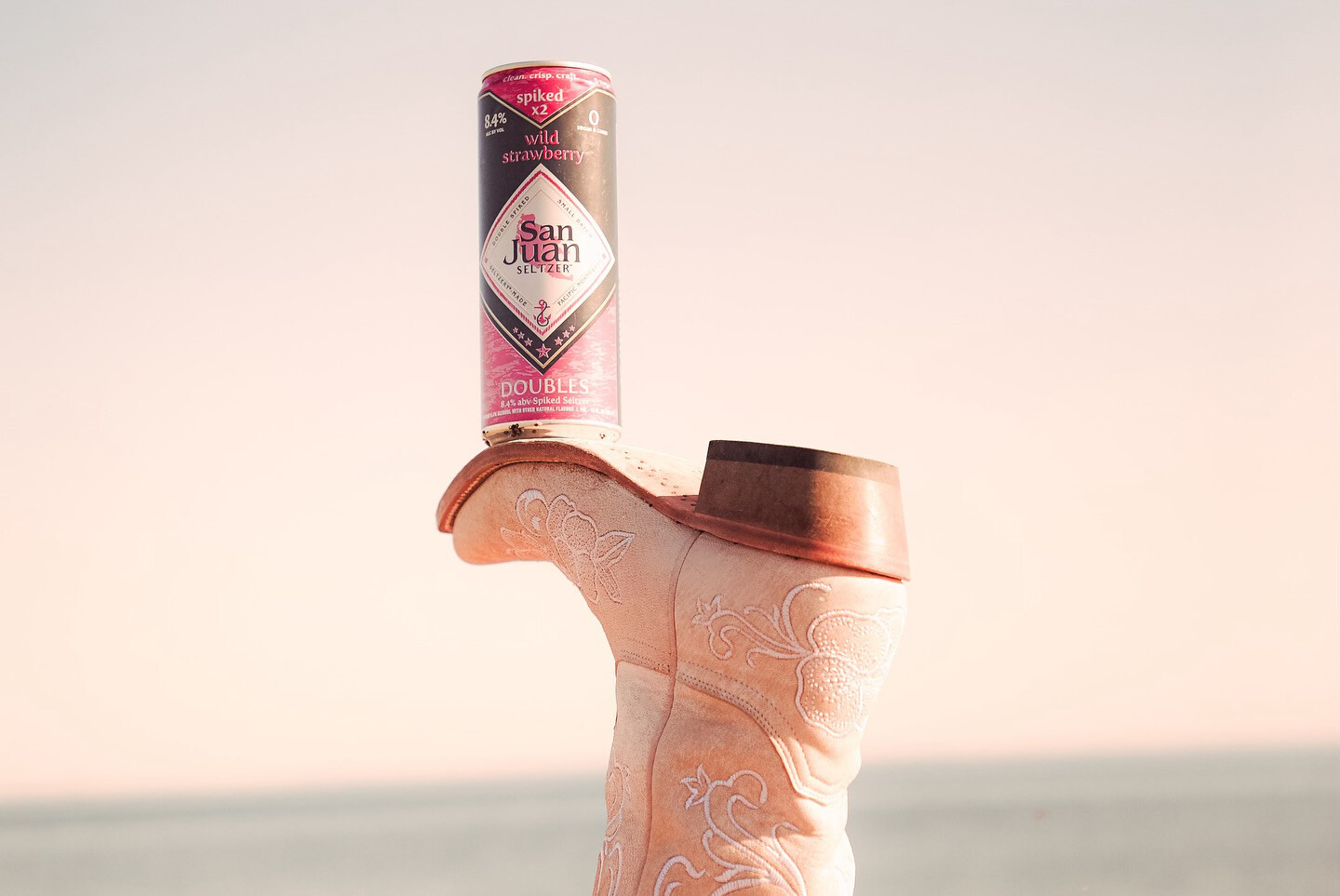
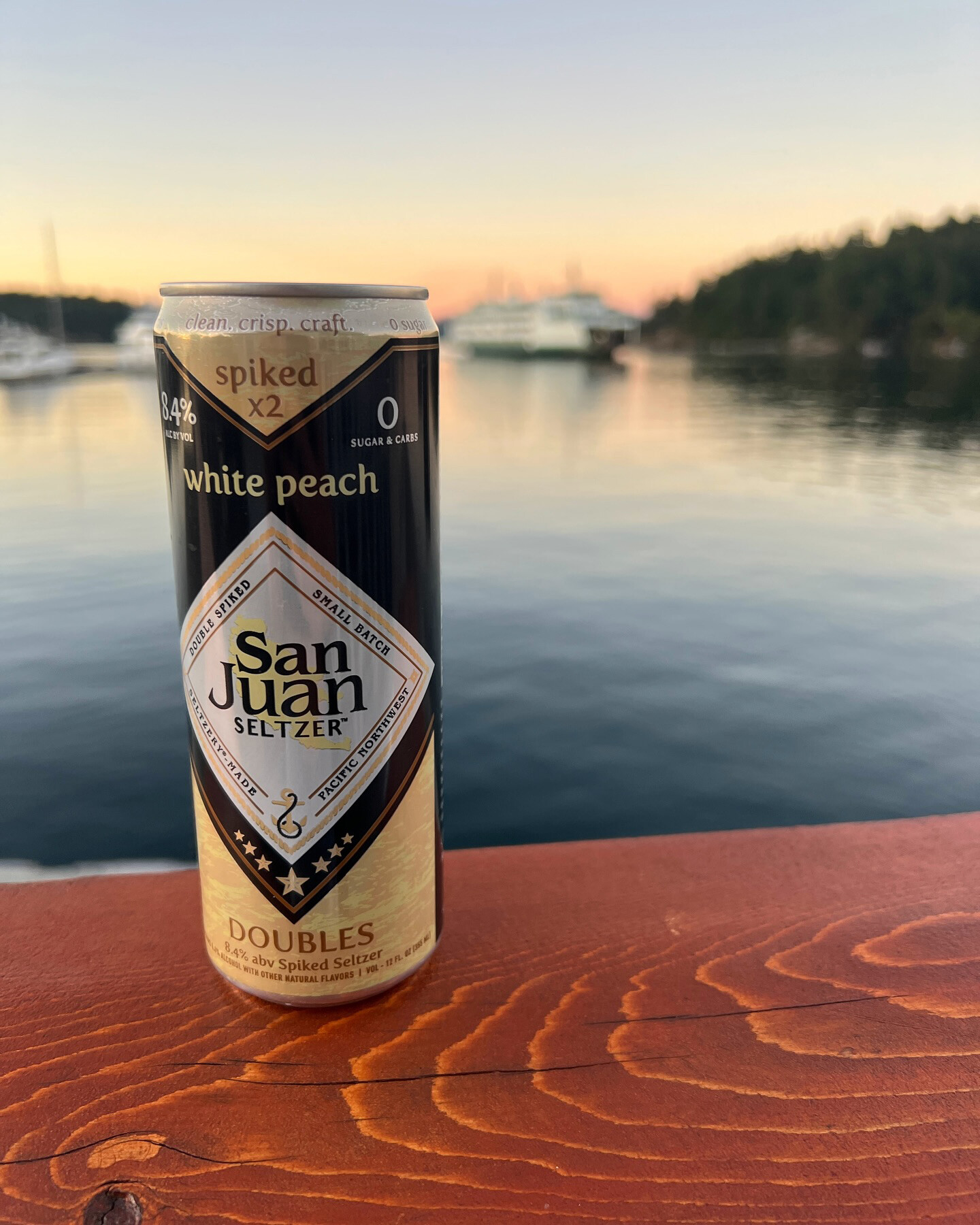
San Juan Doubles launched as San Juan Seltzer's higher-ABV line - 8.4% against the original 4.2%, with bolder flavors and expanded retail ambitions. It needed a distinct identity strong enough to read as its own product, while staying clearly connected to the San Juan brand. Getting that balance wrong in either direction would dilute both.
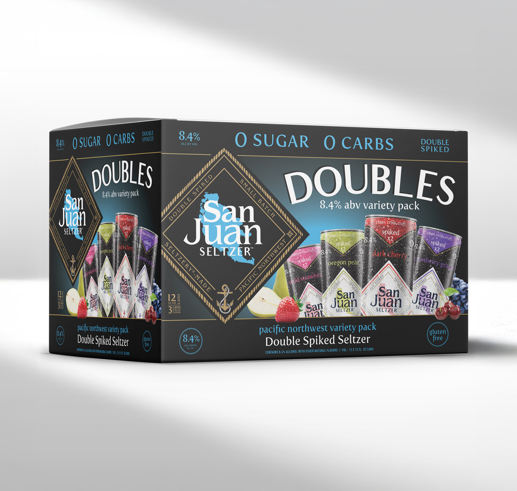
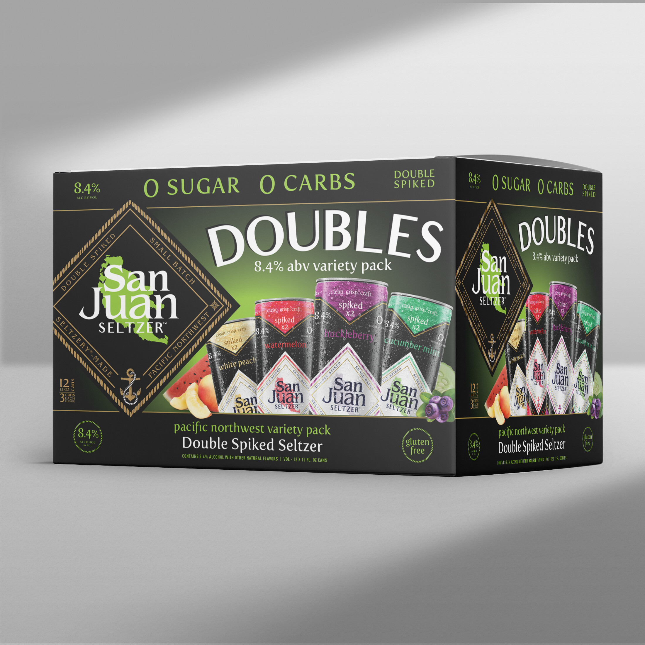
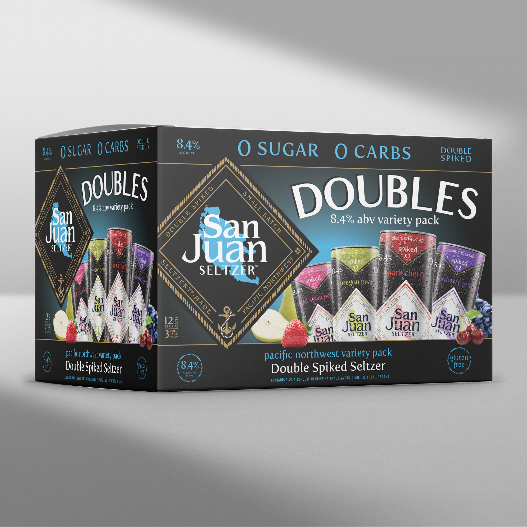
The system had to support rapid SKU growth from day one: four launch flavors with room to grow to eight, plus variety packs built to evolve as the lineup expanded.
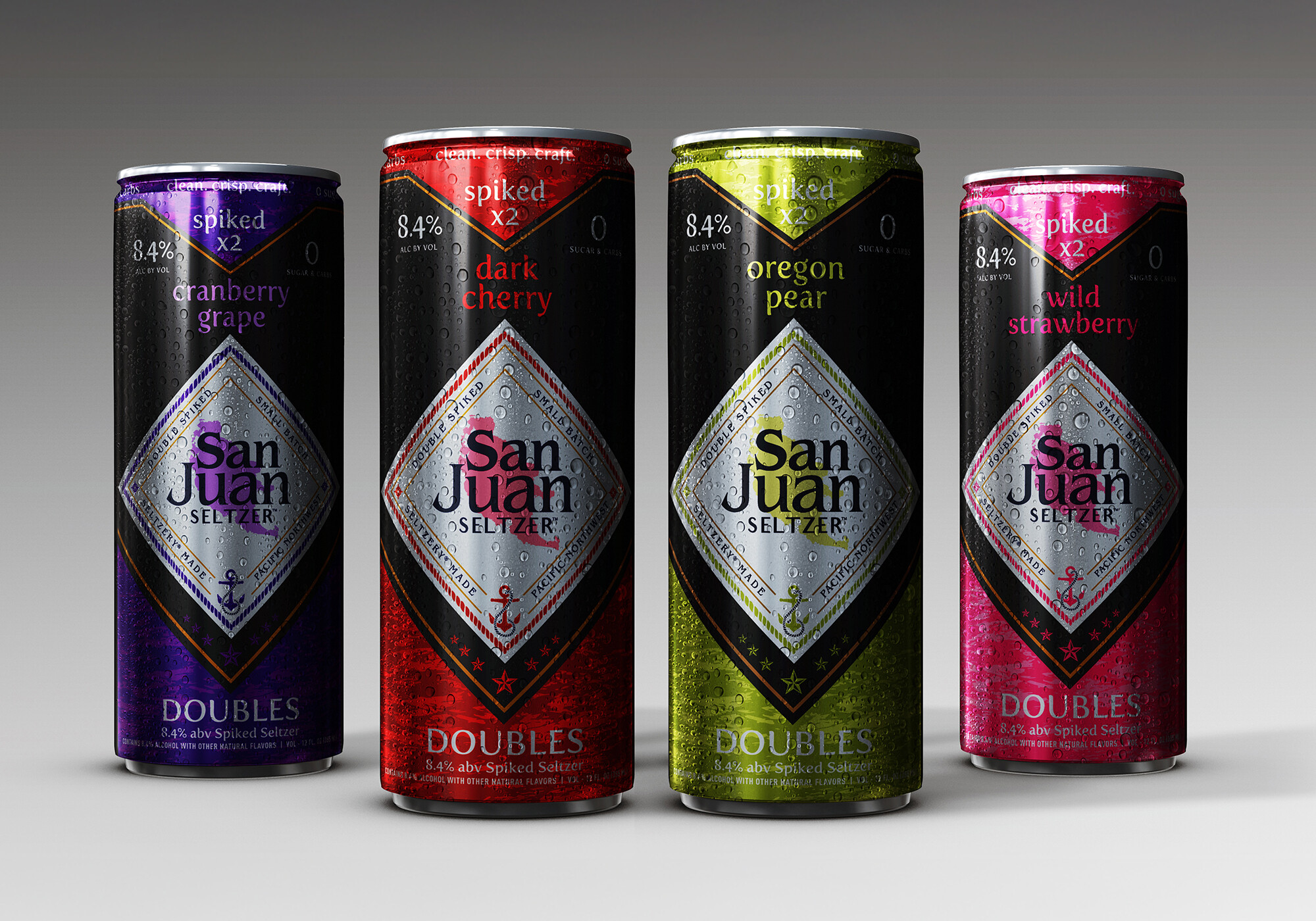
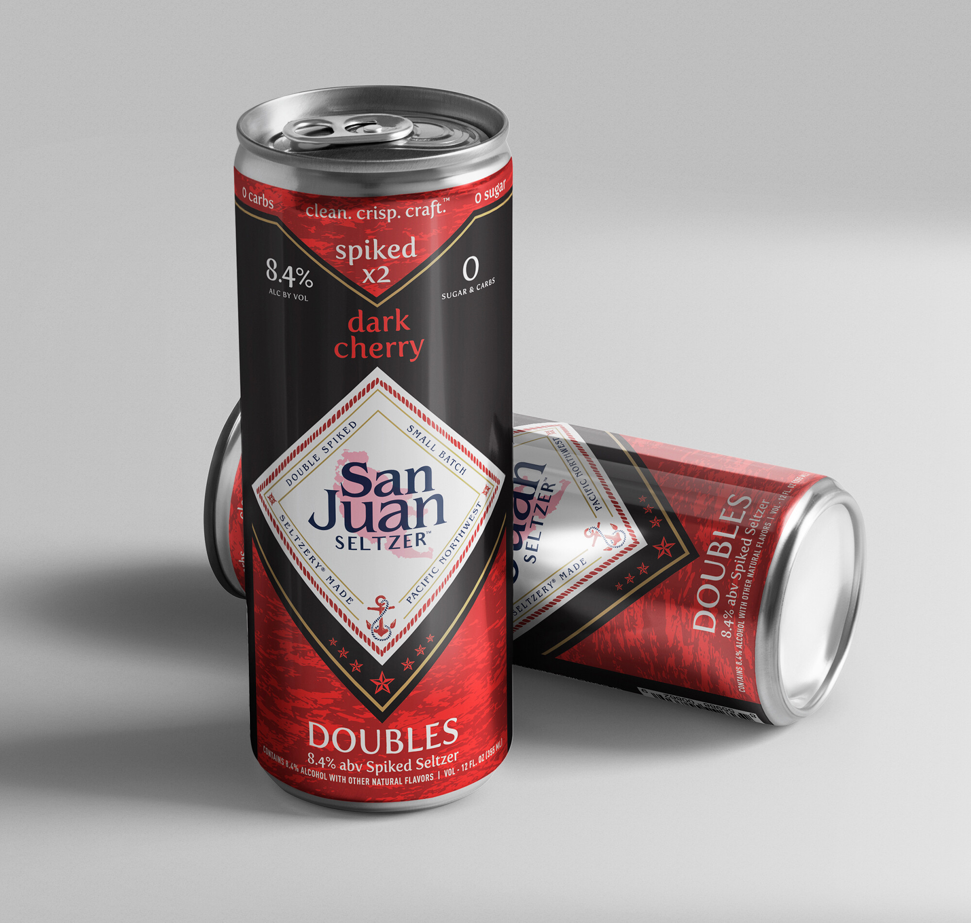
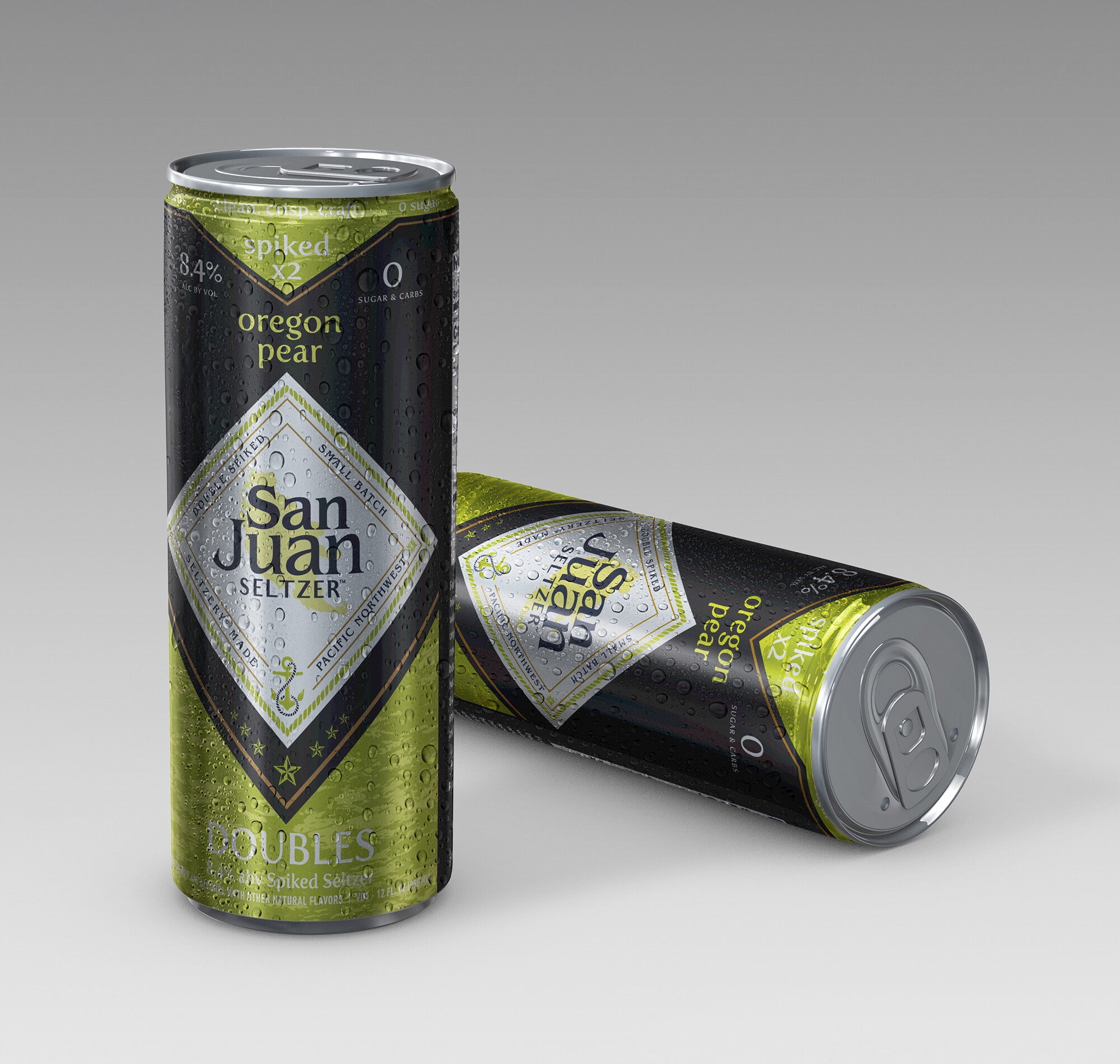
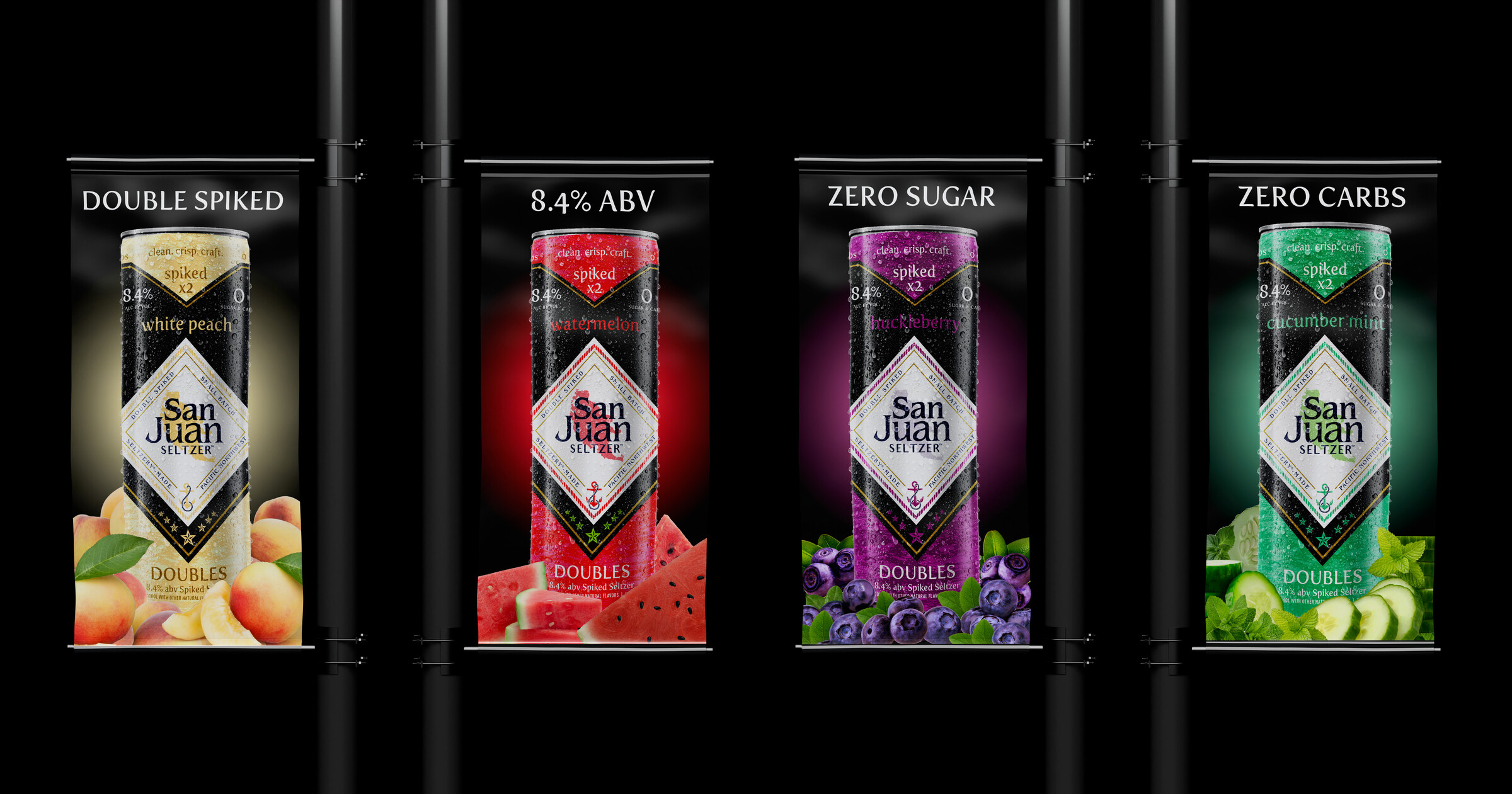
The solution was a disciplined hierarchy and layout framework before any flavor color went down. A consistent typographic architecture and panel structure across every SKU meant new flavors could be added without rebuilding the system. Color-coded flavor bands handled differentiation while the structural logic maintained family cohesion on the shelf and off.
With the architecture locked, the personality followed - vibrant color assignments, Pacific Northwest naming, and a sleek visual tone that felt active and bold without abandoning the craft credibility San Juan had already earned.
The initial launch covered four flavors. The system held up under the expansion - all eight flavors maintaining shelf differentiation through their palette while reading as a unified family. Two variety pack formats were developed alongside the singles, each requiring its own carton architecture while pulling from the same visual language.
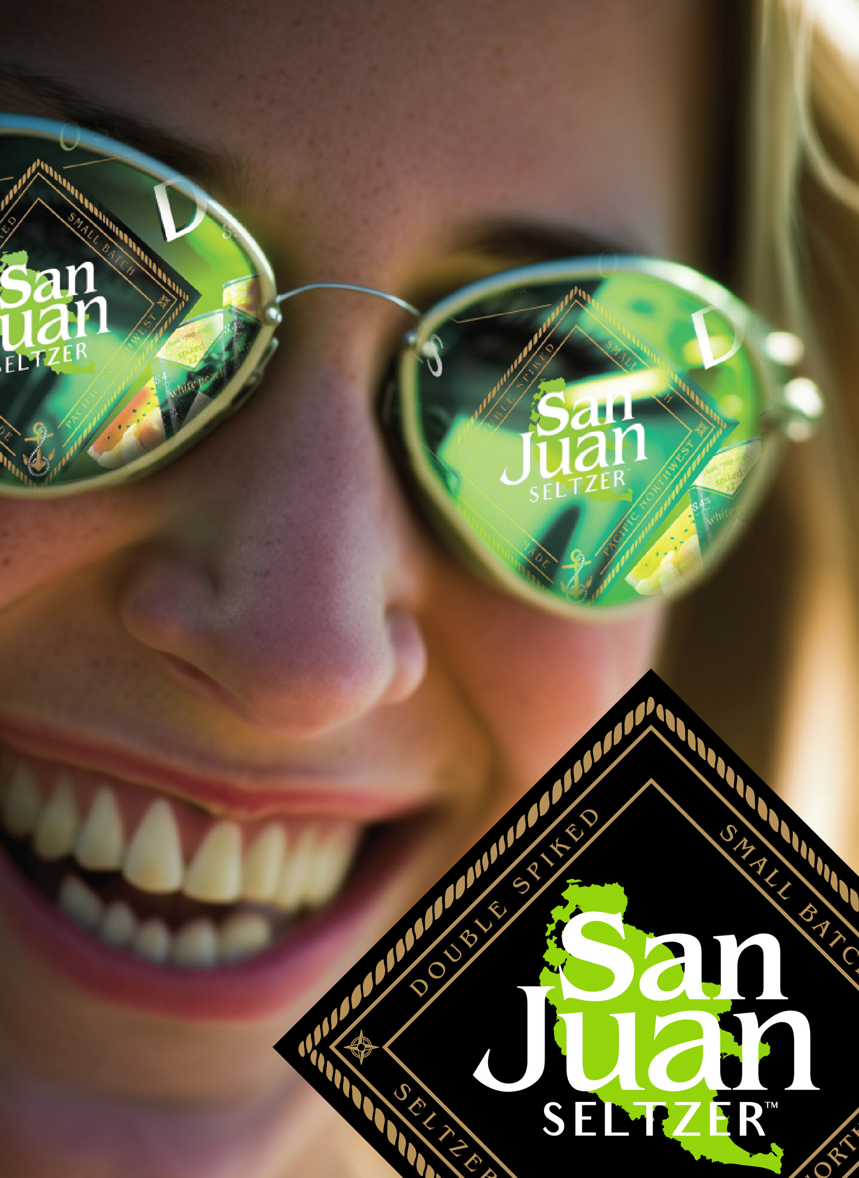

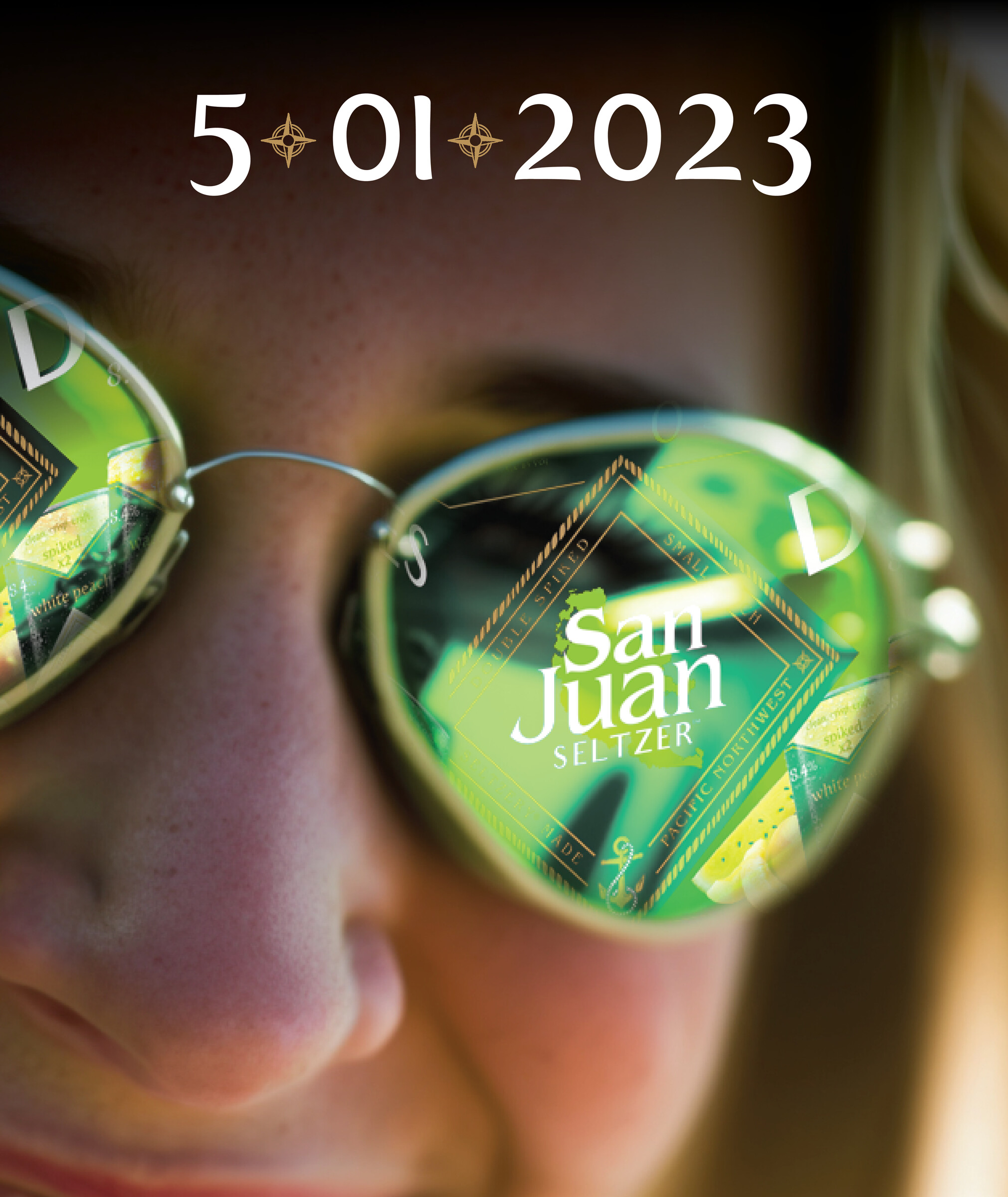
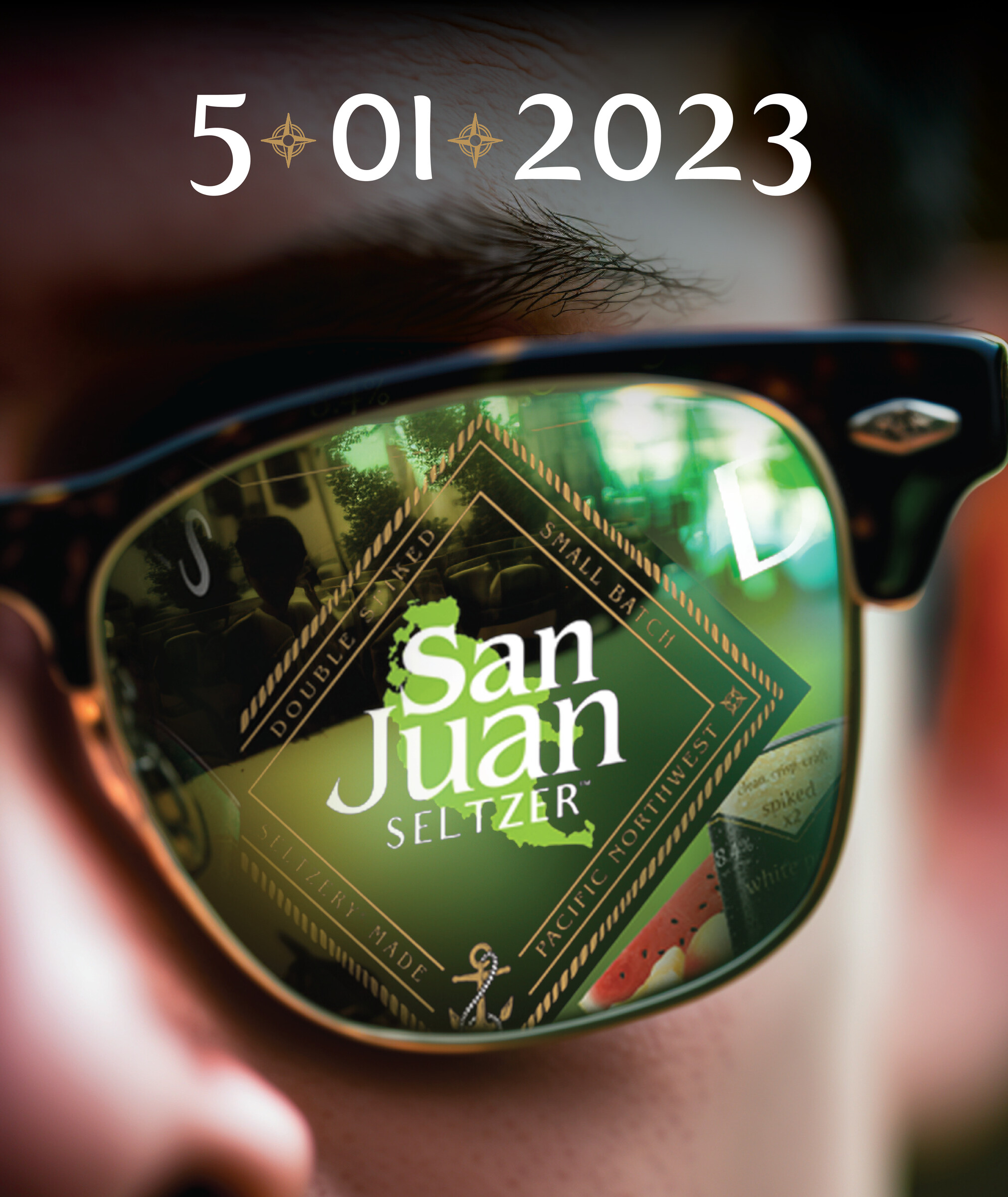
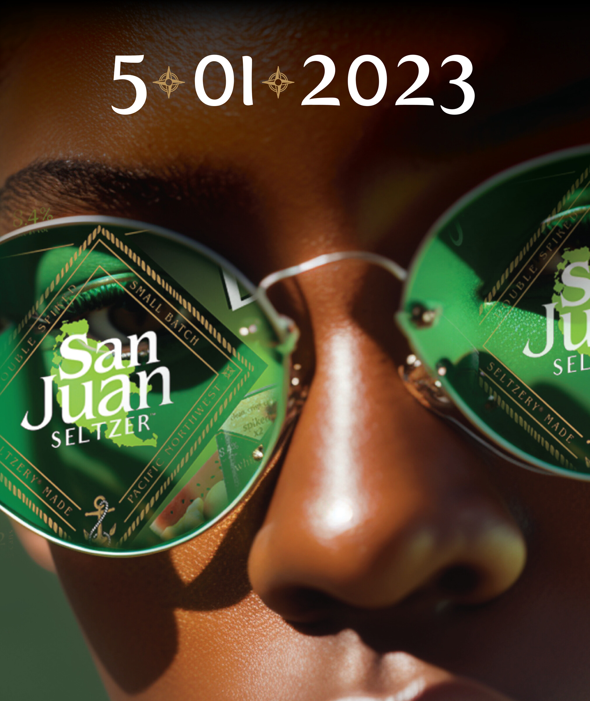
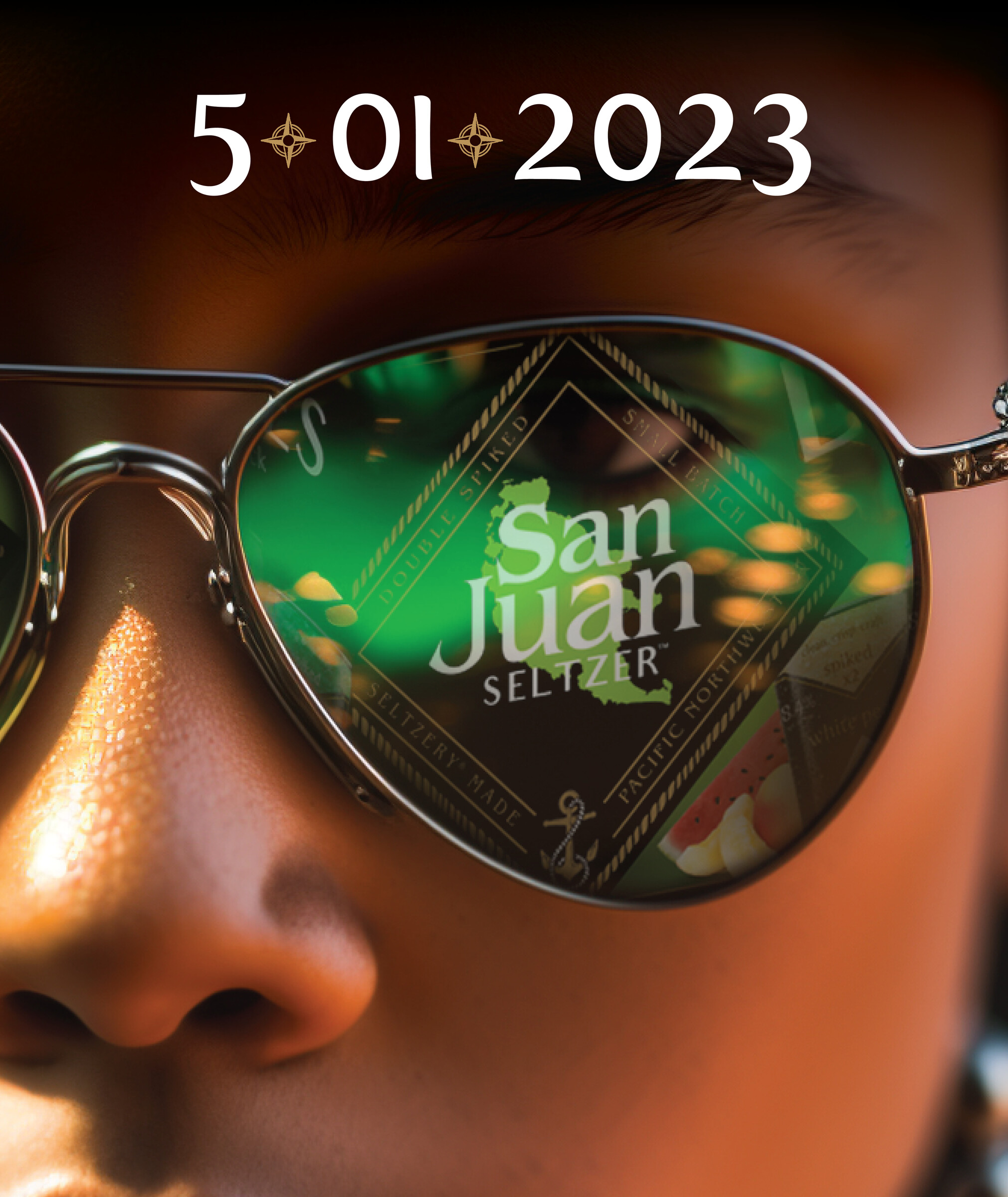
The teaser campaign ran for a month before launch across social channels, building anticipation with a visual identity that felt bold and premium from day one. In-store POP, digital video ads, and launch event materials ran together - all from the same visual system.
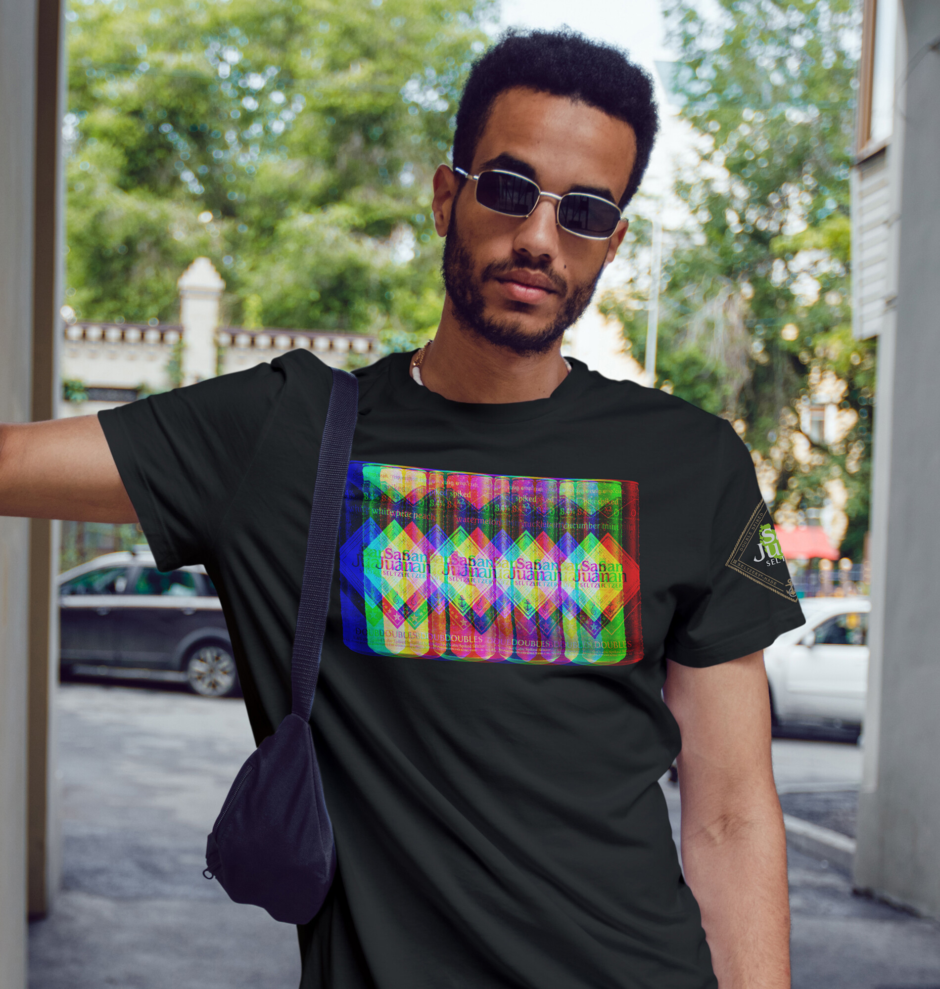
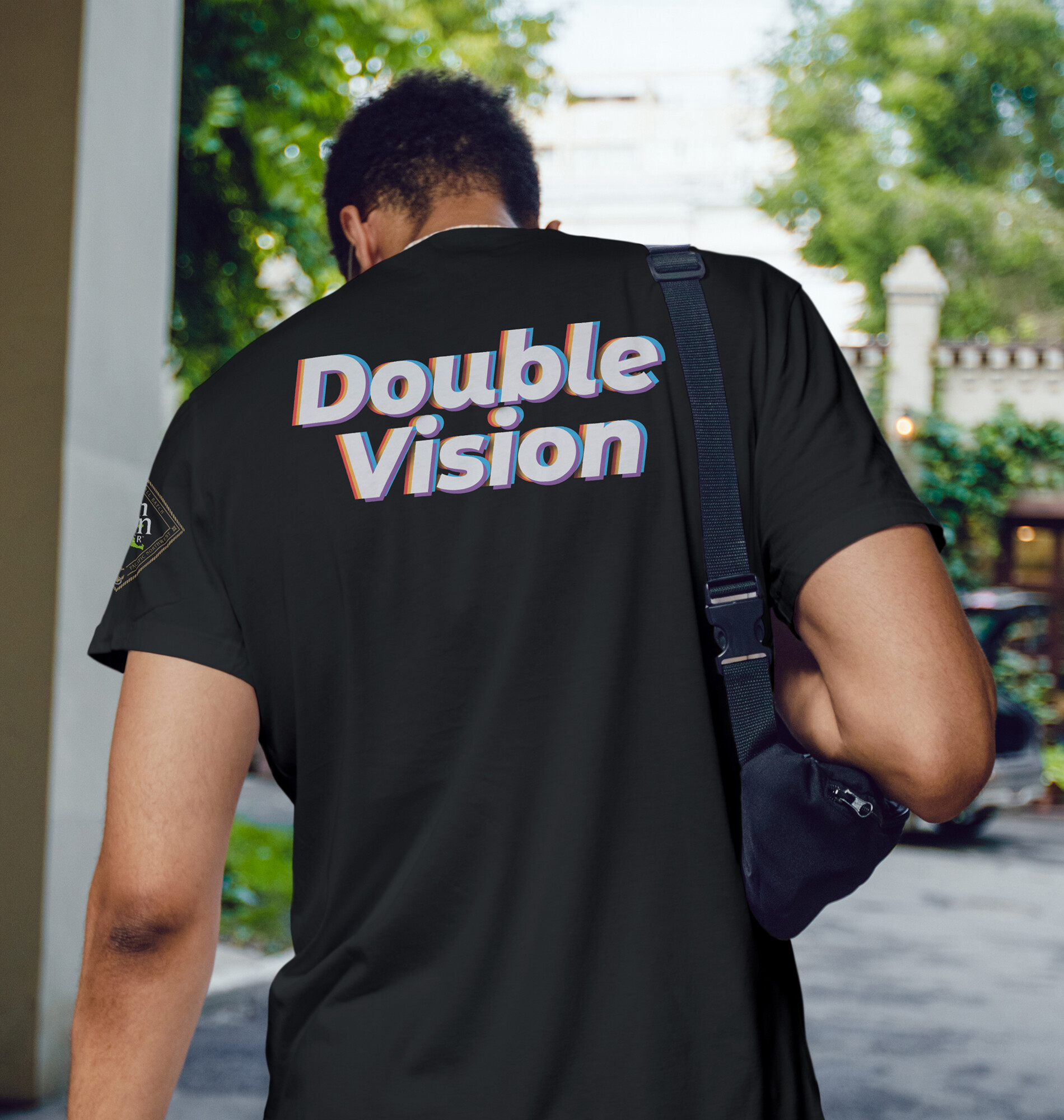
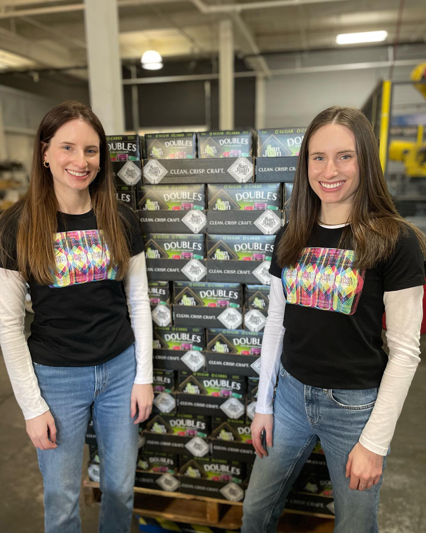
The Doubles identity extended into apparel and lifestyle photography that appeared across social channels and at launch events. The "Seeing Double" shirt became a collector item at the Legion Sports Bar launch party, selling out on the first night.
"A clear, repeatable system designed to scale confidently across flavors, formats, and retail environments."